It’s been a little while since I’ve played around with making creative stuff with CSS just for fun. My trip to State of the Browser conference at the weekend reminded me why I love the web and the creative community around it. If you haven’t already, you should check out Hidde’s summary of the conference. Every talk was absolutely top quality (and some were downright jaw-dropping — Katie Fenn’s live Daft Punk performance in particular!).
Sophie has written a lovely post on why you should go to conferences, and I couldn’t agree more. She includes a list of great web conferences to suit any budget. Attending and speaking at conferences has been 100% worth it for me!
Now, on with the creative stuff. I often find myself thinking of creative ideas (for drawing, painting, writing — anything!) but find myself with a complete lack of time to execute them. So being able to create something super quick is highly appealing, and often serves as a catalyst for sparking new ideas and spending time on something bigger. No, I’m not talking about generative AI! Part of the reason I love the web is that, for me, it’s a medium that allows me space to experiment and make stuff quickly, and the result can easily be refactored, redesigned or thrown away if I don’t like it.
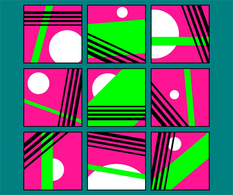
One thing I quite enjoy at home is making small collages with scrap paper — just gluing a few random shapes in a pleasing way to create different patterns and compositions. I enjoy being limited by whatever I happen to have to hand, and seeing whether I can make something that looks nice. I had the idea of redesigning my personal site, using compositions of simple geometric shapes as a motif (who knows whether I’ll get around to doing this!). As a bit of a brainstorm, and to scratch the creative itch, I came up with the idea of creating a simple composition using three CSS gradients, then remixing them with custom properties to see what different outcomes I could generate while keeping the same feel.
To prevent myself getting carried away and spending hours tweaking things, I decided to limit myself in a similar way to having just a few scraps of paper to play with. Each composition has the same base colour background, and same three background gradients that can be adjusted in a limited way with custom properties. The colours can’t be varied, only a few details like the size and position of the circle (made with a radial gradient), or the angle and width of the linear gradient. No additional elements or pseudo-elements are allowed.
Here’s the result!
See the Pen Gradient background composition exercise by Michelle Barker (@michellebarker) on CodePen.
This was a really fun exercise in composition and creativity within narrow limits. I’m definitely going to try out some more ideas.
Webmentions for this page
About webmentionsLikes: 35
Reposts: 18
Mentions: 1
-
@michelle this is super cool!!!
- Sophie -
@michelle they look incredible. I'm in a similar boat with time and ideas, having an 18 month old ????. Though I'm a backend dev by trade I've always felt the pull of css.
Hopefully I can get something just as creative going. Your personal website is one of the recent ones I find inspirational.
- David Peach -
@michelle super rad! Love the colors, too!
- jwithy :prami: -
@michelle I love this ????
- Ana Rodrigues -
@michelle so cool ????
- Brecht -
@michelle thank you
- London Web Standards