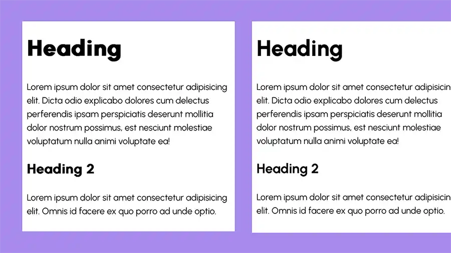
Since I redesigned this website last year, an issue with the heading font has been bugging me. I’d noticed that, unlike in other browsers, in Safari on iOS the headings rendered poorly, slightly blurry, as if they’d been faux-bolded. Googling the problem was coming up with nothing, but I’m using a variable font, so I figured perhaps that had something to do with it not being a super-common issue.

I’m happy to say, I’ve figured it out and finally implemented a fix. It involved learning a thing or two about @font-face.
The @font-face at rule is where we specify a font for use in our CSS. Most of the time I don’t give it too much thought. I specify a few things:
- The font family (How you want to refer to it in the CSS
font-familyproperty. Usually the name of the font, but it can be anything you want.) - The
srcURL and font format. These days I tend to just go with WOFF2, as it’s well supported. Old browsers can fall back to a system font with no harm to the user. font-display. This determines what happens during the period before the font has downloaded. I go withfont-display: swap, which according to MDN, “gives the font face an extremely small block period and an infinite swap period.” In practice that means that during the font block period (before the font is downloaded) a fallback font will be used after a very short delay (up to 100ms according to the spec), which will then be swapped for the specified font once it’s downloaded.
@font-face {
  font-family: 'Urbanist';
  src: url('../fonts/urbanist.woff2') format('woff2');
  font-display: swap;
}
There are a number of other properties that can be specified in the @font-face rule, not all of them necessary in all cases. But with variable fonts we need at least couple of things in order for our fonts to render reliably.
If our font variation is on the weight axis, we should set a range for the font-weight property. A range of 100 to 800 permits us to use any weight in that range (assuming they’re available in our font file).
@font-face {
  font-family: 'Urbanist';
  src: url('../fonts/urbanist.woff2') format('woff2');
  font-display: swap;
  font-weight: 100 800;
}
Secondly, it’s recommended that we set 'woff2-variations' as the font format. In practice the font rendered fine with just the font-weight addition above, and MDN states that this isn’t strictly necessary. But what the hell, it’s a recommendation, so let’s add it. Now the @font-face declaration looks like this:
@font-face {
  font-family: 'Urbanist';
  src: url('../fonts/urbanist.woff2') format('woff2-variations');
  font-display: swap;
  font-weight: 100 800;
}
And now my fonts look beautiful everywhere!
Webmentions for this page
About webmentionsLikes: 21
Reposts: 9
Mentions: 3
-
@michelle The fix was setting the proper range in the `font-weight`, which is a (the?) most common oversight! People get faux bold, or set the weight axis directly with `font-variation-settings` to fight the symptoms.
I'm curious, did you have no `font-weight` set in your `@font-face`, or just a single value?
- Roel Nieskens -
@michelle omg I've battled this too and there is nothing out there!!
Thanks for posting this as i'm sure it will help a lot of people.
I remember feeling really annoyed at a glimpse of layout change because of font swap and found that size-adjust did the trick for now (https://github.com/ohhelloana/ohhelloana/commit/0020cb57ca7dd9f2ff670d94fdb6760d6b653755)
Add size-adjust to fallback font to help with the layout shifts when … · ohhelloana/ohhelloana@0020cb5 - Ana Rodrigues