Day 7 of National Blog Posting Month #NaBloPoMo

I don’t see people using the gap property for flexbox out in the wild all that often, but it’s pretty cool!
gap has been supported for flexbox in all modern browsers since 2021, but has been supported for Grid for much longer. Grid originally had a grid-gap property (shorthand for grid-row-gap and grid-column-gap), but it was later changed to gap to make it compatible with flexbox. That presents a little bit of a problem when it comes to detecting support. In the following code, the styles inside the feature query would apply in browsers that support gap for Grid, even if they didn’t support it for flexbox.
@supports (gap: 1rem) {
  .flex-layout {
    display: flex;
    gap: 1rem;
  }
}
However, flexbox gap support is now so widespread that in some cases the feature query might no longer be needed.
Usage
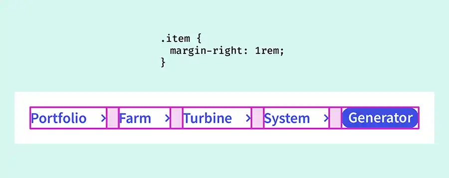
One place I typically like to use gap is for breadcrumbs and similar layouts.

I use the flexbox for the layout, with flex-wrap: wrap to ensure that at small viewport sizes they’ll wrap onto a second row. We might use margins or padding on the right of the items to create some space between them.
When they wrap onto the next line we can see that we’ll need some vertical space too, otherwise our breadcrumbs don’t look too great stacked on top of each other. So we end up adding a bottom margin to each item, as we don’t know at what point they’ll wrap (assuming our content could be of varying length).
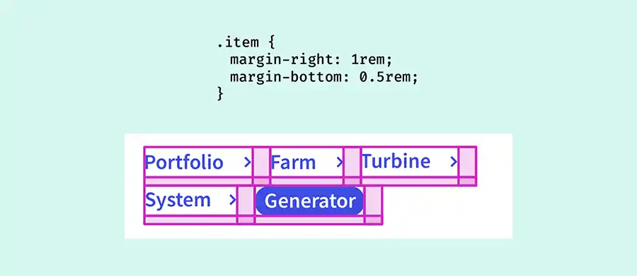
Unfortunately, that leaves us with some extra space at the bottom of our breadcrumb component, which we have to account for in the rest of the layout. (Sure, we could do .item:not(las-child). But we don’t know if there will be more than one item on the last line.) We’ll also have some extra space to the right of each of our items.
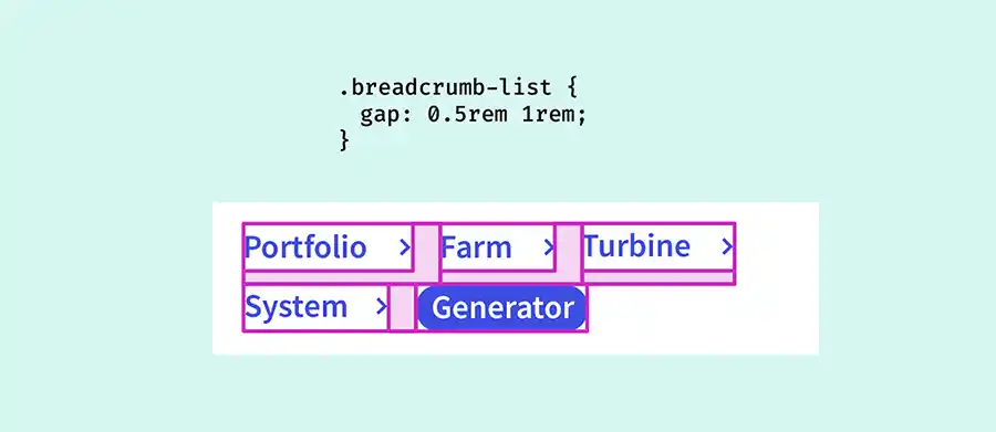
The thing is, gap is pretty clever. Even though flexbox layouts are technically one dimensional (we can only control the row or column axis, not both), gap works across both axes.
If we opt instead to use gap instead of margins of padding, we only get space between the items.
.breadcrumbs-list {
  display: flex;
  flex-wrap: wrap;
  gap: 1rem;
}
And because it’s a shorthand (for row-gap and column-gap), we can set two different values if we choose:
.breadcrumbs-list {
  gap: 0.5rem 1rem;
}
Then we don’t need to faff about with margins ☺️
Webmentions for this page
About webmentionsLikes: 1
Reposts: 0
Mentions: 2