When it comes to building a layout, CSS Grid offers us a number of different choices for placing items. In this article we’ll take a look at the different placement methods, how to use auto-flow to avoid having to explicitly place every item, and why sometimes grid items might not be placed where you expect them to be.
I like to think of using Grid as two distinct parts:
- Scaffolding – or building the structure of the grid itself. This involves defining the properties acting on the grid container, beginning with
display: grid, and describing the shape of the grid and how it should behave using any combination ofgrid-template-columns,grid-template-rows,grid-auto-columnsandgrid-auto-rows(orgrid/grid-templateif using the shorthand). - Furnishing the grid – telling the browser where each child of our grid container should be placed.
In this article we’ll take a deeper look at the second part, and in particular auto placement.
Different ways to place a grid item
Explicit placement
The properties that allow us to explicitly place items on a grid are:
grid-column-startgrid-column-endgrid-row-startgrid-row-endgrid-column(shorthand forgrid-column-start/grid-column-end)grid-row(shorthand forgrid-row-start/grid-row-end)grid-area(shorthand forgrid-row-start/grid-column-start/grid-row-end/grid-column-end)
The above properties are defined on the items themselves. Possible values include line numbers, line names, span values or area names. There are no rules for which you should and shouldn’t use, and you can mix and match as you like. For example:
.item--a {
  grid-area: a;
}

.item--b {
  grid-area: 2 / 2 / 4 / 4;
}

.item--c {
  grid-row: span 2 / 5;
  grid-column: 1 / 3;
}
grid-template-areas
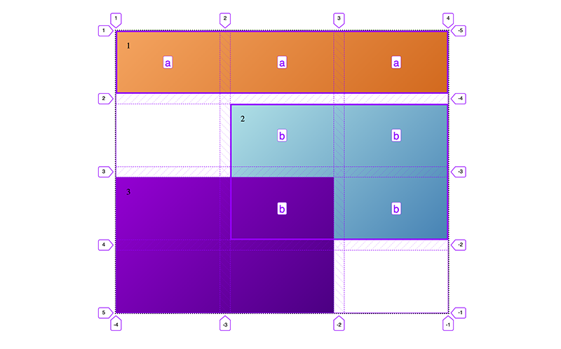
Additionally, we have grid-template-areas. This property it is defined on the grid container. It allows us to define grid areas with names, then reference those areas to place the items:
.grid {
  display: grid;
  grid-template-columns: repeat(3, 1fr);
  grid-template-rows: repeat(4, 120px);
  grid-template-areas:
    'a a a'
    '. b b'
    '. b b'
    '. . .';
}

.a {
  grid-area: a;
}

.b {
  grid-area: b;
}
This is pretty cool, as it means we could change the layout significantly by only altering the grid-template-areas value. We don’t need to add or change any properties on the items themselves. A big win for responsive design!
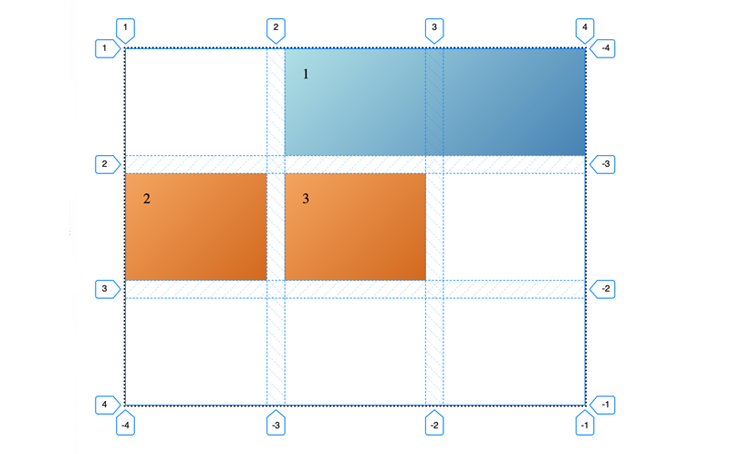
We might be tempted to place every item explicitly using grid-template-areas. But there’s one drawback: You can’t define overlapping areas. Creating a layout like Fig 01 could not be done with grid-template-areas alone.
But we could use grid-template-areas in addition to placing items by line name or area.
.a {
  grid-area: a;
}

.b {
  grid-area: b;
}

.c {
  grid-area: 3 / 1 / 5 / 3;
}
Auto placement
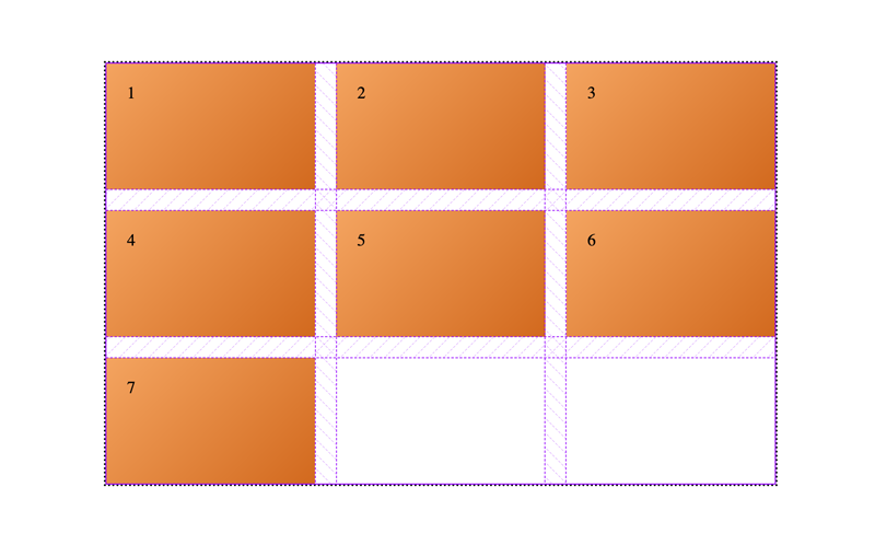
If we don’t explicity place items on our grid, they will be auto-placed. By default each grid items have a span of 1 on both the row and the column axis, so they will each be placed into the next available grid cell. We can use this to our advantage: If we have something like a news feed, we don’t want to have to place each item explicitly, especially if we don’t know how many items there will be.
Predicting auto placement
In the above example the rules of auto placement are fairly intuitive: Items are placed along the row (or inline) axis until they fill up the row, and then they’ll wrap onto the next row (creating a new row if there isn’t one defined).
But if we have some items that are explicity placed, and others that are not, them how can we identify the cells the auto placed be placed into?
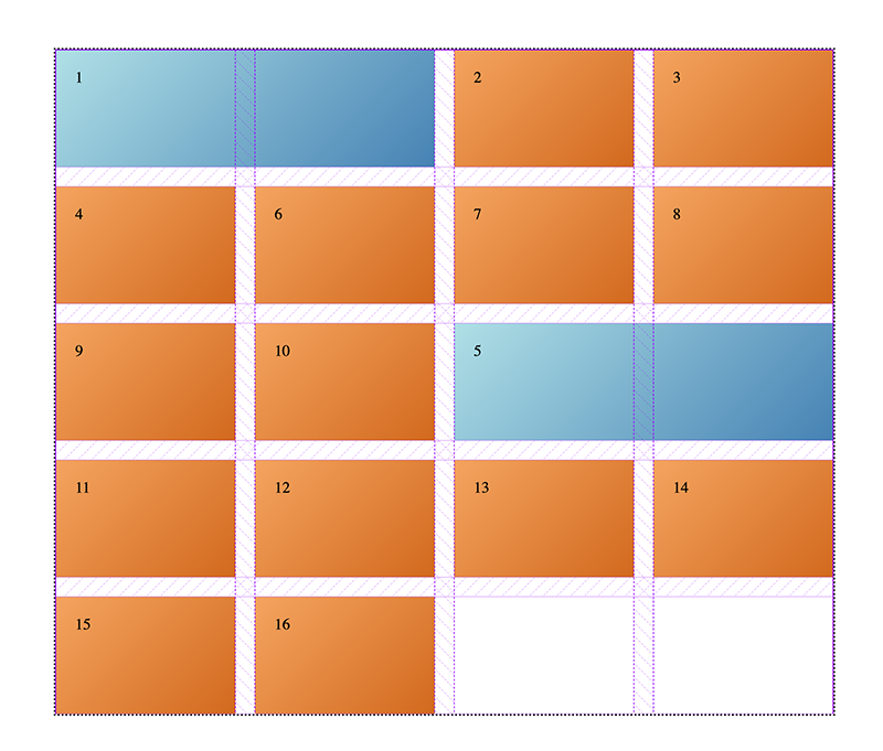
If I place an item on my grid using grid-column: 2 / span 2 I might expect that any auto placed items succeeding that one will be placed after the one I’m placing (Fig 03):
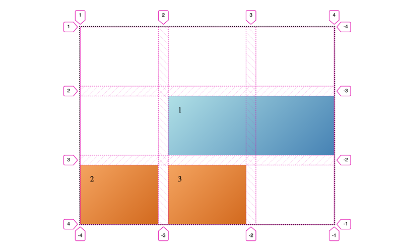
What actually happens with the above code is the succeeding items are placed before the placed item. They are placed into the first available cells, which happen to be the first two in our grid.
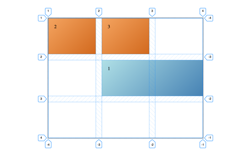
But if we place the blue item only on the column axis, the items are placed after the first one:
So why is the placement behaviour different? If we understand the rules of auto placement, things become clearer.
Understanding flow
A good way to think about this is to think of our grid as a flowing river. Any explicitly placed items are boats anchored in the river. Auto placed items flow around these, from left to right (Fig 06).
Grid items that are only explicitly placed on one axis are more loosly anchored. They participate in the grid flow on the remaining axis.
Items placed using a span value alone will still flow like the others, but they’ll be restricted by their own explicit size. An item with a span of 2 will flow onto the next row if there are less than 2 grid columns available. We can think of these as being semi-auto placed (Fig 07).
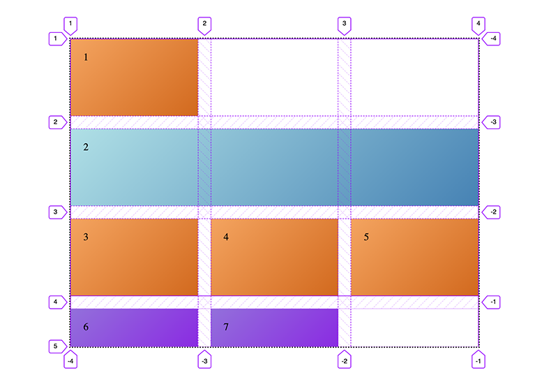
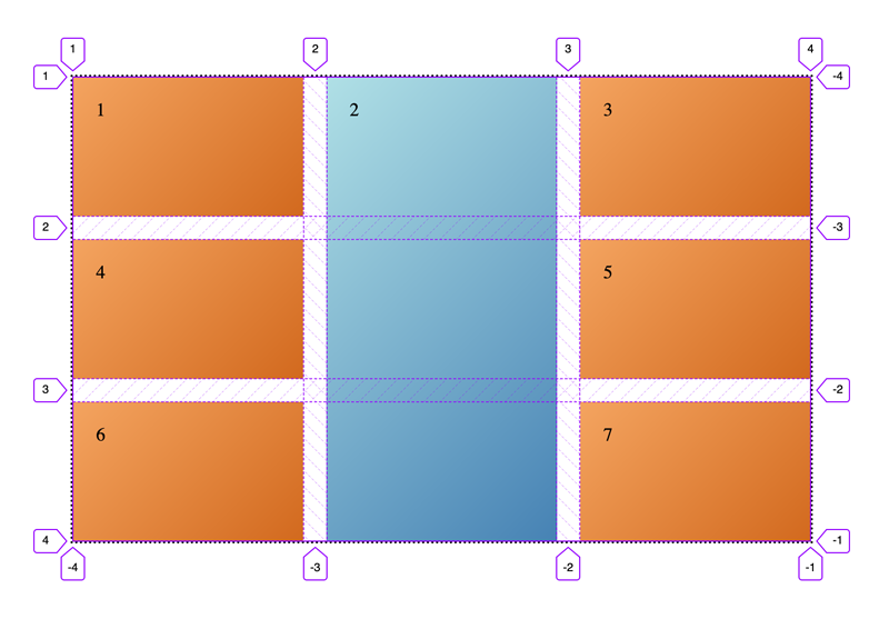
In Fig 07 we’re only placing the item on the column axis again (using span), so successive items are placed after it. We have enough items to fill the grid exactly – but rather than filling earlier grid cell, the sixth and seventh items create an implicit track. This doesn’t happen if we only place it explicitly on the row axis (Fig 08).
This is to do with the order in which item placement is resolved in the grid placement algorithm.
Changing the flow of your grid
There are two different properties we can use to change the order of items in the grid. The first is grid-auto-flow. This changes the direction of flow, and therefore how items will be auto placed. Possible values are row (default), column, row dense and column dense.
grid-auto-flow: column
By changing the value from row to column, we can see in the second section in this demo that the behaviour has now reversed: Items placed on the column axis are now resolved ahead of those on the row axis. Placing an item on the column axis no longer generates an implicit grid track, as items are packed into every cell, but placing an item on the row axis does.
grid-auto-flow: dense
Using the dense keyword in addition to row or column (row is the default), we can
specify that auto placed items should pack themselves into any available grid cells (including ones preceeding any explicitly placed items). This will ensure there are no gaps, even if an item is placed on only one axis. In the above demo you can see how each of the values for grid-auto-flow alter the behaviour of the grid.
Order
The order property is not exclusive to Grid – it can also be used with flexbox. It allows us to change the order of individual items within the flow. Items have a default order of 0. Changing an auto placed item’s order to -1 will place it at the start of the grid auto placed grid items – after explicitly placed items, if there are any placed at the start of the grid.
The order property will only affect auto and semi-auto placed items (those using a single span value). In the demo below the purple item’s position is altered using the order property, but the blue item, which is explicitly placed, is not affected.
Direction
You might have noticed, grid-auto-flow allows us to change the direction of flow from row to column, but it does not allow us to make items flow from right to left. Instead, we can use the direction property. This is part of the CSS Writing Modes, which is designed to support international writing modes where text flows in a different direction from left-to-right. To make our grid flow from right to left we can use this:
.grid {
  direction: rtl;
}
⚠️ Use with caution ⚠️
Properties that affect the visual order of grid items should be used with the utmost caution, as the do not change the source order, and can therefore adversely affect accessibility. Rachel Andrew has written extensively about it in her article, Grid, content re-ordering and accessibility.
I believe there are some cases where visual re-ordering makes sense, but in my experience they most often involve explicit item placement.
Conclusion
I hope this article has helped demystify some issues around placement of auto flow grid items. You might also be interested to read part 1 of this series, Understanding Implicit Tracks, which also deals with placement of grid items.