When observing people getting to grips with CSS Grid, I’ve noticed a few issues that catch people out more often than others, or present more of a challenge when it comes to building a layout. This short series of articles will delve into these common problems and aim to provide a better understanding of Grid so that you can anticipate layout problems, and debug them more easily when they occur.
Accidental implicit tracks
The biggest issue I’ve seen people struggle with is accidentally creating extra grid tracks, which can throw an entire layout into disarray. These extra tracks are known as implicit tracks, and they are created by placing an item outside of the explicit grid’s boundary. To get the most out of Grid, it’s a good idea to understand the concepts of the explicit and implicit grid, and their relationship to each other.
The explicit grid
The explicit grid is defined using the grid-template-rows and grid-template-columns properties (or shorthand grid-template if you prefer):
.grid {
  display: grid;
  grid-template-rows: repeat(4, 150px);
  grid-template-columns: repeat(4, 1fr);
}
Here we’re defining a grid with four rows and four columns, and we can know that our grid will have at least four rows and four columns, no matter what. Even if we don’t have any grid children to place, so that our grid is completely empty, it will still take up the space of four rows and four columns that we’ve defined above.
If we used repeat(4, auto) for the grid-template-rows property, our grid rows would all have a height of auto – so if we had no grid children then our rows would still exist, they would just collapse down to a height of zero without any content to fill them. If we added a row gap (e.g. row-gap: 40px) then the combined height of the gaps between the rows would make up the height of our grid – so without any content it might look like an extra large margin or padding value somewhere that was breaking your layout!
What are implicit tracks?
Implicit tracks are tracks that are only created by placing items. This behaviour in Grid is intentional, and very useful. An example is if you have a grid with four columns that we want to fill with an indeterminate number of items (e.g. a news feed. If we don’t know the number of items, we won’t know how many rows we need for the grid. By default, grid items are placed into the next available grid cell. We can simply omit the grid-template-rows property and allow Grid’s auto-placement to create the right number of rows for our content.
(Side note: I’m assuming here that the grid is using the default grid-auto-flow: row. If you change this to grid-auto-flow: column then implicit tracks will be created on the row axis instead.)
.grid {
  display: grid;
  grid-template-columns: repeat(4, 1fr);
}
We can control the behaviour of implicit tracks with grid-auto-rows and grid-auto-columns.
.grid {
  display: grid;
  grid-template-rows: repeat(4, 150px);
  grid-template-columns: repeat(4, 1fr);
  grid-auto-rows: 150px;
}
The above code, in addition to defining four explicit column and row tracks, instructs Grid that any implicit row tracks created should have a fixed height of 150px. This property is optional, and without it any implicit tracks will have a default size of auto.
Placing items
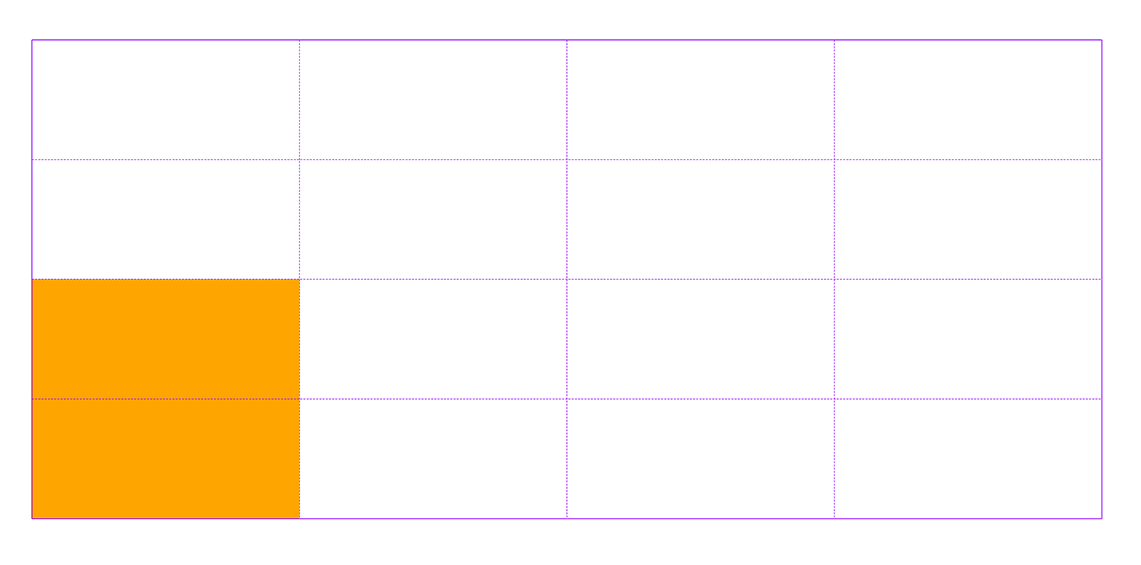
To place an item on the grid we’ve just created, we could do something like this:
.item {
  grid-column: 1 / 2;
  grid-row: 3 / 5;
}
We’re using start and end lines to place the grid item at the bottom left of our grid.
This is not going to cause any problems because we are explicitly placing items by grid line number. We know that our grid has four rows and four columns (therefore five grid lines in either direction), so we’re unlikely to accidentally to unintentionally use a higher line number and accidentally create implicit tracks.
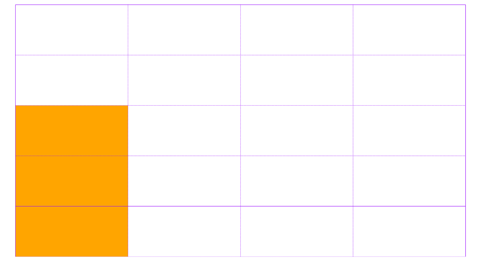
Alternatively, we could use the span keyword in place of a start or end line:
.item {
  grid-column: 1 / 2;
  grid-row: 3 / span 2;
}
I like using span for grid placement – it’s often helpful when you know an item needs to span a set number of grid tracks, rather than end at a specific line – but it means you can sometimes lose track of which grid line you’re placing an item on.
Here we’re using span in place of the grid-row-end line. If we change the span value to 3 instead of 2, this would cause the item span more row tracks than there are available – and whoops! We’ve created an implicit track!
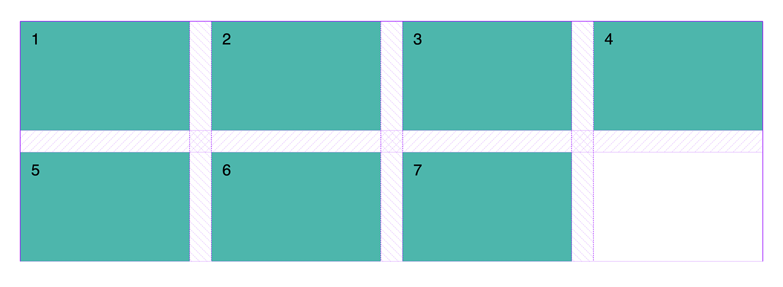
One place this problem sometimes occurs is when you want grid items to overlap each other. Items that aren’t explicitly placed are placed into the next available grid cell, and if there isn’t a grid cell available then implicit tracks will be created, rather than items being stacked on top of each other. This behaviour is very useful as it means we don’t always need to explicitly place items, but this is one case where it’s not particularly helpful to us!
A friend of mine was using Grid to position two elements, one on top of the other, but offset by one row:
This is the code that was used to create the layout:
.grid {
  display: grid;
  grid-template-columns: repeat(4, 1fr);
  grid-template-rows: repeat(3, 200px);
}

.item:first-child {
  grid-column: span 4;
  grid-row: 1 / span 2;
}

.item:nth-child(2) {
  grid-column: span 4;
  grid-row: 2 / span 2;
}
Instead of the desired layout, we get this:
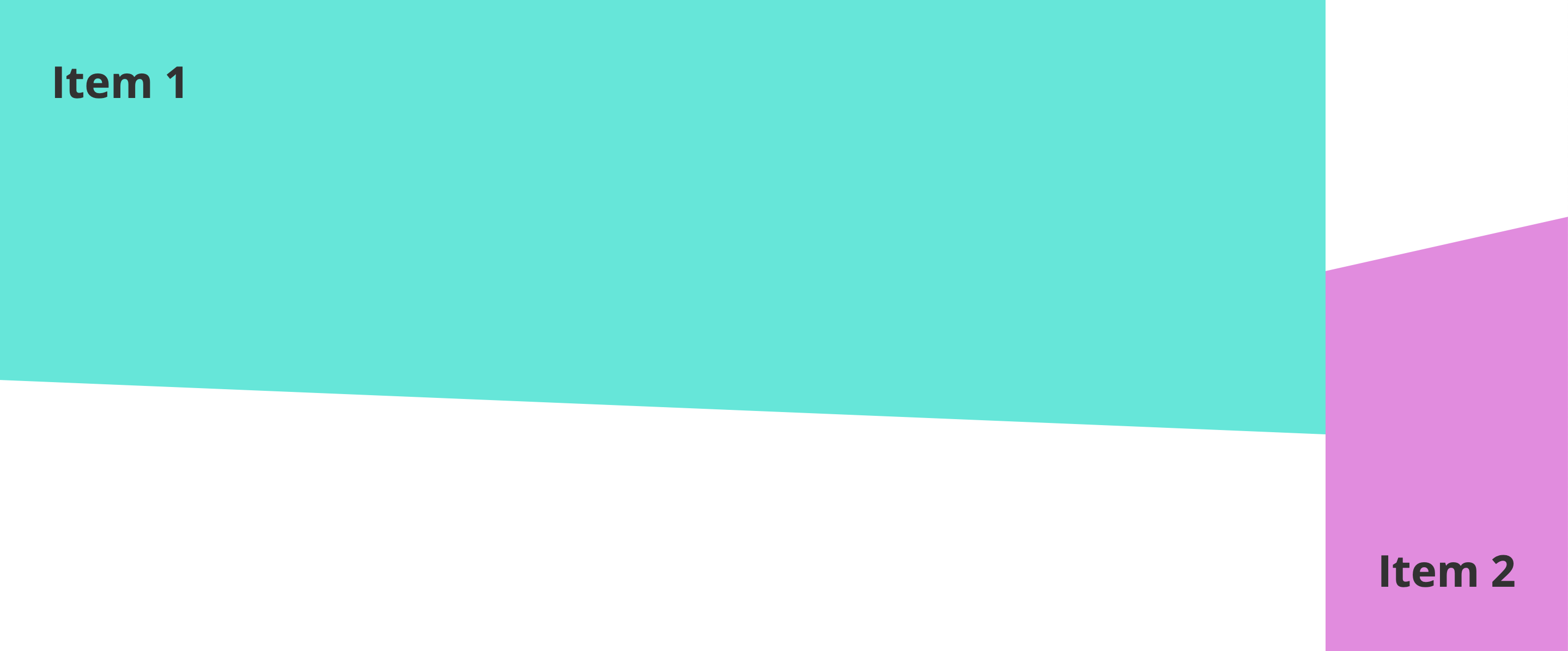
What has happened to the second item? Can you spot the problem here? Both items are using the span keyword for the grid-column value. The first item will be positioned correctly because it will be auto-placed in the first available cell with a span of 4. The second item doesn’t have a start or end line, so the browser needs to resolve this, which it does by generating implicit column tracks.
If the second item only had a span value and no start line on the row axis, then it would wrap onto the next row because the item would still be participating in the flow of the grid. This wouldn’t be the layout we want, but would perhaps be less baffling! But in the code above the browser doesn’t know which column we want to place the item in. It resolves this by placing the item starting at line 5 on the column axis and generating four implicit tracks.
Because we’re not using grid-auto-columns to define a size for our implicit tracks, these will have a default size of auto. And if the grid item has no content, then those tracks will collapse down to a width of 0, rendering our item invisible. Our grid item contains some text, so these implicit tracks will be auto-sized to accommodate this.
If we had a column-gap value of, say, 20px, we would see the width of two column gaps be added to our grid, although the tracks themselves would have a width of 0.
The solution here is to place both items explicitly with a start and end value:
.item:first-child {
  grid-column: 1 / span 4;
  grid-row: 1 / span 2;
}

.item:nth-child(2) {
  grid-column: 1 / span 4;
  grid-row: 2 / span 2;
}
Play with the demo below to explore different ways of “breaking” the layout:
Preventing our layouts breaking
So, how can we best avoid running into problems with implicit tracks? One way is to understand how Grid is calculating our layout behind the scenes.
Understanding the Grid Item Placement Algorithm
This sounds scarier than it really is! The Grid Item Placement Algorithm is the order in which the placement of grid items is resolved. Grid items that are explicitly positioned first, followed by the items with a definite row position, then the browser determines the columns in the implicit grid and places any auto-placed items (items without an explicit position) accordingly. This is assuming the grid-auto-flow property value is row (the default). Keeping this in mind can help you to understand why you might have implicit tracks being created on one axis and not the other, if this is contrary to your expectations.
I also have a few tips for ways you to place items than can help avoid accidentally pushing items off the explicit grid...
Naming grid lines
One way that helps me be more intentional with my grid placement is naming grid lines. Let’s say the item we want to place is an image. We could do this:
.grid {
  display: grid;
  grid-template-rows:
    repeat(2, 150px) [image-start] repeat(2, 150px)
    [image-end];
  grid-template-columns: [image-start] repeat(3, 1fr) [image-end] 1fr;
  grid-auto-rows: 150px;
}
Using -start and -end as a suffix for our line names creates a grid area, which makes placing our image very simple:
.image {
  grid-area: image;
}
You can also use the grid-template-areas property to do a similar thing, which feels more intuitive to many people – just bear in mind that won’t work if you need overlapping grid items.
Placing by end line
Sometimes placing by end line number (as opposed to start line number) can help avoid the problem of creating accidental implicit tracks. Taking our example above, perhaps we know that we want the image to span three grid tracks, so we’re using the span keyword as the grid-column-end value. But it might be better to use span as the grid-column-start value and explicitly place it on its end line:
.image {
  /* The image will end at line 4 on the column axis: */
  grid-column: span 3 / 4;
}
This can be helpful if we have a very large grid. Imagine our grid has 20 columns instead of just four, we might know that it needs to be placed one line away from the end, but we don’t want to have to calculate what the start line should be each time – that would be annoying and prone to error!
Negative grid lines
A technique I find very useful (and something I’ve written about before), is using negative line numbers to place grid items. Negative line number represent the lines of your grid in reverse. So in a grid of four tracks (which would have five grid lines), line -1 is the equivalent to line 5, line -2 is the equivalent to line 4, and so on.
Again, this can come in very handy when working with a large grid. If we know and item needs to align to the end of the grid then we can simply use grid line -1, instead of having to remember that the last line is line 21, for example.
Debugging with dev tools
I thoroughly recommend the Firefox dev tools for inspecting and debugging problems with CSS Grid. The grid inspector allows you to switch on line numbers, so even if the sizes of your implicit tracks have collapsed right down to zero you will still be able to see that they have been created. (The inspector also shows you the negative line numbers – very handy!)
Conclusion
I hope this article goes some way towards demystifying exmplicit versus explicit tracks when working with CSS Grid and equips you with some valuable knowledge to help you debug broken layouts. Look out for more articles in the Debugging CSS Grid series coming soon.
Webmentions for this page
About webmentionsLikes: 0
Reposts: 0
Mentions: 4