Did you know you can use negative line numbers to position grid items with CSS Grid? I didn’t until recently – or rather, I hadn’t given it any thought, as I never felt like I needed to before.
But it stuck me recently, after writing this article on relative positioning of grid items, that negative lines could be advantageous here.
If you place an grid item using a line number with a positive value, if that line doesn’t exist yet (because there aren’t enough tracks in your grid) then implicit tracks will be created.
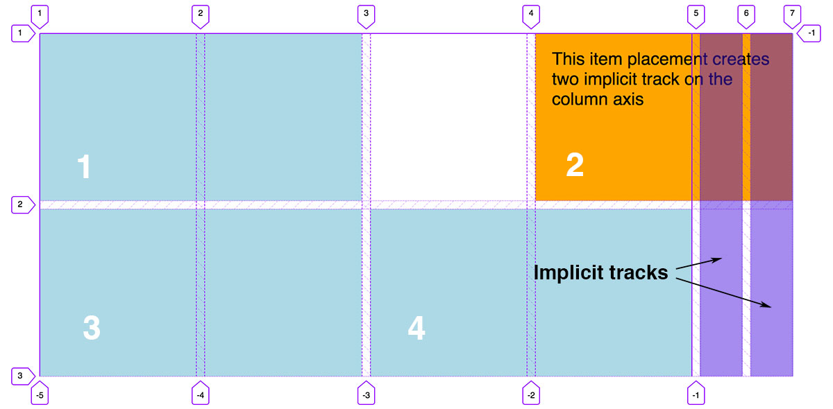
This is useful because we don’t need to define a precise number of tracks if we don’t know how many grid items we’ll be placing. An example might be a news feed or image gallery with dynamic content. We can control the size of these implicit tracks using the grid-auto-columns and grid-auto-rows properties.
What I expected to happen when placing items with negative line numbers was that implicit tracks would be created in the reverse direction - this would be the tracks above the explicitly defined grid tracks on the row axis, or to the left on the column axis (if using the default left-to-right writing mode, which defines the grid content flow). What actually happens is more interesting, and probably a lot more useful.
Imagine I have a grid defined like so, with four explicit tracks on each axis:
.grid {
	grid-template-columns: repeat(4, 1fr);
	grid-template-rows: repeat(4, 200px);
}
I can place an item like this (using the grid-column shorthand property for grid-column-start / grid-column-end):
.item {
	grid-column: -1 / span 3;
}
Rather than being starting two grid lines before grid line 1, the item is placed at the very last grid line.
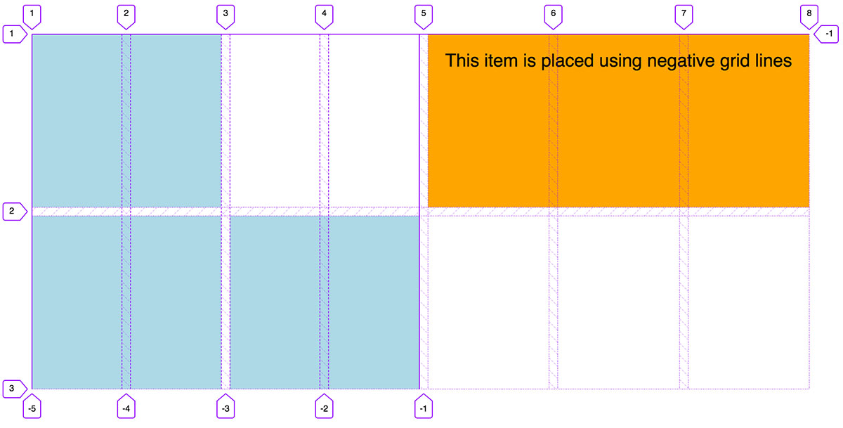
In this example I’m using the Grid inspector in Firefox dev tools, which, handily, shows negative grid line numbers as well as positive ones. If I place the item starting at grid-line -2, it will start one grid line from the last one, -3 will be 2 grid lines from last, and so on.
This grid has four tracks, so five grid lines if we ignore any implicit tracks. But we could feasibly place the item using a negative number larger that the ones available, which would create implicit tracks in the other direction:
.item {
	grid-column: -8 / span 3;
}
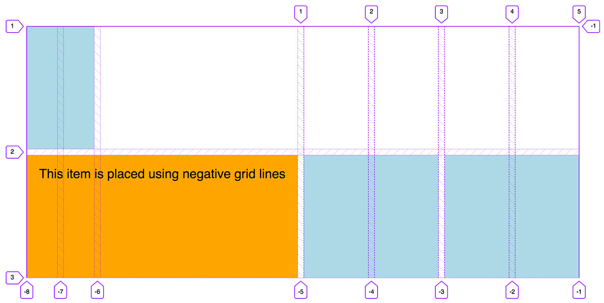
Note, as we’re creating implicit tracks to the left, the first grid item is now placed at the first implicit track, rather than on the explicit grid. This is because I haven’t explicitly placed the other grid items, so they are being auto-placed into the first available cells.
Why is this useful?
Using negative grid lines allows us to place items relative to the end of the grid. This is especially useful if we have a large grid – it means we don’t have to work out the exact line number from the start, we could simply place it from the end. In a 24 column grid, for example, we might place an item using an end line like this:
.item {
	grid-column: span 8 / 24;
}
This requires us to remember that the 24th line is one line away from the end. But perhaps the following is a bit more intuitive:
.item {
	grid-column: span 8 / -2;
}
This could be especially useful when it comes to centering items on a grid. If we know that an item needs to be an equal number of tracks from the start and the end of the grid, then we only need to set the end line as the negative equivalent of the start line:
.item {
	grid-column: span 2 / -2;
}
If we need to increase the size of our grid at different breakpoints but our grid item still needs to be centered, placing it with negative lines means we don’t necessarily need to place the item again. For example, in this 12-column grid, which becomes a 16-column grid at larger breakpoints, the item I’m placing on the grid still starts and end the same number of tracks from the grid edges, no matter how many columns there are:
.grid {
	grid-template-columns: repeat(12, 1fr);
}

.item {
	grid-column: span 2 / -2;
}

@media (min-width: 60em) {
	.grid {
		grid-template-columns: repeat(16, 1fr);
	}
}
Here’s a full demo where several items are placed using negative line numbers:
Bonus
This technique for centering items also lends itself well to working with CSS variables. We can set the start line as a variable and the end line is calculated as it’s equivalent negative value:
.item {
	--start: 4;
	--end: calc(var(--start) * -1);
	grid-column: var(--start) / var(--end);
}
If we do need to change the start line and end line at certain breakpoints, all we need to do is update one value. Nice!
Webmentions for this page
About webmentionsLikes: 0
Reposts: 0
Mentions: 2