In the second part of the Debugging CSS Grid series, we’ll take a look at fr (or fraction) units. Fr units are very useful for sizing grid tracks, and vastly simplify the process of building responsive layouts. But there are one or two unexpected behaviours you may run into if you don’t understand how they work. This article will aim to demystify these.
Introduction
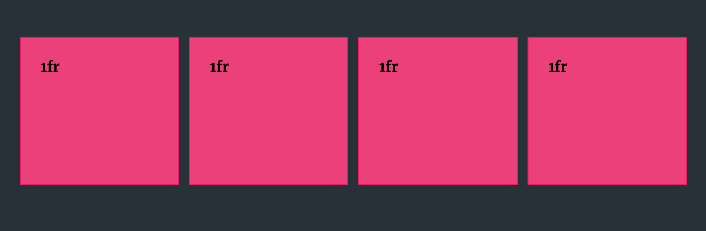
The fr unit is a new unit, exclusive to Grid. It allows you to size your grid tracks according to a proportion of the available space in the grid container. By using fr units instead of percentages for a flexible layout, we can avoid messy and complicated calc() functions to size our grid tracks. As a simple example, we can create four equal-width columns:
.grid {
  display: grid;
  grid-template-columns: repeat(4, 1fr);
  column-gap: 20px;
}
The grid takes into account the 20px gap between each column track and distributes the remaining space equally. You can also use it alongside fixed tracks:
.grid {
  display: grid;
  grid-template-columns: repeat(3, 200px) 1fr;
  column-gap: 20px;
}
This will give us three fixed columns of 200px and a fourth column, sized with the fr unit, which will take up the remaining space.
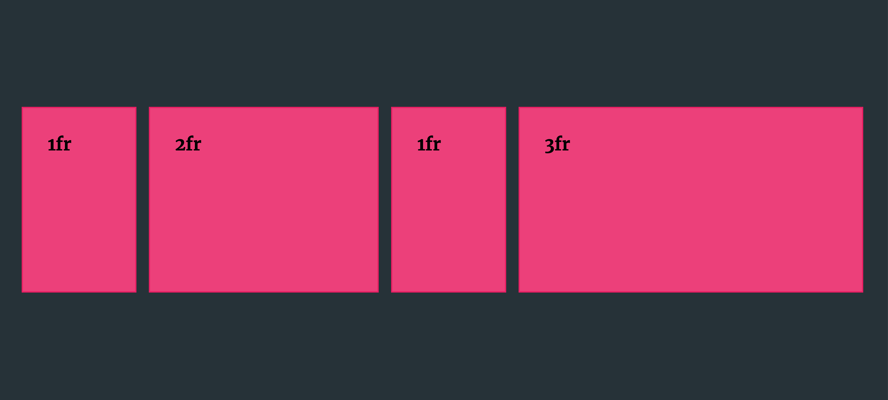
We can use multiples of the fr unit to create tracks that are proportionally larger or smaller. In this example, the second track will be twice the width, and the fourth track will be three times the width of the first and third tracks.
.grid {
  display: grid;
  grid-template-columns: 1fr 2fr 1fr 3fr;
  column-gap: 20px;
}
All fr units are not created equal
A common mistake is to assume that all tracks sized with the same number of fr units will be the same size. This is certainly what you would expect if you were using percentages for track sizing, for example. But if we compare the first and last examples above, we can quite clearly see that the 1fr columns in the last example (Fig 03) are not the same size as those in the first example (Fig 01), despite using the same value! The reason for this is that fr units are flexible units. They do not behave as lengths, like pixels, rems, ems and others, which is why they cannot be used in calc() functions. To quote directly from the spec:
Tracks sized with fr units are called “flexible tracks”, as they flex in response to leftover space similar to how flex items fill space in a flex container.
Flexible tracks are resolved last according to Grid’s sizing algorithm. The browser takes into account all of the fixed tracks and column or row gaps, plus the maximum size of any tracks sized using expressions like minmax(), then distributes the remaining space accordingly.
Consider the following example:
.grid {
  display: grid;
  grid-template-columns: repeat(3, minmax(20px, 300px)) 1fr;
}
We have three columns sized with minmax() (with a maximum size of 300px), plus one column of 1fr. If the width of the grid container is less than the sum of the three columns (900px) then the last column’s maximum size will depend on the content. If the track contains no grid item (or the grid item has no content, and nothing else affecting its size, like padding or borders) then it will have a resolved width of 0 – so it will be invisible. It’s only when our grid container is larger than 900px (e.g. for larger viewports) that we will see that 1fr column, which will fill the remaining space in the grid.
Fractions of fractions
You don’t need to distribute all of the available space in a grid. We can also size tracks using values of less than 1fr.
If we have three grid tracks at 0.5fr each, we might expect that they take up half the width of the available space – a fraction of a fraction. But this demo shows what actually happens here.
The tracks with a size of 0.5fr actually behave as if they were 1fr! This might be somewhat surprising if we think of fr tracks in the same way as length-based units (like percentages), but becomes clearer if we think of these as flex items instead.
Understanding the flex factor
The value of the fr unit in the CSS Grid specification is referred to as the flex factor. The value of any fr tracks is computed by this formula:
<flex factor of the track> * <leftover space> / <sum of all flex factors>
The specification explains what happens when a track’s flex factor is less than 1:
If the sum of the flex factors is less than 1, they’ll take up only a corresponding fraction of the leftover space, rather than expanding to fill the entire thing.
Because each of our tracks is 0.5fr, the sum of all our flex factors is greater than 1 – 1.5 to be exact. So our column tracks expand to fill all the available space. However, if we sized each track at 0.2fr, say, then the sum of the flex factors will be 0.6. If we try this out then we can see that each item will take up the equivalent proportion of the available space.
Intrinsic and extrinsic sizing
We’ve seen that the size of fr tracks is influenced by the rest of the grid: The sizes of other tracks, and the gap values. This is known as extrinsic sizing – where the size is determined by context. But the size of an fr track is also dependent on its content. If you have three columns of 1fr, and you place an item in one of those columns whose horizontal size is larger than the equal distributed space then that track will grow to accommodate the content, while the others will become smaller to make space. This is intrinsic sizing. (The Intrinsic and Extrinsic sizing specification offers a full explanation.)
In this example we have a grid with three child items, and one of those children contains an really long word:
We can see that the column containing the longer word is larger than the other two tracks, despite being sized with the same unit. (The same thing will happen if you have some content in the grid with its own intrinsic dimensions – e.g. an <img> element with width: 600px in the CSS.)
This is a sensible behaviour and prevents our content from being cut off, or overflowing the container. But it’s not always desireable. If the purpose of our grid is to impose a strict visual layout, then this has the potential to break our layout. If we want to clamp our grid tracks so that they take up an equal proportion of the available space regardless of the size of their content, we can use CSS Grid’s minmax() function. By default, Grid effectively behaves as if 1fr tracks have a minimum size of auto – minmax(auto, 1fr). By supplying a different minimum (e.g. 0), we can prevent our grid tracks expanding to fit the content. You can see this in action in the following example:
Conclusion
Fr units are actually the simplest units to work with in Grid, and for the most part cause much less pain than using percentages and calc() for your grid tracks! Don’t be put of using them! I hope this article can serve as a handy reference if you ever get caught out in some more unusual scenarios.
Further reading
Best Practices with Grid Layout by Rachel Andrew
Understanding Sizing in CSS Layout by Rachel Andrew
Webmentions for this page
About webmentionsLikes: 0
Reposts: 0
Mentions: 1