There are many different ways of using colour informatively when it comes to data visualization. But we also need to ensure our use of colour conveys the right information, and that it is used accessibly. In this article we’ll walk through some examples of using colour in different types of visualizations with the data visualization library D3.js. Some familiarity with D3 will be assumed, but there will be some helpful pointers regardless of how you create your visualizations.
Is colour the best option?
Colour can be extremely useful in conveying meaning in our designs. It can also be difficult to get right, and in the worst case could have a negative impact on the user experience. Some colour combinations are difficult to perceive by people with colour blindness or low vision. Some colours might have different cultural significance in different parts of the world, which can affect how they are interpreted in a UI. The colour red might signify warning or danger in the western world, but in East Asian countries often represents happiness and good fortune.
Therefore, it’s rarely a good idea to rely on colour alone. Before creating a chart, we should consider what other options are available to us for visualizing our data. It’s useful to keep in mind Gestalt principles: size, position, proximity, grouping and contrast could be some other ways to differentiate data, as well as text labels when necessary. On the web we’re lucky because our charts can also be interactive: we can progressively disclose more information to the user, without overwhelming them.
Colour scales
Assuming we’ve established that colour is important for our visualization, let’s look at some colour scale options. We’re going to be using the d3-scale module, and evaluating some different use cases for its various scale functions.
Overview of scales
The purpose of a scale is to map one range of values to another. In D3 (and data visualization in general), their purpose is to map values in a set of data to a visual representation. We can see the principle illustrated in this demo, where hovering on the larger area maps the position on the smaller one.
See the Pen D3 domain/range by Michelle Barker (@michellebarker) on CodePen.
The input (that is, the data we want to map) is the domain and the output (consisting of the range of values our mapped data should result in) is called the range.
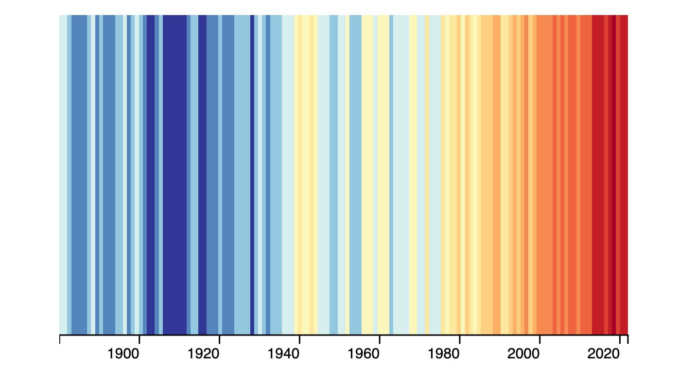
D3 has a lot of different scale functions, but we’ll look at a handful that are particularly useful when working with colour in data visualization. To demonstrate we’re going to visualize data from the Global Warming and Climate Change API. To start with we’ll fetch data from this endpoint, which gives us an array of global temperature anomalies from 1893 to the present day. We’ll plot these as a linear gradient in CSS, which will allow us to see the advantages on disadvantages of the different types of scales in action.
To help visualise the result of applying different colour scales, here is an interactive demo that demonstrates linear, diverging and threshold colour scales — the main ones I’ll be explaining in this article.
See the Pen D3 color scale visualizer by Michelle Barker (@michellebarker) on CodePen.
Continuous scales
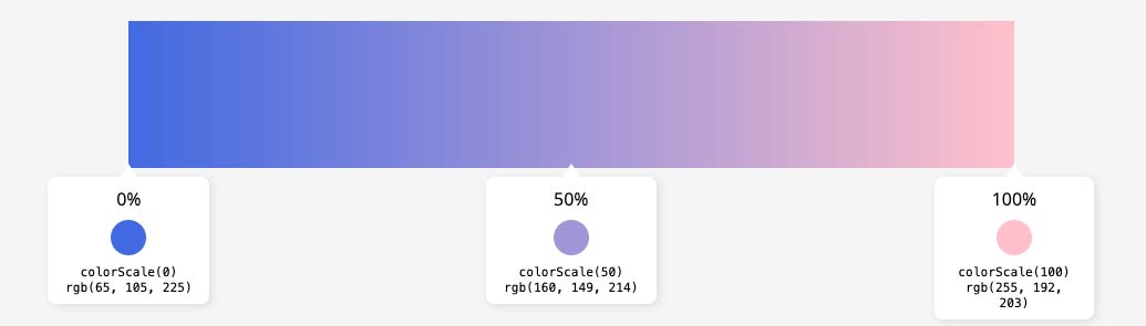
Continuous scales in D3 enable us to map a continuous, quantitative input domain to a continuous output range. Let’s look at an example of a continuous colour scale using D3’s scaleLinear function. Here we’re creating a function to map a domain of values from 0 to 100 to a continuous colour range from royalblue to pink.
const colorScale = d3
  .scaleLinear()
  .domain([0, 100])
  .range(['royalblue', 'pink'])
If we call our colour scale function, passing in a value from 0 to 100 we’ll get a colour that falls somewhere within that range. So colorScale(0) will give us royalblue (output as rgb(173, 216, 230)), colorScale(100) will give us pink (rgb(255, 192, 203)), while colorScale(50) results in a lavender colour (interpolated from blue and pink).
Clamping
Passing in a value outside of our expected domain can result in some unexpected colours. For example, colorScale(200) results in rgb(255, 255, 181), a pale yellow colour!

A solution is to use the clamp method, which ensures any values outside of the domain will be clamped to the given range, and we won’t get any unexpected results.
const colorScale = d3
  .scaleLinear()
  .domain([0, 100])
  .range(['royalblue', 'pink'])
  .clamp(true)
Working with data
When working with data it’s likely we’ll want our domain to be determined by the data itself. We can use D3’s extent function to get the highest and lowest values in our dataset as an array. We can pass in a simple array, for example:
d3.extent([0, 20, 50, 100]) // result: [0, 100]Alternatively we can use an accessor function, if we want to use a particular attribute from our data. Let’s fetch some data from the Global Warming and Climate Change API and use the extent function to get the domain based on land temperature anomaly values from the dataset. We’ll write a new function called draw to do this, seeing as we’ll be using it quite a bit later on:
/* Fetch data */
fetch('https://global-warming.org/api/temperature-api')
  .then((response) => response.json())
  .then((response) => {
    const data = downsampleData(response.result)
    draw(data)
  })
  .catch((error) => error)

/* Accessor function to get the land temperature from the datum */
const yAccessor = (d) => parseFloat(d.land)

const draw = (data) => {
  /* Retrieve the lowest and highest temperatures from our data */
  const domain = d3.extent(data, yAccessor) // result: [-0.481, 1.018]

  const colorScale = d3
    .scaleLinear()
    .domain(domain)
    .range(['pink', 'blue'])
    .clamp(true)
}
The request response contains quite high resolution data. In the demo we’re using a function to downsample the data so that we are working with the average temperature anomaly on a yearly rather than monthly basis. This might not be necessary for your own dataset.
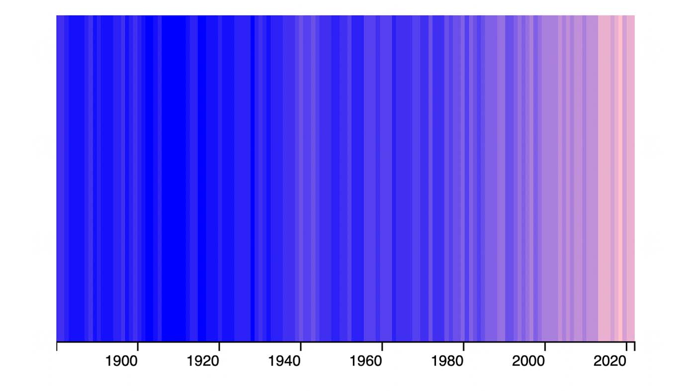
Let’s use our linear colour scale with our data to render a an SVG with a gradient fill that corresponds to temperature anomaly values over time — where higher temperatures are represented by colours towards the pink end of the scale and lower temperatures by bluer colours.
/* In our draw function */
const colorScale = d3
  .scaleLinear()
  .domain(domain)
  .range(['pink', 'royalblue'])
  .clamp(true)

/* Create SVG */
const svg = chart
  .append('svg')
  .attr('width', 600)
  .attr('height', 400)
  .attr('viewBox', '0 0 600 400')

/* Append <defs> element containing <linearGradient>, where we will define the gradient to use */
const gradient = svg.append('defs').append('linearGradient').attr('id', 'grad1')

/* Create the gradient stops from our data */
data.forEach((d, index) => {
  const color = colorScale(yAccessor(d))
  const step = 100 / data.length

  gradient.append('stop').attr('offset', 0).attr('stop-colour', color)

  gradient
    .append('stop')
    .attr('offset', `${index * step}%`)
    .attr('stop-colour', color)
})

/* Create a rectangle and fill it with the gradient background */
svg
  .append('rect')
  .attr('x', 0)
  .attr('y', 0)
  .attr('width', 600)
  .attr('height', 400)
  .attr('fill', 'url(#grad1)')
We could use a CSS gradient for this particular visualisation, but if we want to create a more complex chart that includes axes, labels, and more information, using an SVG is much more versatile.
Note, when we use a linear scale both our domain and range can include a greater number of values, but it generally works best if both arrays are of the same length. In this example colorScale(0) will map to dark violet, colorScale(100) will map to red, and so on.
d3.scaleLinear()
  .domain([-100, 0, 100])
  .range(['lightblue', 'darkviolet', 'red'])
Diverging scales
We can in fact use a different scale function for creating diverging colour scales: scaleDiverging always takes three values for its domain, similar to our linear scale function above. But instead of a range, we can specify an interpolator. D3 provides a bunch of colour scheme interpolators in its d3-scale-chromatic module. The interpolator d3.interpolateRdYlBu is perfect for our temperature data, as it goes from red, through neutral colours, to dark blue. It also has a good degree of tonal contrast, with the lightness of the colours decreasing towards either end of the scale. This makes it more accessible for users that might find it difficult to perceive changes in hue.
We’ll flip the domain around in this instance, so that higher values will be represented by colours towards the red end of the scale and vice versa. We’re setting a middle value of 0, as 0 represents no temperature anomaly, which should be represented by a neutral colour.
Let’s apply this scale to our dataset.
/* Replace the previous `colorScale` value in our draw function: */
const colorScale = d3
  .scaleDiverging(d3.interpolateRdYlBu)
  .domain([domain[1], 0, domain[0]])
See the Pen D3 colour scale linear (diverging) by Michelle Barker (@michellebarker) on CodePen.
Interpolation
As we have seen, D3’s scale functions interpolate between two (or more) colours to produce hues that fall anywhere between those in our specified colour range. We can choose how the colours are interpolated on a linear scale using D3’s various interpolation methods. Specifying interpolateCubeHelix as an interpolation method, for example, will yield quite a different result to interpolateRGB.
const colorScale = d3
  .scaleLinear()
  .domain([0, 100])
  .range(['royalblue', 'pink'])
  .interpolate(d3.interpolateCubehelix)
colour interpolation is a huge topic, beyond the scope of this article. Check out the documentation on colour spaces in the d3-interpolate module for details of the various interpolation methods available in D3 — and try playing around with them to see the different results.
Discrete scales
We’re going to take a look at two of D3’s scale functions for working with discrete data — data that consists of individual or countable values. Using our temperature data, perhaps we want to draw a line graph showing distinct lines for temperature over time during the spring, summer, autumn and winter respectively. Spring, summer, autumn and winter are discrete values (they are each distinct), while temperature is continuous.
Ordinal scale
If we want to colour our lines distinctly for the four seasons we could use an ordinal scale. This maps a discrete input to a discrete output with a 1:1 relationship.
d3.scaleOrdinal()
  .domain(['spring', 'summer', 'autumn', 'winter'])
  .range(['turquoise', 'pink', 'orangered', 'royalblue'])
See the Pen D3 ordinal colour scale by Michelle Barker (@michellebarker) on CodePen.
We would expect our data to fall into any one of these categories. On the other hand, if we were displaying a bar chart showing the number of survey respondents categorized by gender, there could be some responses that do not conform to our three categories: a respondent might have entered a different gender in their response, or declined to answer. We can use the unknown() method to define a colour for unexpected or undefined values:
d3.scaleOrdinal()
  .domain(['male', 'female', 'non-binary'])
  .range(['blue', 'cornflowerblue', 'lightblue'])
  .unknown('grey')
Threshold scale
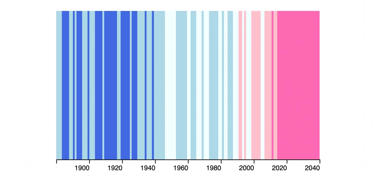
A threshold scale is useful when we have continuous numerical input that we want to map to a discrete output. In our temperature data, it could be difficult to determine small changes in temperature when using a continuous colour scale. But using a threshold scale, we can show when the temperature crosses a given threshold, and provide visually distinct colours (see the demo). The scale’s domain should consist of the threshold boundaries.
const colorScaleThreshold = d3
  .scaleThreshold()
  .domain([-0.25, 0, 0.25, 0.5, 0.75])
  .range(['royalblue', 'lightblue', 'azure', 'pink', 'hotpink'])
If we use this scale for our temperature data we can clearly see the marked increase in temperature anomalies in the early part of this century. For finer detail, we could increase the number of colour thresholds.
Rather than manually set our threshold colours, we could compute these from our linear or diverging scales.
/* In our draw function: */

/* Create the continuous colour scale to interpolate threshold colour values */
const colorScaleDiverging = d3
  .scaleDiverging(d3.interpolateRdYlBu)
  .domain(linearDomain)
  .clamp(true)

/* Create the threshold scale domain - equally spaced values from the data extent */
const totalThresholds = 8
// Calculate the value between each threshold
const step = (domain[1] - domain[0]) / totalThresholds

const thresholdScaleDomain = d3.range(totalThresholds).map((d) => {
  return (d + 1) * step + domain[0]
})

/* Create the threshold scale range using our previous colour scale function. It sould have the same number of values as the domain */
let thresholdScaleRange = thresholdScaleDomain.map((d) => {
  return colorScaleDiverging(d)
})

thresholdScaleRange = [
  colorScaleLinear(domain[0]), // include the lowest threshold, so we don't miss out on the first colour
  ...thresholdScaleRange,
]

/* Use these in our new colour scale function */
const colorScaleThreshold = d3
  .scaleThreshold()
  .domain(thresholdScaleDomain)
  .range(thresholdScaleRange)
Using a threshold scale rather than a linear scale, we can more clearly see the temperature contrast over the long term with getting too granular. Reducing the number of thresholds creates a starker visual disparity between the beginning of the last century and recent years, as we can clearly see the proportion of data that falls above given thresholds. Try adjusting the number of thresholds in this demo to see the impact.
See the Pen D3 colour scale threshold (diverging) by Michelle Barker (@michellebarker) on CodePen.
Hopefully this article has given you a good overview of where different types of scales might come useful when working with colour and data visualisation.
Webmentions for this page
About webmentionsLikes: 21
Reposts: 5
Mentions: 3
-
@michelle brilliant!! Super useful post! Thanks
- Mike Brondbjerg