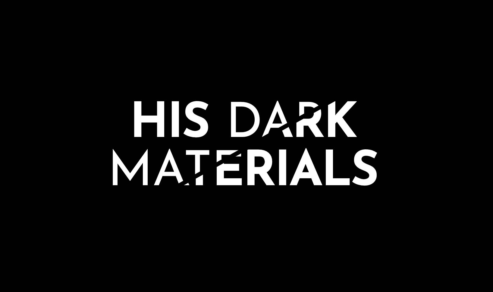
I love the new BBC adaptation of Philip Pullman’s His Dark Materials trilogy of novels. There’s also some pretty nice graphic design to appreciate. I’m a sucker for a beautiful title sequence (I need to watch the opening credits of Game of Thrones in full, every single time), and this one certainly fits the bill, as well as the striking logo. After watching a recent episode, I thought I’d have a go at re-creating this logo with CSS!

Typography
Although it’s essentially a plain text logo, there’s plenty to unpack when it comes to building it for the web. The logo consists of two font weights, and most notably, is “fractured” into two parts by a diagonal slash through the middle. The text on the left of the fracture consists of a regular font weight, with the exception of the first word (“His”). The text on the right, and the first word, use a bold variant of the same font.
I don’t know what the actual font used in the logo is, but a few people on Twitter have suggested it might be Neutraface by House Industries. I opted against paying $125 for the purpose of a fun demo, so I’ve substituted this for Josefin Sans, available from Google Fonts.
HTML
I wanted to build the logo in a way that would ensure it works on any background – that is to say, the background would be visible through the transparent areas of the logo – so hiding things with black gradients or pseudo elements was a no-no.
Although this is just a fun exercise, I wanted to avoid duplicating the HTML if possible. One (possibly easier) path would have been to use two spans with the same text inside and <h1>, like this:
<h1>
  <span>His Dark Materials</span>
  <span aria-hidden="true">His Dark Materials</span>
</h1>
I could then use position: absolute on the second item to superimpose it on the first, and style them independently. There’s nothing inherently wrong about this – aria-hidden ensures the text won’t be read out twice by a screenreader –, but I preferred to keep it to a single text element if I could. I decided to make use of pseudo elements (::before and ::after) and use the content property instead.
We can use CSS custom properties to duplicate the text content into the pseudo elements:
<h1 style="--text: 'His Dark Materials'">His Dark Materials</h1>h1::before,
h1::after {
content: var(--text);
}This give us (effectively) two more “copies” of our text to work with. I put this in inverted commas because they’re not actually copies of the HTML, only the text content – and they’re not selectable or, for that matter, accessible on their own. But that’s fine, because our text content still exists in accessible form inside the <h1>.
If we position these absolutely, then they will overlay the original heading and we can style them individually.
h1::before,
h1::after {
  content: var(--text);
  position: absolute;
  top: 0;
  left: 0;
  width: 100%;
  text-align: center;
  color: white;
  z-index: -1;
}
CSS
Now we can use clip-path() on the pseudo elements to create the fracture effect:
h1 {
  --high: 80%;
  --low: 20%;
  --gap: 0.5rem;
}

h1::after {
  -webkit-clip-path: polygon(
    calc(var(--high) + var(--gap)) 0,
    100% 0,
    100% 100%,
    calc(var(--low) + var(--gap)) 100%
  );
  clip-path: polygon(
    calc(var(--high) + var(--gap)) 0,
    100% 0,
    100% 100%,
    calc(var(--low) + var(--gap)) 100%
  );
}

h1::before {
  font-weight: 400;
  -webkit-clip-path: polygon(
    calc(var(--high) - var(--gap)) 0,
    calc(var(--low) - var(--gap)) 100%,
    0 100%,
    0 0
  );
  clip-path: polygon(
    calc(var(--high) - var(--gap)) 0,
    calc(var(--low) - var(--gap)) 100%,
    0 100%,
    0 0
  );
}
The ::before pseudo element is clipped diagonally so that only the left portion is visible, and ::after is clipped so that the reverse is visible, allowing a small gap between then (which will create the slash effect). As some browsers still require clip-path` to be prefixed, we can leverage custom properties to cut down on our overall code:
h1 {
  --high: 80%;
  --low: 20%;
  --gap: 0.5rem;

  --clipLeft: polygon(
    calc(var(--high) - var(--gap)) 0,
    calc(var(--low) - var(--gap)) 100%,
    0 100%,
    0 0
  );

  --clipRight: polygon(
    calc(var(--high) + var(--gap)) 0,
    100% 0,
    100% 100%,
    calc(var(--low) + var(--gap)) 100%
  );
}

h1::before {
  font-weight: 400;
  -webkit-clip-path: var(--clipLeft);
  clip-path: var(--clipLeft);
}

h1::after {
  -webkit-clip-path: var(--clipRight);
  clip-path: var(--clipRight);
}The original text is still visible underneath the clipped pseudo elements, so I’m setting the colour to transparent. The pseudo elements also have a lower z-index — that way the text will still be selectable, but the viewer will only see the clipped text below.
h1 {
  color: transparent;
}
Lastly, while most of the text on the left of the slash is in the regular font weight, the first word needs to be bold. Unfortunately we can’t style this as a separate entity using content, so it needs a bit of hackery, as well as altering the markup to allow us to select the first word (in the absence of a ::first-word selector!):
<h1 style="--text: 'His Dark Materials'"><span>His</span> Dark Materials</h1>Now I can make the text of the first word visible and set the font weight to bold, which effectively hides the corresponding pseudo element content:
h1 > span {
  font-weight: 700;
  color: white;
}
I’m not keen on this solution, as it is very limited. If we had a case where the first word needed to be styled in a different font, or a lighter weight, then hiding the pseudo element content wouldn’t work. But it’s good enough for our purpose this time.
Check out the full demo:
Webmentions for this page
About webmentionsLikes: 0
Reposts: 0
Mentions: 2