Day 14 of National Blog Posting Month #NaBloPoMo
I’ve been playing around with layering radial gradients in CSS to create flower shapes, with the help of CSS trigonometric functions. For a primer on what trigonometric functions are, and why they’re useful in our code, I’ve written a three-part series for Codrops.
Radial gradients
We can draw circles as background images with the radial-gradient() function in CSS:
.item {
  background: radial-gradient(
    circle at 50% 50%,
    black 20%,
    transparent calc(20% + 1px)
  );
}
This will give us a black circle in the centre of the element, with a radius of 20% of the element’s size. I’m using the calc() function here to smooth the edges of our gradient, avoiding jagged lines, which can be visible on some screens.
Creating shapes
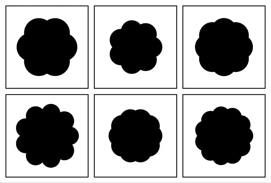
We can layer multiple gradients to draw shapes.
.item {
  background: radial-gradient(
      circle at 50% 50%,
      black 20%,
      transparent calc(20% + 1px)
    ), radial-gradient(
      circle at 60% 70%,
      black 25%,
      transparent calc(25% + 1px)
    ), radial-gradient(circle at 35% 35%, black 15%, transparent calc(15% + 1px));
}
For these flower shapes, the idea is that we can use trigonometry to position the centre of each circle.

If we imaging we’re placing each gradient circle on the circumference of a single circle, like a clock face, we need to know the angle of each point on the main circle. This will be 360 degree divided by the number of circles on our flower shape.
To make our code easier to read and reuse, we can use custom properties.
.item {
  --angle: 360deg / var(--numberOfCircles, 6);
}
We need to work out the x and y position of each circle, and that’s where trigonometric functions come in. x is calculated by the cosine of the angle (the cos() function in CSS), multiplied by the radius — the distance from the centre of the point we’re calculating. y is calculated using sine (the sin() function in CSS):
--x: calc(cos(var(--angle)) * var(--radius));
--y: calc(sin(var(--angle)) * var(--radius));
Additionally, we need to shift our calculations to the centre of the element, otherwise all of our circles will sit off to the side. We’re going to move them along by 50%:
--x: calc(50% + cos(var(--angle)) * var(--radius));
--y: calc(50% + sin(var(--angle)) * var(--radius));
That’ll place our drawn shape in the centre, but let’s instead use custom properties, in case we want to change the position later on.
--x: calc(var(--posX) + cos(var(--angle)) * var(--radius));
--y: calc(var(--posY) + sin(var(--angle)) * var(--radius));
This calculates one of the points, but we need to do this multiple times — once for every circle we’re placing (or each of the petals of our flower). For six circles, we need six x and y variables, so let’s name them accordingly.
.item {
  --posX: 50%;
  --posY: 50%;
  --angle: 360deg / var(--numberOfCircles, 6);
  --radius: 20%;

  --a1: calc(var(--angle) * 1);
  --x1: calc(var(--posX) + (cos(var(--a1)) * var(--radius)));
  --y1: calc(var(--posY) + (sin(var(--a1)) * var(--radius)));

  --a2: calc(var(--angle) * 2);
  --x2: calc(var(--posX) + (cos(var(--a2)) * var(--radius)));
  --y2: calc(var(--posY) + (sin(var(--a2)) * var(--radius)));

  --a3: calc(var(--angle) * 3);
  --x3: calc(var(--posX) + (cos(var(--a3)) * var(--radius)));
  --y3: calc(var(--posY) + (sin(var(--a3)) * var(--radius)));

  /* ...and so on */
}Now let’s plug these into some radial-gradient() functions. Again, we’ll use custom properties to help us avoid repetition, and so that we can change things easily later on.
.item {
  --size: 20%;
  --color: black;
  --grad: var(--color) var(--size), transparent calc(var(--size) + 1px);

  --baseGradient: radial-gradient(circle at var(--x1) var(--y1), var(--grad)),
    radial-gradient(circle at var(--x2) var(--y2), var(--grad)),
    radial-gradient(circle at var(--x3) var(--y3), var(--grad)) /* ...and so on, all the way up to 6 */;

  background: var(--baseGradient);
}
In the final demo, I’m adding another circle at the centre.
More petals
If we want to add more circles (or petals to our flower shape) we need to make sure we define the additional variables we need (--x7, --y7, --x8, --y8, etc.) and add them to our background. Because we’ve defined the original --baseGradient variable for the background, we don’t need to write the whole thing out again. We can just append the new values, and update the custom property for the number of circles:
.item:nth-child(2) {
  --noOfCircles: 7;

  background: var(--baseGradient), radial-gradient(circle at var(--x7) var(--y7), var(--grad));
}
In the demo, you can see I’m also changing the variables for the size (of the small circles) and radius (distance of each circle from the centre) for different effects.
See the Pen Radial gradients with trigonometric functions by Michelle Barker (@michellebarker) on CodePen.
What else can we do?
There are lots of creative ways we can use these gradient effects, such as combining with mix-blend-mode for image overlays:
See the Pen Radial gradients with trigonometric functions + mix-blend-mode by Michelle Barker (@michellebarker) on CodePen.
Or using the gradients as image masks:
See the Pen Radial gradients with trigonometric functions + mask by Michelle Barker (@michellebarker) on CodePen.
We could even animate them using @property, although that won’t work in Firefox yet. I’m sure there are plenty more creative possibilities!
Webmentions for this page
About webmentionsLikes: 0
Reposts: 0
Mentions: 2