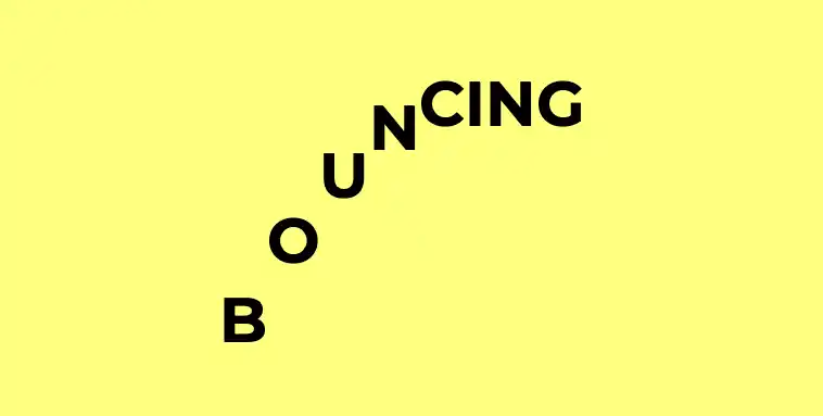
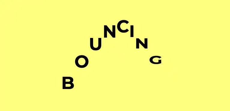
Here’s a tiny CSS tip for making staggered animations feel waaaay more natural: Negative animation delay. I’ve seen this idea shared by master CSS animators Jhey and Amit on separate occasions, and it’s such a neat little trick that it’s worth recording here!
Let’s say we have a group of elements, and we want them to animate in turn on a loop — such as this wavy text example. We’re calculating the animation-delay value them using a custom property corresponding to the element’s index.
<h1>
  <span style="--i: 0">B</span>
  <span style="--i: 1">O</span>
  <span style="--i: 2">U</span>
  <span style="--i: 3">N</span>
  <span style="--i: 4">C</span>
  <span style="--i: 5">I</span>
  <span style="--i: 6">N</span>
  <span style="--i: 7">G</span>
</h1>
span {
--delay: calc(var(--i) * 200ms);
animation: bounce 500ms var(--delay, 0) infinite;
}Here I’m setting that in the HTML, but we could use Splitting.js, a library that handles assigning custom properties for us (which enables a whole lot of cool text effects and more — I've written about it on this blog before).
Here’s the demo with a regular, positive animation delay. You’ll notice that on the first iteration of the animation, each letter begins from a standing start.

Now, if we instead calculate a negative delay (using -200ms instead of 200ms), we’ll see the animation behave as if it’s already in progress — we won’t be waiting for the last element to finally animate once all the others have done so. Lovely!
span {
  --delay: calc(var(--i) * -200ms);
  animation: bounce 500ms var(--delay, 0) infinite;
}
Try commenting out the --stagger custom property in this demo to see the difference.
See the Pen Bouncing letters by Michelle Barker (@michellebarker) on CodePen.
Webmentions for this page
About webmentionsLikes: 0
Reposts: 0
Mentions: 13