Day 28 of National Blog Posting Month #NaBloPoMo
The overflow CSS property (shorthand for overflow-x and overflow-y) controls what happens when the stuff you put inside a box is bigger than the box itself. Should it bleed out of the box (overflow: visible, the default)? Hidden completely (overflow: hidden)? Or should the content be scrollable (overflow: scroll or overflow: auto)?
Why can I see scroll bars (or not)?
Both scroll and auto should clip the content to the element’s padding box. According to the spec, when an element uses scroll the user agent should display scroll bars when this value is set in one direction, whether or not any content is overflowing or clipped. Using auto, the scroll bars should only display when there is overflow — therefore they should not be visible if the content is not larger that the container box.
In practice however, this behaviour is inconsistent. On a Mac the scroll bars are only visible when the user hovers over the scrollable element. Whereas Windows often renders the scrollbars when auto is used, even if there is no overflow.
For the purpose of this article I’m going to talk a lot about width and height, inline and block axis. I’m making some assumptions in referring mostly to documents in the default horizontal writing mode, where width corresponds to the inline axis and height to the block axis. It adds another layer of complexity when we get to talking about logical properties, writing modes and direction, as I’m sure many of these rules will be flipped around! But as I’ve only developed web applications in horizontal writing modes, that’s where my expertise lies.
Overflow is good
Overflow is pretty useful: if our content is longer than the height of the viewport, users expect to be able to scroll to see it. We get that behaviour for free (thanks browsers!). If we set a fixed height on an element and our content is longer then we’ll get overflow. We rarely set fixed heights on the web, preferring (sensibly) to let the height be determined by the content, but an exception might be a layout like this, where we have a fixed, full-height menu on the left of our content. If there are more items in our menu than can be accommodated by the height of the element, the user should be able to scroll them into view. We can handle that easily by setting max-height: 100vh (or whatever our fixed height is) and overflow-y: auto on the left-hand element.
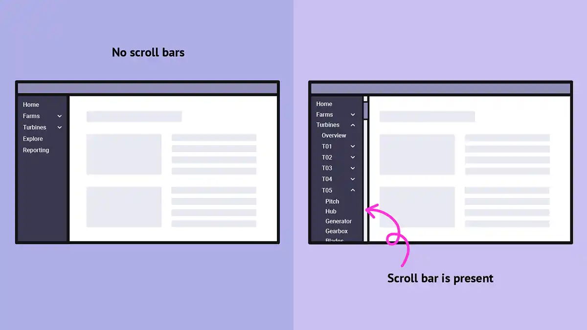
Keep that in your mind, because we’re going to come back to that layout later on!
Uh oh, overflow!
Sometimes we might need to deal with unexpected overflow causing layout bugs. Often that manifests itself as pesky scrollbars appearing where we don’t want them. Some things that commonly cause overflow:
Images
Unlike height, constraint by width is commonplace, as we’re limited by the width of the viewport itself. Block elements have a width of 100% by default, so they shouldn’t generally overflow unless a: we give them a fixed width or minimum width, or b: we put something in them that has intrinsic width, like an image with a width of 1600px in a 1400px viewport.
It’s common to add max-width: 100% to your CSS reset to prevent this.
Long words
I work on a web app for wind farm operators. Some of our clients are German, and sometimes a long German wind farm name will cause issues in a flex box or grid layout.
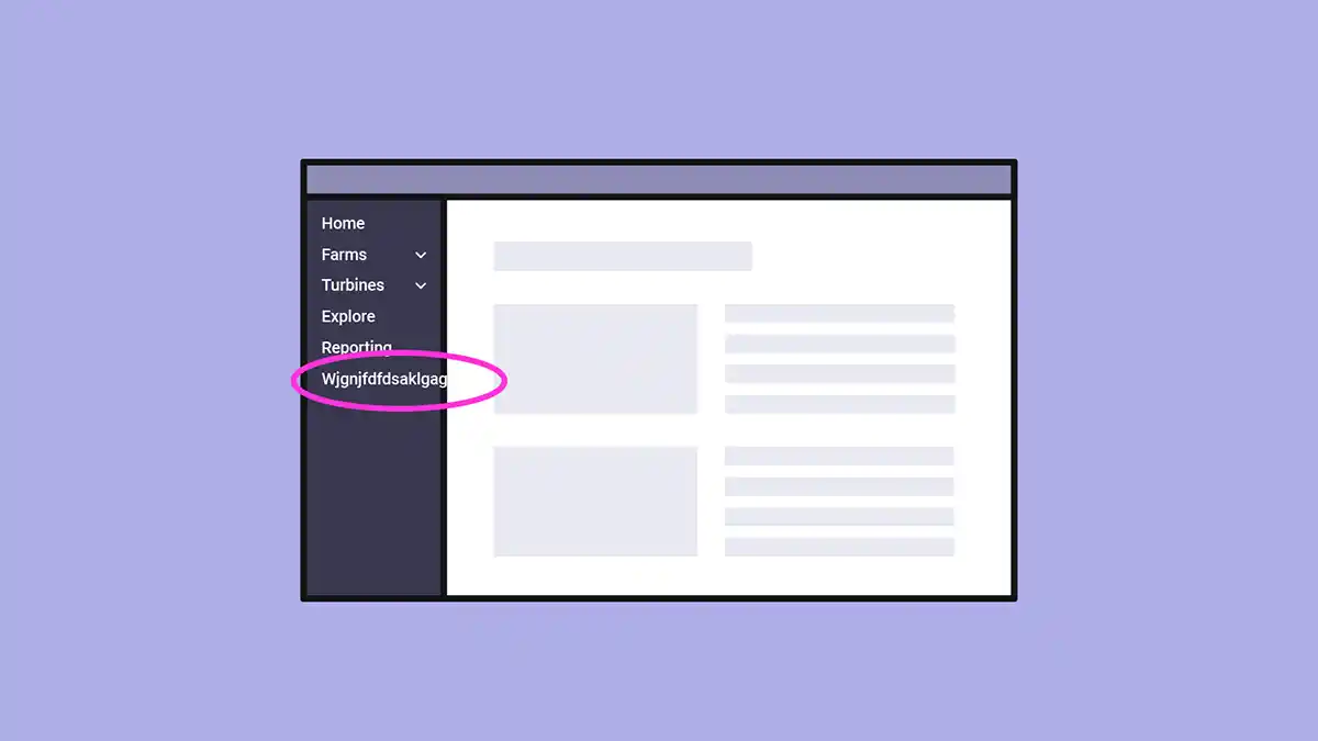
One way to solve that is with overflow-wrap: break-word, which will allow the text to wrap within a single word where there is insufficient space.
In some cases we might want to clip the text and use text-overflow: ellipsis. I’m not a huge fan of hiding content from users, but there are occasional cases that warrant it.
See the Pen text-overflow: ellipsis by Michelle Barker (@michellebarker) on CodePen.
Transforms
Sometimes we might hide an element off-screen with a transform, perhaps in order to animate it into view upon a chosen interaction. It’s easy to forget that the transformed element can still cause overflow!
We could hide it with display: none in order to prevent this, which would cause the rest of the layout to behave as if the overflowing element isn’t there. Alternatively we could set overflow: hidden on a parent element.
Flexbox layouts
Flexbox layouts are a common cause of unexpected overflow. Each element might on its own have no fixed size, but combined could be wider than the available space.
Sometimes the simple solution is flex-wrap: wrap, which might be a good solution for a horizontal menu, for example. Other times we might need to take a closer look at the intrinsic width of individual elements in our flex layout, or adjust the flex-grow, flex-shrink or flex-basis values.
Delegating overflow
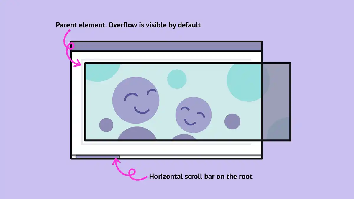
Because overflow is visible by default (except on the root element), we’ll generally only get horizontal overflow on the root element if the overflowing element exceeds the viewport.
By setting overflow to scroll or auto on an ancestor of the overflowing element we cause the horizontal scrolling behaviour to be removed on the root element (providing there isn’t another element causing it), and the ancestor to handle it instead. This could be another possible solution to the horizontal menu example above.
It’s also useful for creating a scrollable gallery, or a table.
Debugging overflow
An element causing horizontal overflow is a common bug, and one that can be tricky (and irritating) to debug. At one time you would get a warning about it if you run your site through Lighthouse, although I’m unsure if it’s still the case. My personal technique is to go through the DOM commenting out chunks of code until I find the area that’s causing the problem.
Debugging with Firefox
Firefox dev tools are really helpful when it comes to debugging overflow. If you inspect the DOM you’ll see a little “overflow” tag on the offending element, and a “scroll” tag on the scrollable ancestor. Handy!
Problem: overflow visible on one axis
So, unwanted overflow issues can be a bit of a pain, but it helps to understand what causes them and how to debug them. There are some quirks of the overflow property that are a little inconvenient, however.
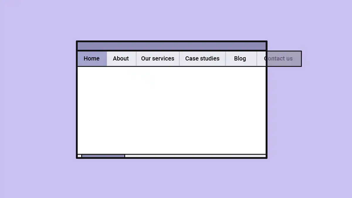
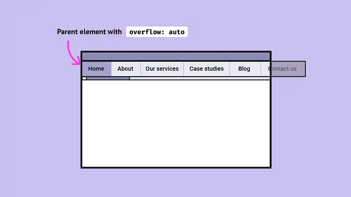
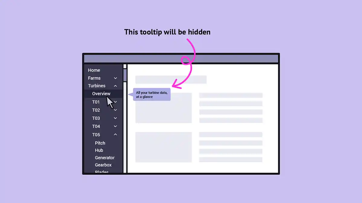
Let’s go back to our previous example of a fixed sidebar menu. The menu might be longer than the visible height of its parent, so we’ll need overflow-y: auto to allow the user to scroll in order to discover all the menu items. The menu I built used some technical language that might be unfamiliar to new users, so I was asked to add some tooltips, which would display to the right of the hovered element.
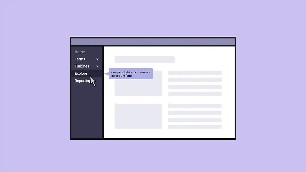
It would make sense to include these in the HTML close to the actual link they describe, in order to position it correctly. Then we could use CSS to position the tooltip to the right and display it on hover or focus:
.tooltip {
position: absolute;
top: 50%;
left: 100%;
transform: translateY(-50%);
display: none;
}
a:hover + .tooltip,
a:focus + .tooltip {
display: block;
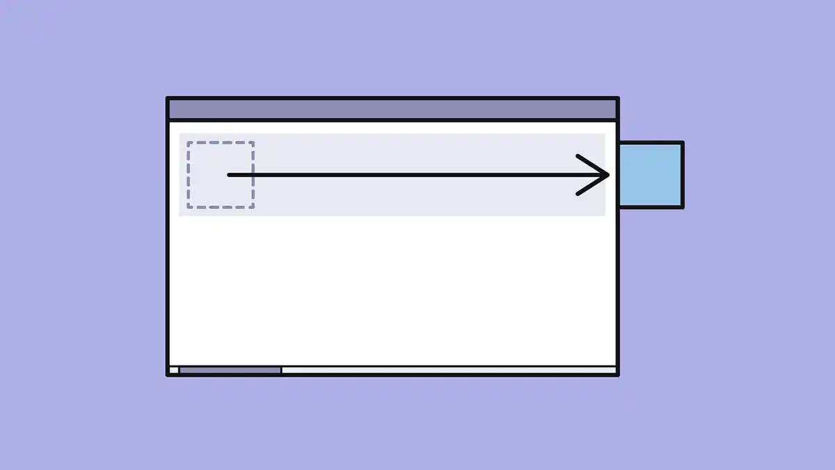
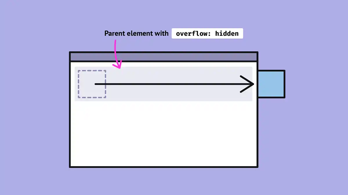
}Unfortunately, because the menu has overflow in one direction, hovering on a menu item (causing the tooltip to appear) will cause overflow in the horizontal direction too! What we really want is overflow-x: visible and overflow-y: auto. But sadly that combination isn’t permitted.
I’ve tried out a CSS-only solution using :has(), where the tooltips are positioned outside the menu:
See the Pen Overflow menu tooltips by Michelle Barker (@michellebarker) on CodePen.
There are plenty of accessibility considerations around tooltips though, so we might want to consider a JS solution.
Webmentions for this page
About webmentionsLikes: 0
Reposts: 0
Mentions: 2