If you follow this blog you’ll know I’m a big fan of CSS Grid, and without a doubt it’s given us developers more power than ever before when it comes to tackling layout on the web. But there are a few of my CSS layout needs that Grid hasn’t quite managed to fulfill just yet – here’s hoping some of these get implemented down the road!
Styling row and column gaps
There aren’t any grid properties that allow you to apply styles directly to the row and column gaps. It would be great to be able to apply something like a background or border style here. At the moment, if you want to do something like the example below, you need to hack your way around it with borders, backgrounds or pseudo-elements on the grid items themselves. You could set a background on your grid and a solid colour on your grid items – that’s all well and good unless you want your items to have a transparent background and the content behind to show through.
Something like the column-rule property (from the Multi-Column spec) would at least be a start.
Multiple gap values
I’ve come across a number of cases where it would have been incredibly useful to be able to set multiple value for the column-gap and row-gap properties. In one of my previous articles, Solving a Tricky Layout Problem with CSS Grid, rather than creating empty rows I could have done something like this:
.grid {
  row-gap: 0 40px 40px 0;
}
Auto flow patterns
This is a big one, and probably tricky to implement – but would undoubtedly be extremely useful. Suppose I have a layout like this:
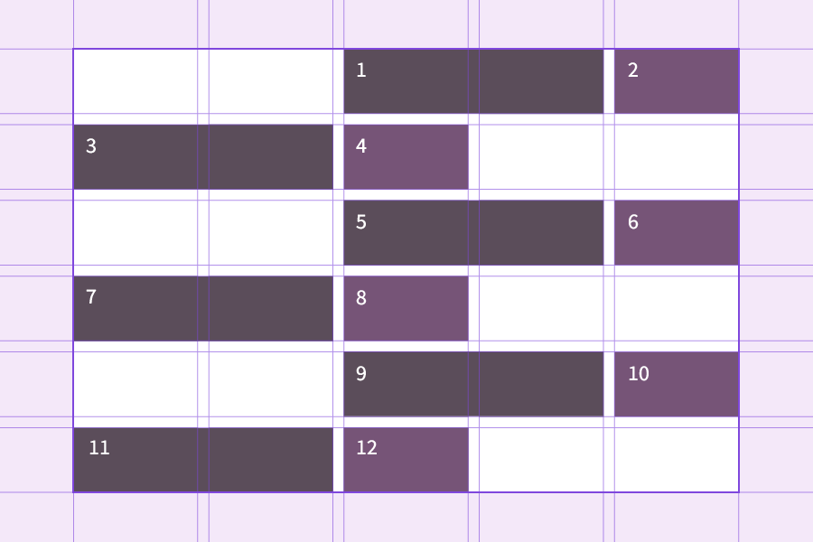
On every even row, the two grid items are positioned in the cells on the right, and every odd row they are positioned on the left. I’m allowing Grid to create implicit tracks (which can be specified with the grid-auto-rows property) as I don’t know how many items my grid will contain (which may be the case when dealing with user-generated content).
This is relatively simple to acheive using nth-child when our grid items only span a single row track. However, we run into problem if we want to position items in two dimensions. Now let’s suppose every other item needs to span two tracks, and subsequent items need to move down a row to accomodate:
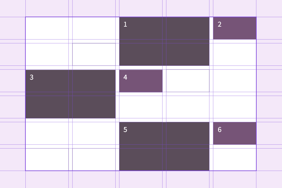
Now we run into problems when we try to use nth-child, because there is no way to tell Grid to position the items on the row axis relative to the previous one, as evidenced in this Codepen example:
I would love to see a solution similar to the grid-template-areas property, where Grid interprets the “areas” as an nth-child-type pattern:
.grid {
  grid-template-pattern:
    '. . 1 1 2'
    '. . 1 1 .'
    '1 1 2 . .'
    '1 1 . . .';
}
Any following items would simply repeat this pattern.
Calc() with the fr unit
The fr unit in Grid is incredibly useful, but at the moment it isn’t possible to use it in combination with calc(). According to the specification, this is to do with fr representing a flex value rather than a length, so I imagine this is unlikely to change any time soon.
I’ve come across one or two situations where it would have been useful to be able to use calc() with the fr unit – Ana Tudor's DRY state switching technique is one such case that comes to mind.
Aspect ratio grid cells
Now this one looks like it might be a real possibility at some point in the future. There is already a proposal for an aspect ratio CSS property which, while in the very, very early stages, is eagerly anticipated by many CSS developers. I would like to be able to define the aspect ratio of the grid cells themselves, rather than the child items. (I wrote a bit about it here, and employed a bit of a hack with CSS variables.)
Special mentions
Subgrid
Subgrid (where a child grid item can inherit the grid of its parent) must be one of the most-requested CSS Grid features. Happily, that’s coming in the Level 2 specification!
Masonry
Grid still doesn’t allow us to create a true masonry layout natively in CSS – not without dictating the heights of items in some way. It would be great to be able to do this with CSS, but I don’t think of it really as part of CSS Grid. This type of layout seems to me more like a combination of Grid and flexbox, and something else entirely. I hope that one day we’ll be able to acheive it with CSS alone, but I think we’ll have a while to wait.