As I’ve written about recently, it’s super exciting to see a bunch of new CSS features landing in browsers, and who can blame us for wanting to get started using them straight away?! It’s great to see browsers working to support new CSS features quicker than ever before, and that pace should persist with Interop, an initiative where browser vendors work together to implement features interoperably. And with so-called “evergreen” browsers, most users should see those new features right away, as their browsers update seamlessly.
But, as Jim Neilsen pointed out, that doesn’t mean every user has the latest and greatest browser version. Many older devices can’t update to the latest version. The OS doesn’t support it. This means that:
- You need to test your website on older devices, and
- If you’re using fancy new CSS features, you need to provide fallbacks, or ensure that users whose devices don’t support those features can still get by without them.
Progressive enhancement
Progressive enhancement is a web development strategy by which we ensure that the essential content and functionality of a website is accessible to as many users as possible, while providing an improved experience using newer features for users whose devices are capable of supporting them. Fun fact: while writing this article I opened the website WhatIsMyBrowser.com while on a train, with an intermittent internet connection. The CSS for the page wouldn’t load, but I still got the HTML and could use the page perfectly well, even if it wasn’t exactly pretty. That’s progressive enhancement!
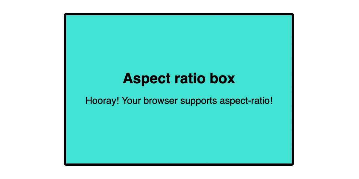
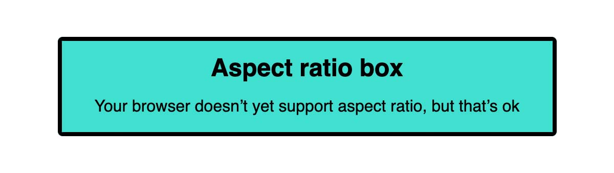
Of course, in many cases users will be able to load your CSS file, but their browser might not support some of the features you choose to use. Sometimes that’s fine! Take the aspect-ratio property, which is relatively new, and wouldn’t be supported on, say, an iPhone 6, which is pegged to Safari version 12. If I set the aspect-ratio property on this element with a bit of text in, all that will happen in browsers that don’t support aspect-ratio is the element will be the height that it needs to be to accommodate the text. No big deal to the average user.
Fallbacks
In other cases we might need to provide a fallback for a particular CSS feature. One way we can do that is by repeating the CSS property with a different value. Perhaps we want to use the new lch() color function, which is currently only supported in Safari. By including a hsl() value in the preceding rule, we can ensure than browsers that don’t support lch() have the hsl() value applied — the browser will simply ignore the value it doesn’t recognise.
.element {
  background: rgb(84% 0% 77%);
  background: lch(50% 100 331);
}
Feature queries
Sometimes the fallback needs to be a little more complex, in which case we could use a feature query. Perhaps our aspect-ratio component has an image background.
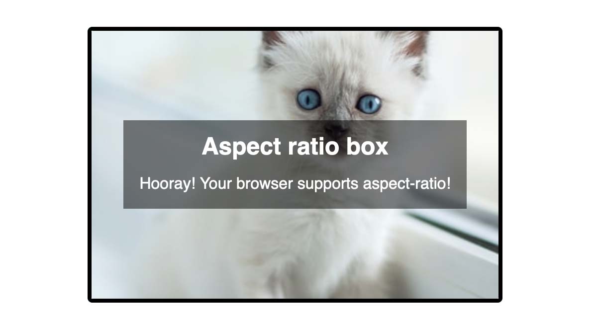
With a shallow height (where the browser doesn’t support aspect-ratio) the image might appear oddly cropped and hard to discern. Using a feature query, we could set a minimum height where aspect-ratio isn’t supported.
.aspect-box {
  min-height: 10rem;
}

@supports (aspect-ratio: 3 / 2) {
  .aspect-box {
    min-height: auto;
    aspect-ratio: 3 / 2;
  }
}(See the demo.)
We could go even further, and use the old-fashioned method for setting an aspect ratio for browsers that don’t support the modern property. But remember, the goal of progressive enhancement is not to provide the same experience for users of older browsers, but to provide a useable experience. There is little point in writing more than double the amount of code to ensure an identical result. If it’s absolutely essential that virtually all users get the aspect ratio images, (and believe me, I’ve been in plenty of situations where it has been deemed essential — i.e. by key stakeholders using older devices!) then you’re free to code them the old-fashioned way. But, in my opinion, that should be a last resort.
Polyfilling
Thankfully the number of situations where we need to polyfill a feature is growing smaller by the day, but in a few cases where we want to use a new CSS feature, it might still be necessary. The :focus-visible pseudo-class (which we can use for applying accessible focus styles to an element that’s focused only when it’s useful to the user) has only recently gained widespread browser support, and for a while was supported in some browsers but not others. There is currently no way to test for support of pseudo-classes using feature queries (which might allow us to provide a :focus style as a fallback for those browsers), using a polyfill like this one is a useful alternative.
Once you are confident that you no longer need a polyfill (e.g. when a feature is widely supported) it’s a good idea to remove it, to avoid serving unnecessary JS to your users.
Testing
The other important piece of the equation is, of course, to test your websites! There is no substitute for real-device testing, so if you have access to a device lab you should absolutely use it. At the very least, aim to test on a few different devices if you can get hold of them. Issues with touch interaction, for example, will only become apparent if you’re using an actual touch-screen device.
Testing platforms
If you can’t test on real devices (and plenty of companies don’t have the budget to keep a well-stocked device lab), online testing platforms such as Browserstack and LamdaTest enable us to test on a range of platforms and devices. Some of these platforms provide cheaper emulator options, but I would urge you to use the real-device option if you can, as they will help you catch issues that aren’t replicated in emulators. They may be more expensive, but can help you prevent more costly issues arising if a bunch of customers can’t access your site!
Which browsers to test?
With the thousands of different devices, operating systems and browser versions, it’s clearly impossible to test in every possible environment! So which ones should you test in? I find the Statcounter website to be very useful here, as it shows the most-used browsers over the course of a year. You can filter by year, date, platform and region: If you’re making a website for Trowbridge town council in the UK, for example, the UK stats are probably going to be far more valuable to you than the worldwide ones.
The site also lets you specifically check the stats for browser versions, which is what I find most useful for testing. As a rule of thumb, I aim to cover at least the past two years of the most popular listed browsers with my testing, plus a couple of older browsers/devices — particularly versions of Safari that may be running on older devices.
If you’re working for a client, and you’re in a position to do so, it might be worth coming up with a written agreement that sets out explicitly how far back you intend to test, and what they can expect from browsers that don’t support all the features (versus what constitutes a bug). Educating clients about progressive enhancement could save quite a lot of time and explanation down the line, when they’re reporting “bugs” that are in fact fallbacks for older browsers!
Other ways to test
In addition to cross-browser testing, there are some other methods we should consider when testing our websites:
- Keyboard navigation – Many people use a keyboard instead of a mouse. Can you navigate the website using only your keyboard? Are focused elements apparent?
- Screenreaders – People with visual impairment might use a screenreader to browse the website, which reads the content of the page. MacOS has a built-in screenreader, VoiceOver, and Chromebooks include Chrome Vox. (I definitely need to get better at testing with screenreaders!)
- Zooming – Plenty of users (myself included!) increase the zoom level in their browsers. Try zooming to at least 15%. Does the font size increase as expected? Does the layout break?
- Reduced motion – Users can set a preference for reduced motion at OS level. Does your website respect their motion preferences? Can they pause animations that might be distracting, or worse, trigger cognitive issues?
- Accessibility tools – Tools like Axe scan you webpage and check for accessibility issues (such as missing alt text, colour contrast and semantic markup) that would be time-consuming to check manually. It’s worth running your site through one of these tools to catch issues that might otherwise go unnoticed.
This list is by no means exhaustive, but should give you some things to think about when you’re next testing your website. Remember, by building with progressive enhancement, we can aim to reduce the number of issues raised by testing, and provide an experience that accommodates everyone.