Confession: I almost never write border-radius as shorthand, largely because I can never remember the order. My brain is wired to remember margin and padding shorthands (top, right, bottom, left), but when it comes to corners it’s a different story. Do I start from the top left corner, or the top right? So I usually resort to the longhand, which is admittedly verbose, but at least has the advantage of being explicit, for me and any future readers of my code. For the record, these are equivalent:
div {
  border-radius: 10% 20% 30% 75%;
}

div {
  border-top-left-radius: 10%;
  border-top-right-radius: 20%;
  border-bottom-right-radius: 30%;
  border-bottom-left-radius: 75%;
}
In the shorthand, we start from the top left corner, and go round clockwise, ending with the bottom left.
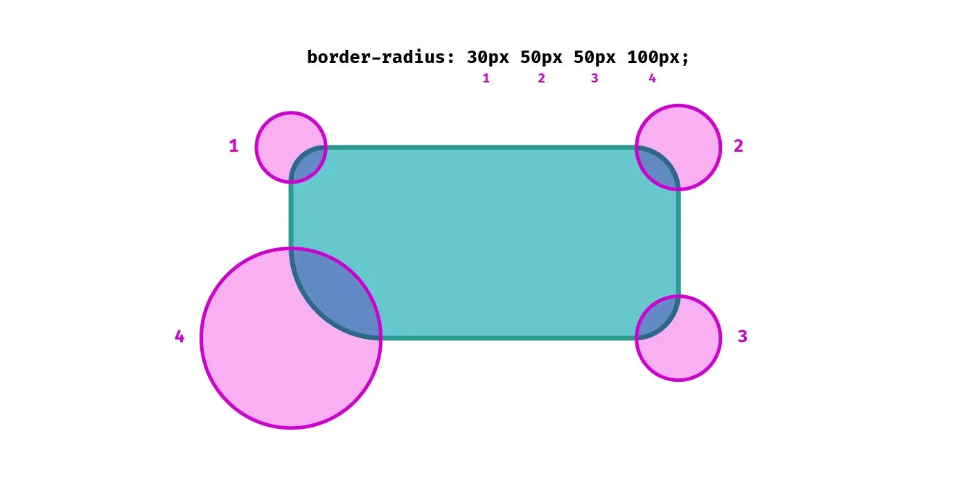
Ironically, the very act of writing this article will probably ensure it’s firmly lodged in my brain forever more.
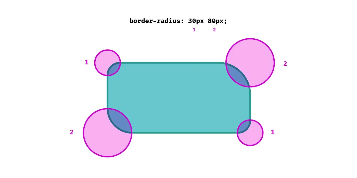
Using just two values in the shorthand we can set both the top-left and bottom-right radii (the first value), and the top-right and bottom-left (the second value).
Unequal radii
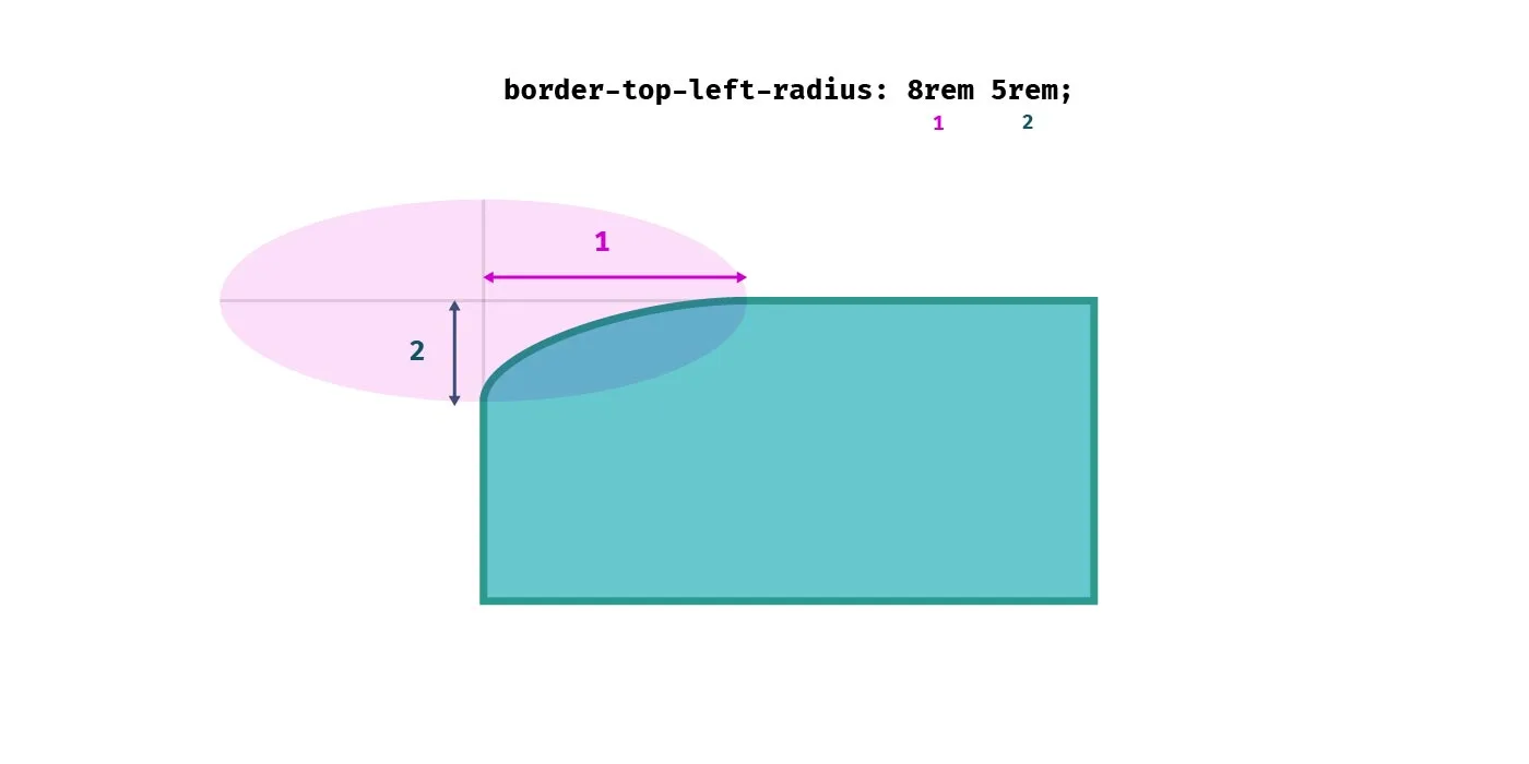
It gets a tad more complicated when dealing with unequal radii. Say we want a top left radius that’s more elliptical in appearance. We’ll need a longer border-radius along the top edge, and a shorter one on the left edge. We can use two values for our border-top-left-radius property:
div {
  border-top-left-radius: 100% 5rem;
}
The first value is the radius is the horizontal direction, the second is in the vertical direction.
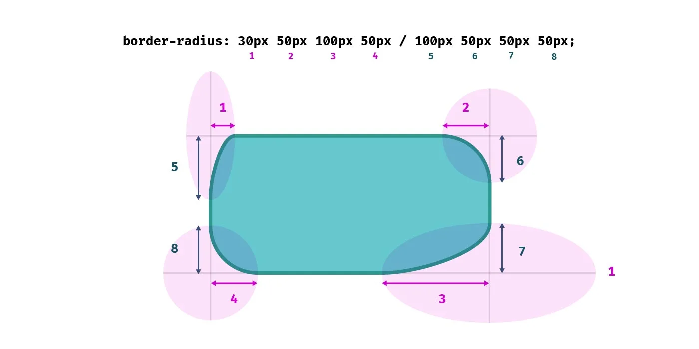
So how about using the shorthand for unequal radii? Setting all of our radii to different values can result in uneven, organic-looking shapes. We can use the slash separator, first specifying the horizontal radii for each corner, then the vertical radii after the slash.
div {
  border-radius: 2rem 8rem 8rem 9rem / 3rem 11rem 6rem 5rem;
}
Effectively, we take two passed around our element clockwise.
We don’t have to set every radius in the shorthand. The shorthand in this example is equivalent to setting all of the vertical radii to 50%, while alternately setting the horizontal radii to 5rem and 2rem respectively.
/* Shortand */
div {
  border-radius: 5rem 2rem / 50%;
}

/* Equivalent to: */
div {
  border-top-left-radius: 5rem 50%;
  border-top-right-radius: 2rem 50%;
  border-bottom-right-radius: 5rem 50%;
  border-bottom-left-radius: 2rem 50%;
}
Logical properties for border-radius
If we are working with different languages on our website we might want our border radii to change according to the writing mode or direction of our text. Logical properties give us flow-relative values. For example for Arabic text, which is written right-to-left, the border radii might need to be applied on the left side of the element, while in European languages it would be applied on the right. Fortunately there are logical property equivalents for the longhand border-radius- properties.
Logical properties typically refer to the inline or block axis, which are different depending on the direction or writing mode. In English, which is written left-to-right, the inline axis refers to the horizontal axis and the block axis refers to the vertical axis. The start of the inline axis would be the left, the end would be the right. In a vertical writing mode, the inline axis would be the vertical axis, and the block axis would be the horizontal one.
The logical properties for border radius refer to the start and/or end of the inline or block axis. Of all the logical properties, they’re perhaps the most confusing to read. Let’s compare defining the top left, top right, bottom right and bottom left radii, and their logical property equivalents:
div {
  border-top-left-radius: 5rem;
  border-top-right-radius: 2rem;
  border-bottom-right-radius: 4rem;
  border-bottom-left-radius: 3rem;
}

/* With logical properties: */
div {
  border-start-start-radius: 5rem;
  border-start-end-radius: 2rem;
  border-end-end-radius: 4rem;
  border-end-start-radius: 3rem;
}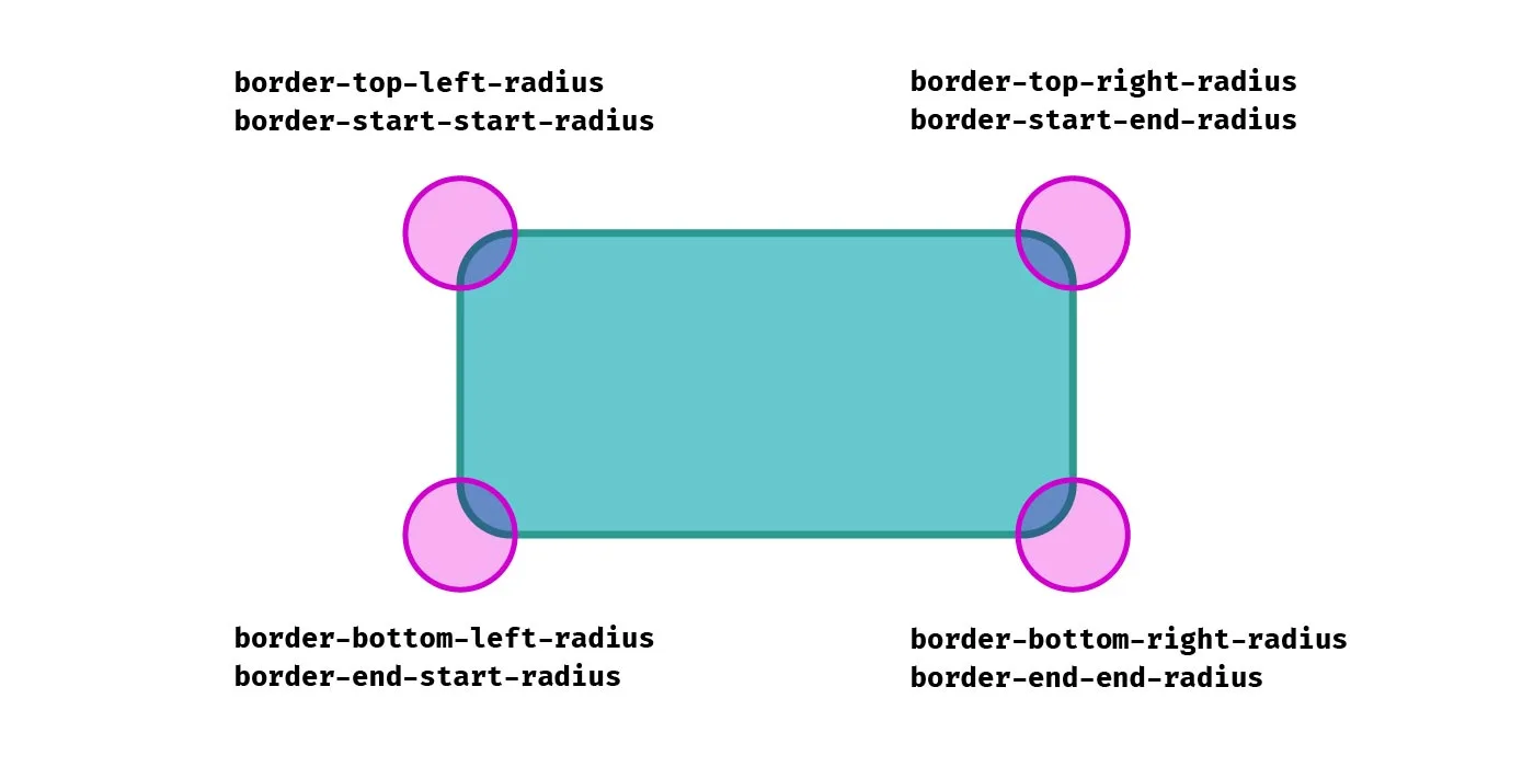
Getting used to writing border-start-start-radius is certainly a bit of a mental leap for me! It’s written like that because it’s the start of the block axis and the start of the inline axis, while border-start-end-radius refers to the start of the block axis and the end of the inline axis, and so on.
As you can see in the following demo, when the direction of the text is switched from left-to-right to right-to-left, as well as the order of items being reverse, the border radii are switched for the elements that use logical properties, whereas the ones using directional properties remain the same.
See the Pen Logical border-radius by Michelle Barker (@michellebarker) on CodePen.
Logical properties and unequal radii
Somewhat confusingly, although the property name refers to the block axis then the inline axis, the radius value is written inline axis first, then block axis. This makes it consistent with the order of the physical properties (e.g. border-top-right-radius and border-start-end-radius would refer to the same corner, and the order of values would be the same), but might still be confusing! I suppose we could think of it as the block edge is the one that is getting the rounding treatment first, despite it referring to the horizontal radius.
Vertical writing modes
Here’s an interesting quirk: In a vertical writing mode, logical border radius properties don’t behave exactly as I would expect when using an elliptical border radius (i.e. more than one value). In this demo, I’m applying the vertical-rl writing mode to the second element.
.wrapper {
  writing-mode: vertical-rl;
}

p {
  border-start-start-radius: 10rem 1rem;
  border-start-end-radius: 2rem 3rem;
  border-end-end-radius: 8rem 4rem;
}

.wrapper:nth-child(2) {
  writing-mode: horizontal-tb;
}
See the Pen Logical border-radius by Michelle Barker (@michellebarker) on CodePen.
As I would expect, what was the top left corner effectively becomes the top right corner as the element is now laid out vertically. But contrary to what I would expect, the two property values are reversed. The corner goes from a long, shallow curve along the block-start edge (the edge above the text) to a narrow, deep curve in a vertical writing mode. This surprised me, as I expected the corners to behave in much the same way as if I had rotated the element using a transform. In order to force the intended appearance, we need to reverse the values:
.wrapper:nth-child(2) p {
  /* We have to reverse the values if we want them to be logical :( */
  border-start-start-radius: 1rem 10rem;
  border-start-end-radius: 3rem 2rem;
  border-end-end-radius: 4rem 8rem;
}
I’m not sure whether I’m misunderstanding something in the spec or whether this is a bug (the fact that it works the same in Chrome and Firefox would suggest otherwise), but it seems counter-intuitive to me.
No logical shorthand
We’ve seen how to apply logical border radius properties, but it might surprise you to know there is no logical property shorthand. Unlike other border-related properties, if we want to apply a border radius using logical properties we must use the more verbose longhand options.
So be warned, when dealing with international content that could use different writing modes and text directions, using the logical properties for border radius might be a good idea. Using the border-radius shorthand, the physical values will remain the same regardless of the direction of flow.
Reference
Check out the CSS Tricks almanac for a useful guide to all things border-radius.
Webmentions for this page
About webmentionsLikes: 12
Reposts: 1
Mentions: 1