Card-based UIs are commonly-used web design patterns, and it’s not unusual to build a UI that requires a hover (or focus) effect to be applied to an entire card. There are a few strategies for implementing this effect using CSS, and this CSS Tricks article covers some of them. (None of them is perfect, and they all have their pitfalls!)
But what if our link hover effect needs to affect a number of child items, and they don’t all sit neatly inside a rectangle, like a regular card?
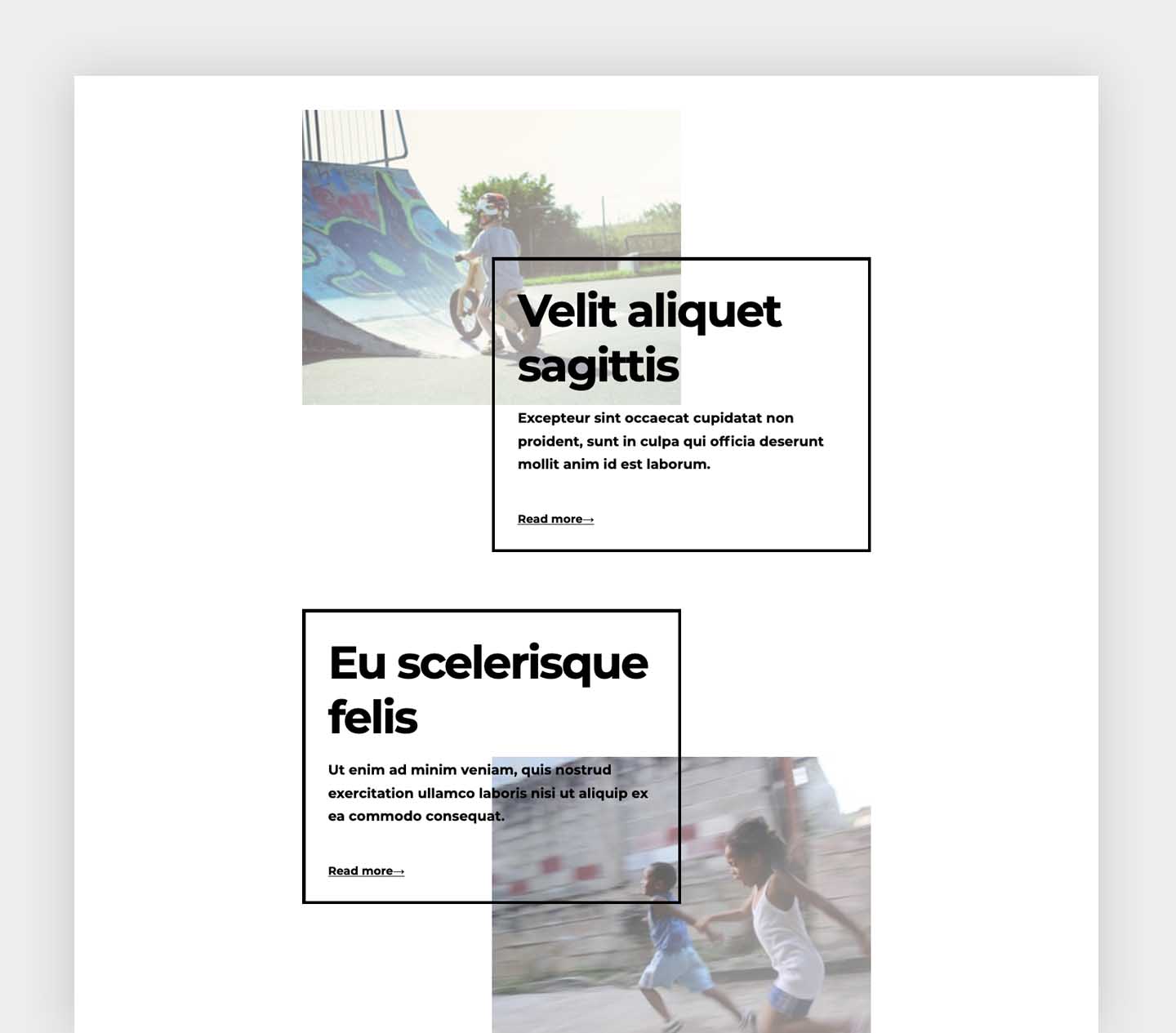
With CSS Grid, we can lay items out on a horizontal and a vertical axis, in order to build visually interesting layouts, like this one:

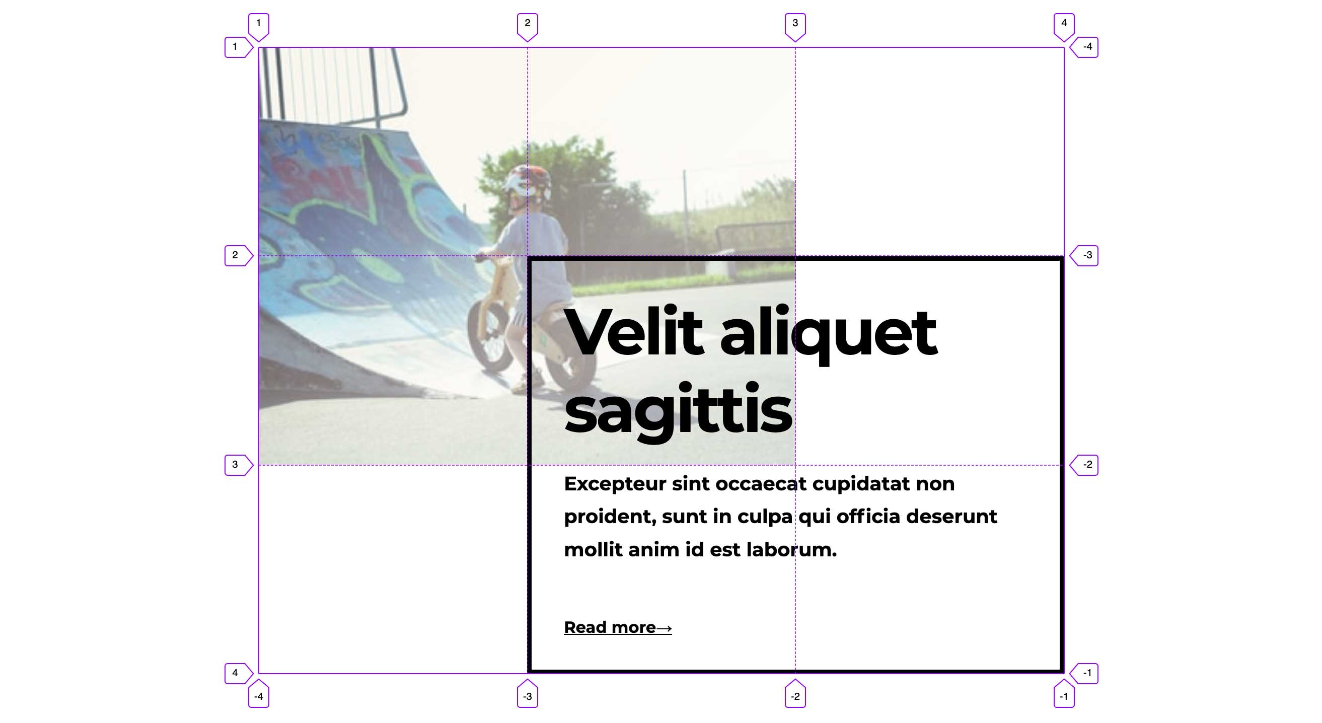
By turning on the the Grid inspector in Firefox’s dev tools, we can see how the items of one of those components are laid out on the grid:

If, in our UI design, those grid items need to act as links, then it would make sense for a hover effect would be applied to all the grid items whenever one of them is hovered.

That’s no problem if we hover over the first item: we can use the general sibling combinator to apply the hover effect to the subsequent items.
.grid__img:hover ~ .grid__caption,
.grid__img:focus ~ .grid__caption {
  /* Hover and focus styles */
}
But, unfortunately, the general sibling combinator only affects successive siblings, not those preceding. If we hover over the second item, the hover effect is not applied to the first.
Absolute positioning
A better option might be to use an absolute-positioned link to cover the entire area of the component. Once again, we can apply the hover effect using the general sibling combinator, but this time we’re ensuring that all the grid items will follow the anchor link and therefore have the hover effect applied:
<div class="grid">
  <a href="/" class="grid__link"></a>
  <div class="grid__img">
    <img src="/..." alt="" />
  </div>
  <div class="grid__card">
    <h2>Eu scelerisque felis</h2>
    <p>
      Ut enim ad minim veniam, quis nostrud exercitation ullamco laboris ni ut
      aliquip ex ea commodo consequat.
    </p>
    <span>Read more→</span>
  </div>
</div>
.grid {
position: relative;
display: grid;
grid-template: repeat(3, 1fr) / repeat(3, 1fr);
}
.grid__link {
position: absolute;
display: grid;
grid-template: repeat(3, 1fr) / repeat(3, 1fr);
}Positioning with Grid
With grid we don’t actually need absolute positioning here. Instead, we can position it as a grid item that spans the full column and row axes. We’ll need to use z-index to ensure it’s always on top:
.grid__link {
  grid-area: 1 / 1 / -1 / -1;
  display: grid;
  grid-template: repeat(3, 1fr) / repeat(3, 1fr);
  z-index: 1;
}Accessibility
This is arguably a better option for accessibility, as it means that instead of having three different links all going to the same URL, we can just use one. But we need to ensure that the link will be announced correctly to assistive technologies.
By using aria-labelledby we can give our link an accessible label that corresponds to the component heading. We could also use aria-hidden to ensure that the heading isn’t announced a second time.
<div class="grid">
  <a href="/" class="link" aria-labelledby="title"></a>
  <div class="grid__img">
    <img src="/..." alt="" />
  </div>
  <div class="grid__card">
    <h2 id="title" aria-hidden="true">Eu scelerisque felis</h2>
    <p>
      Ut enim ad minim veniam, quis nostrud exercitation ullamco laboris nisi ut
      aliquip ex ea commodo consequat.
    </p>
    <span>Read more→</span>
  </div>
</div>
This works correctly when tested using VoiceOver in Safari.
But...it doesn’t solve the problem
The problem here is that wherever we hover within the bounding box of our anchor link, the hover effect will be applied. But visually, if you’re hovering over whitespace, you probably don’t want the component to behave as if it’s being hovered. It just doesn’t make a lot of sense.

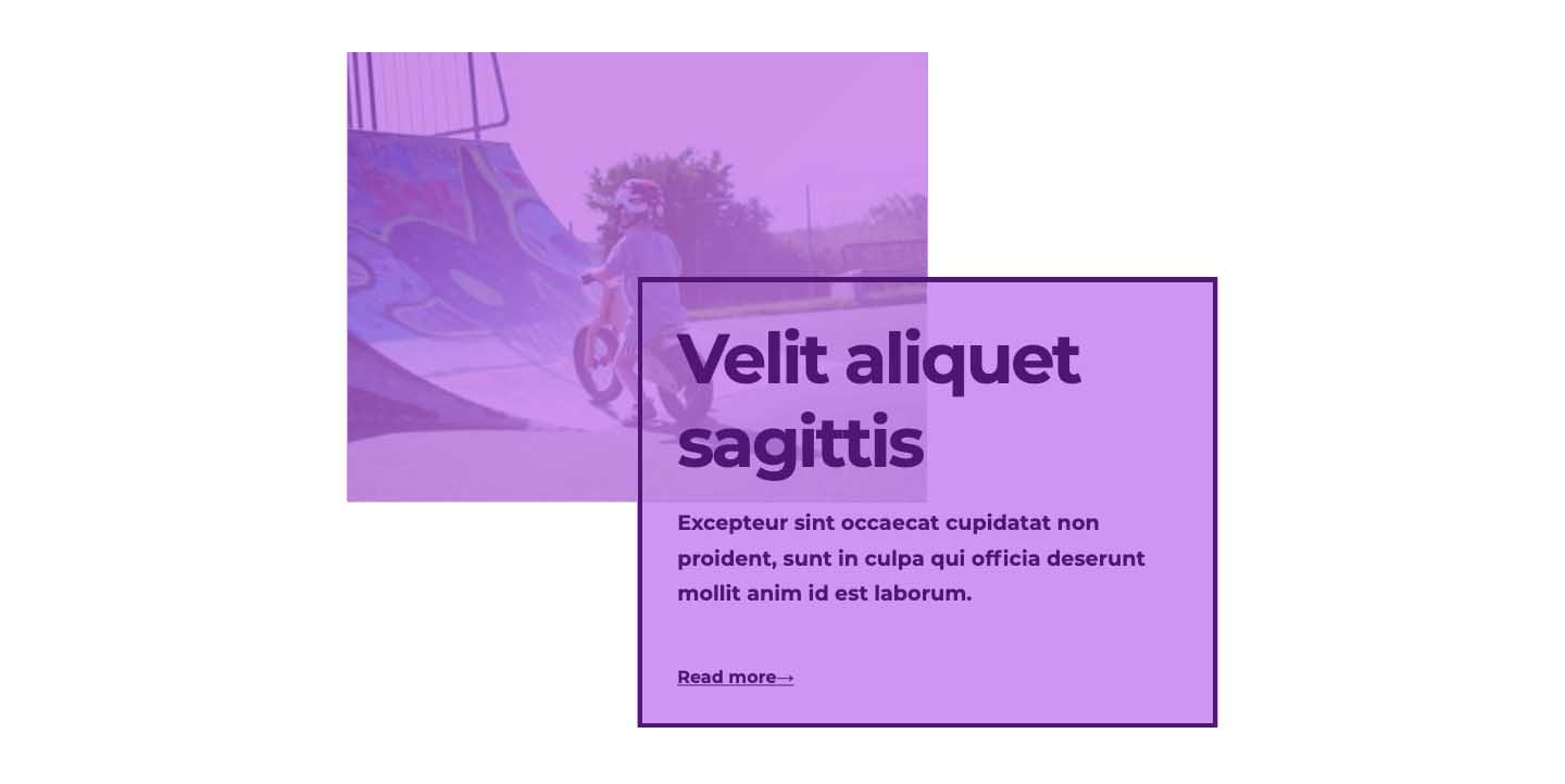
What we actually want is for our link to behave as if it’s shaped like this:

Nested grids to the rescue
Now we’ll see another reason why CSS Grid is the ideal choice for laying out this component. By making the absolute-positioned anchor link a grid container that matches the component grid, we can overlay the grid items with pseudo-elements. If we add pointer-events: none to the anchor link itself, and pointer-events: auto to the pseudo-elements, the hover effect will only be applied when those areas are hovered.
.grid__link {
  pointer-events: none;
}

.grid__link::before,
.grid__link::after {
  pointer-events: auto;
}
An imperfect solution
This technique works well enough, as long as we can be more-or-less sure of the size of the resolved grid items. If we’re relying on our grid tracks to be intrinsically sized (based on the length or dimensions of the content), then the absolute-positioned pseudo-elements may not align correctly with our original grid items.
In this example, the first grid item contains a long paragraph of content, which makes the auto-sized grid row much taller:
Unfortunately, the items in the second grid (the anchor link) aren’t aware of the original grid children, so they don’t respond accordingly.
A better solution with Subgrid
This is where subgrid comes into play to solve our problem. Subgrid is part of the CSS Grid Level 2 specification. It allows us to create a grid container inside a parent grid that inherits the parent grid on the column or row axis (or both).
We can, in turn, make that anchor link a grid as before, but this time we can use grid-template (or the longhand grid-template-rows/grid-template-columns) to instruct it to use a subgrid.
.link {
  grid-template: subgrid / subgrid;
}
Now, positioning the pseudo-elements on the grid as before will ensure they align correctly with the original grid items.
This assumes we’re using the default align-items value of stretch. If we use anything other than that, it’s likely we’ll still run into some alignment problems.
Browser support
Before we get too excited, let’s look at the reality. At the time of writing, subgrid is only supported in Firefox. That’s it. Which is a shame, because it’s extremely useful, and would probably increase CSS Grid adoption. Once it lands in Chrome (and I believe it will, at some point), then it’ll be much more worthwhile to use in production. I hope that writing about and sharing use cases like this might increase the momentum to bring subgrid support to all browsers.
If you want to use the above technique, you can always provide a (albeit less perfect) fallback for non-supporting browsers – which, happily is only one line of code:
.link {
  grid-template: repeat(3, 1fr) / repeat(3, 1fr);

  @supports (grid-template: subgrid / subgrid) {
    grid-template: subgrid / subgrid;
  }
}
Then, when subgrid finally hits the mainstream, your site will be ready to go!
See the full demo on Codepen:
Resources
If you’re interested in learning more about subgrid, Rachel Andrew has got your covered with this useful guide:
Webmentions for this page
About webmentionsLikes: 0
Reposts: 0
Mentions: 2