In this article we’ll explore how to use SVG filters for advanced colour manipulation on images.
Blend modes and beyond
If you’re writing CSS regularly there’s a good chance you will have come across blend modes. The background-blend-mode and mix-blend-mode properties allow us to blend a background and a foreground element together, and when used on images can help create some interesting effects, similar to the way image editing programs like Photoshop do. You can get really creative and even replicate Instagram’s filters, like Una Kravets has done here. You can even create duotone images using mix-blend-mode on pseudo-elements (another trick from Una!).
CSS blend modes are not currently supported in Edge and IE11, so they’re best treated as an enhancement rather than something that should be relied upon for your site. However, sometimes they’re not quite enough on their own. Sometimes we might want a bit more control over things like blur, contrast and colour manipulation.
CSS filters
CSS filters give us a few more capabilites where blend modes don’t fully satisfy our needs. While blend modes depend on a second colour or image to blend with the original (whether a background image, another element of a pseudo-element), CSS filters work on the image directly. We can blur images, convert them to greyscale, add a drop-shadow, or rotate the hue, for example. There’s a great introduction on CSS Tricks, which explains some of their capabilities. However, for full control over our images we have SVG filters. CSS filters, while incredibly useful and a great tool to have in CSS, are a simplified implementation of SVG filters – and knowing about SVG filters can give us superpowers when it comes to image manipulation! Even better, support for SVG filters goes right back to IE10, giving them a clear advantage over CSS filters in many situations.
FeColorMatrix
SVG filters open up a whole new world of image effects, but the one I want to focus on in this article is the feColorMatrix filter, which allows us to manipulate the red, green, blue and alpha channels of an image by adding different amounts of red, green, blue or alpha into them. Still with me? feColorMatrix (fe stands for “Filter Effect” in SVG filters) allows for highly nuanced colour adjustment.
Writing an SVG filter
SVG filters can be written inline in your HTML like this:
<svg viewBox="0 0 600 400" width="0" height="0" xmlns:xlink="http://www.w3.org/1999/xlink">
  <defs>
    <filter id="myFilter">
      <!--the rest of the code for the filter goes here-->
    </filter>
  </defs>
</svg>
Notice we’re wrapping the filter in a <defs> tag so it becomes a symbol we can reuse. I’ve giving the SVG a width and height of 0 so it doesn’t show up on the page – it’s purely for defining the filter.
The filter needs an id, which we can reference in our CSS to apply a filter, like this:
.fig {
	filter: url(#myFilter);
}
Here’s an example of an feColorMatrix filter:
<filter id="myFilter">
  <feColorMatrix in="SourceGraphic"
    type="matrix"
    values="1 1 0 0 0
            1 1 0 0 0
            1 1 0 0 0
            0 0 0 1 0" />
</filter>
The syntax looks quite complicated at first glance, but it can be helpful to visualise it like this:
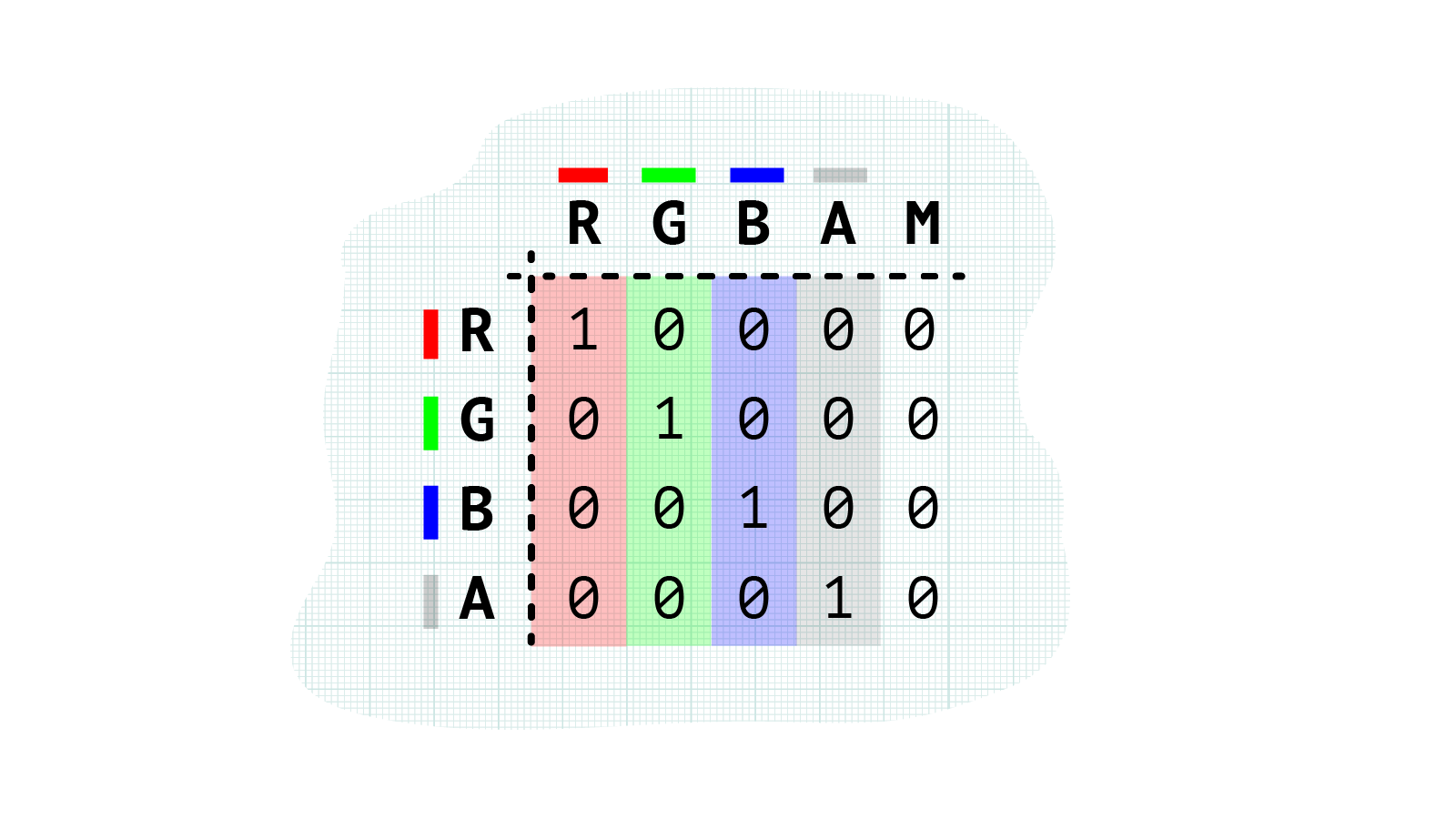
The x axis represents the channels of our original image (red, green, blue and alpha), and the y axis represent the colours we can add or remove from those channels. The final value on the x axis is the multiplication factor, which we won’t worry too much about for now.
The matrix for a regular (unedited) image looks like the one above. The red, green, blue and alpha values are all in their original channels - so the red pixels will be red, the green pixels will be green, and so on.
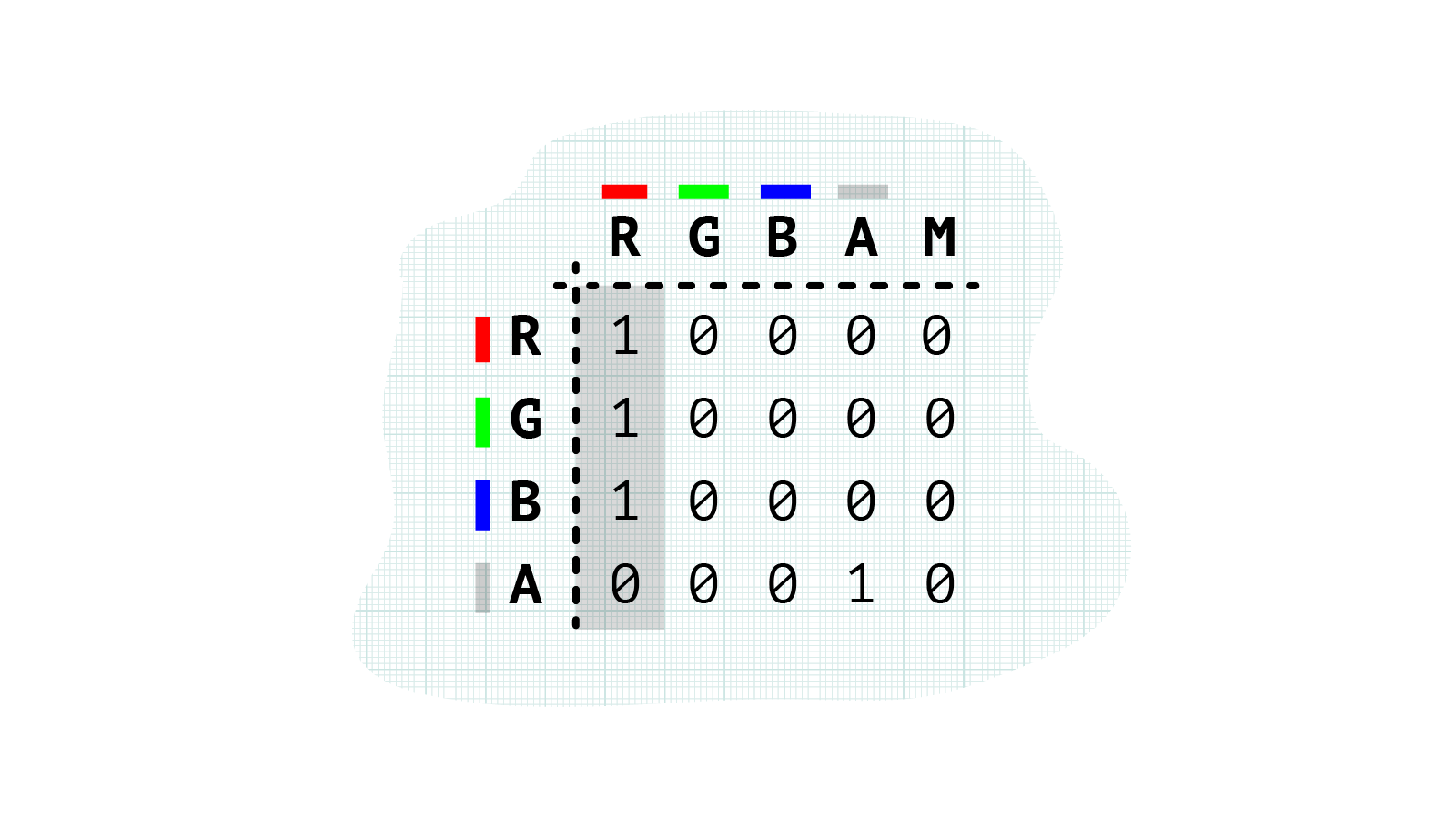
To colourize images we can introduce different amounts of red, green or blue into other channels. For example, we can add blue to each channel to create a blue colorized image:
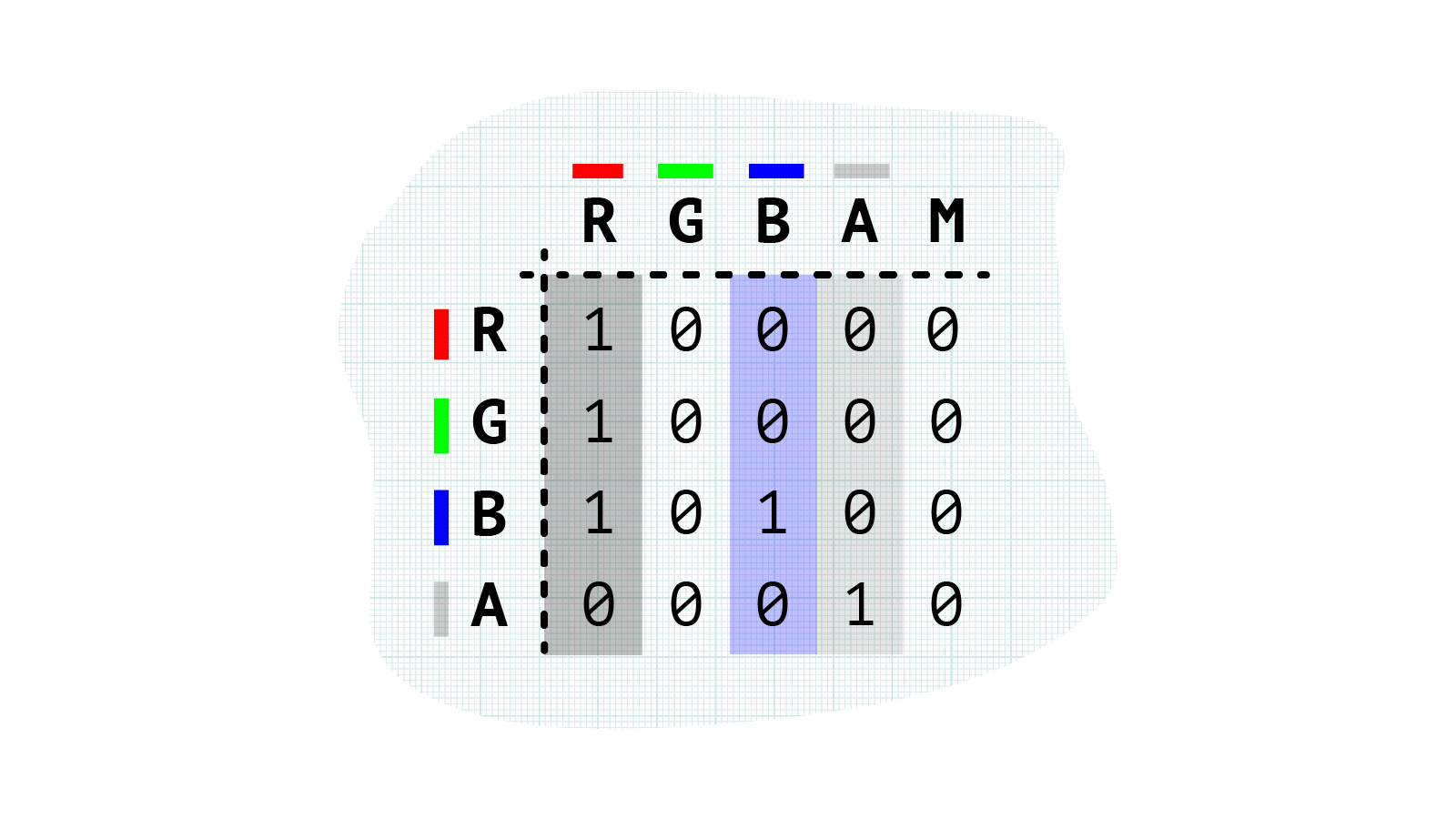
We can turn a colour image greyscale by removing red, green and blue from all channels except one:
This demo shows a number of different combinations we could use to get a greyscale image. Adjusting the values in the alpha channel can give us greater degrees of contrast, darkening or lightening the image.
In the following matrix we’re setting all the values in the red channel to 100% (giving us a greyscale image), then adding blue into the blue channel – so the image has a blue-ish tinge:
To create a duotone effect (with better browser support than blend modes!) we need to apply values to the alpha channel. The alpha channel can darken and lighten the image. To darken parts of the image we can use negative values, while positive values will lighten it. (Setting all values in the alpha channel to 1 will make the image completely white.)
<filter id="myFilter">
  <feColorMatrix in="SourceGraphic"
    type="matrix"
    values="1 1 1 0 0
		    0 0 0 -0.5 0
		    0 0 0 0.2 0
		    0 0 0 1 0" />
</filter>
This gives us a duotone effect like this:

It can be a little trickier to find the perfect mix of colours using the alpha channel, but playing around with the values will give you a feel for it. Hopefully this introduction has given you a taste of what’s possible.
To learn more about how feColorMatrix works here are two articles that explain it really well:
- Finessing
feColorMatrixby Una Kravets - CSS Filters Can Turn Your Gray Skies Blue by Amelia Bellamy-Royds
The best way to really understand feColorMatrix is to play around with the values yourself.
Here is a demo showing a few of the creative possibilities:
Webmentions for this page
About webmentionsLikes: 0
Reposts: 0
Mentions: 2