Here’s a short round-up of some of the web technologies and resources that are getting me excited right now. Having started with the best intentions to write one of these posts regular, it’s been several months since the first one.
Aspect Ratio
Chrome (and Edge by extension) just shipped support for the new CSS aspect-ratio property! CSS Tricks has a breakdown of what this is and how to use it. Once this has widespread support, it’ll render padding hacks a thing of the past. The syntax couldn’t be simpler — here’s how we could create an element with 4:3 aspect ratio:
.element {
  width: 100%;
  aspect-ratio: 4 / 3;
}
Google’s developer blog features a full breakdown of how to use it it in conjunction with object-fit for aspect ratio images.
Container queries on the horizon
Another thing that’ll soon be making our lives easier is the much-anticipated specification for container queries. Media queries have long bestowed on developers the ability to style elements differently depending on viewport width, but one thing that’s eluded us is styling based on the size of a parent element. Think of a grid of cards which might not take up the full page width. In a layout with a sidebar we might want to implement a two-column layout, but without a sidebar we might want to show rows of three, or use a different style altogether. Ethan Marcotte wrote a more thorough explanation of why container queries are useful a few of years ago.
Flexbox and CSS Grid have made it easier to create intrinsically responsive layouts without the need for media queries in the recent years, but even so, few developers would disagree that container queries - styling dependent on the size of a containing element - would be very handy. A practical implementation turned out to be anything but straightforward, and many had pretty much given up hope. But recently the discussion was revived, and it looks like we might get our wish after all! It’s still too early to say when we can expect to be able to start using container queries, but hey, it gives us something to look forward to.
Draggable
I’ve written before about how much I love animating with Greensock (GSAP). Recently I had fun playing around with the Draggable plugin to build this paper snowflake maker - drag the handles to cut out a unique paper snowflake. The snowflake segments are made using CSS clip-path, and dragging the handles updates the polygon path value. I made heavy use of custom properties here too.
See the Pen Snowflakes with clip-path trigonometry by Michelle Barker (@michellebarker) on CodePen.
Course: Three.js Journey
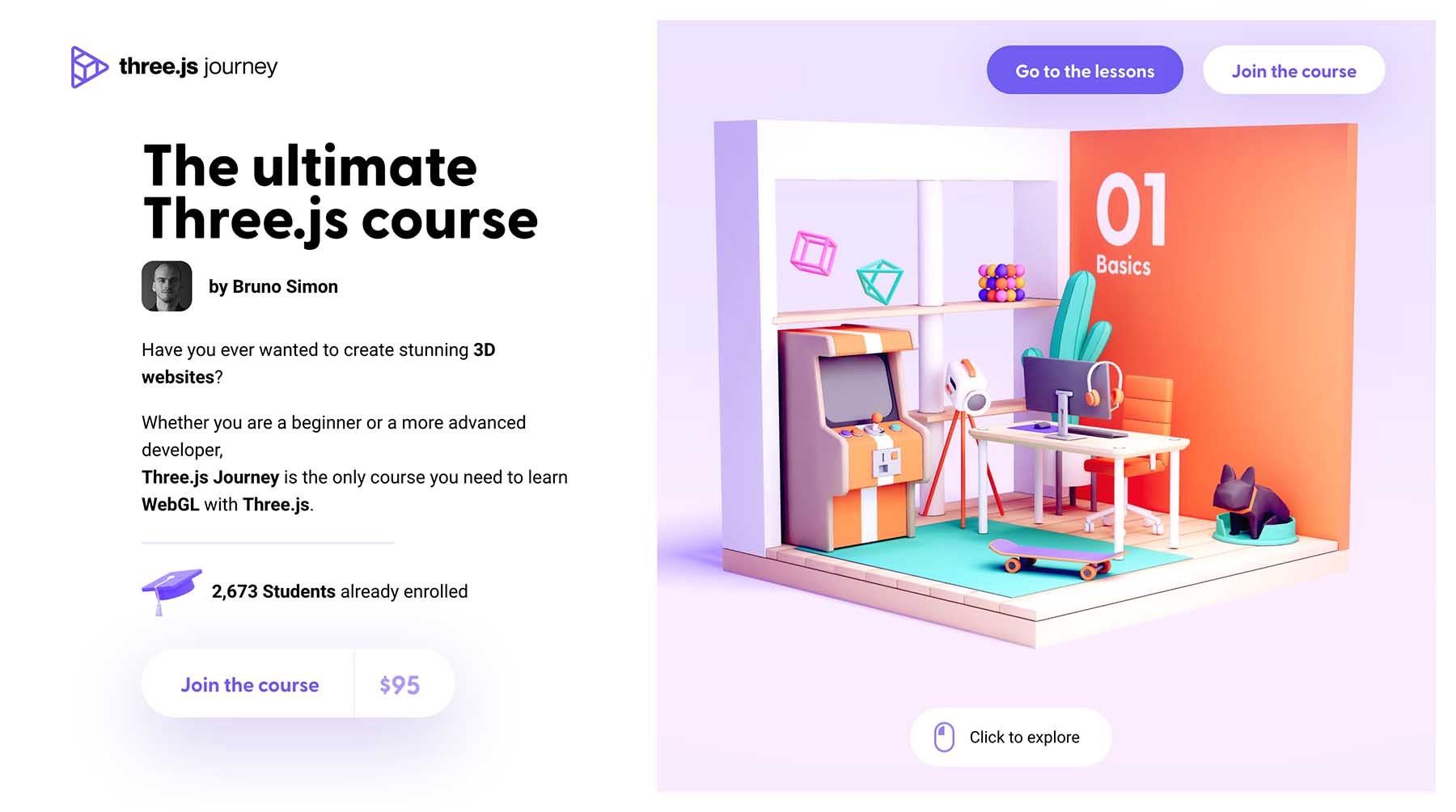
You might have seen Bruno Simon’s amazing portfolio site – a visual feast where you drive a car through a 3D landscape — or come across some of his other work on the web. These immersive experiences are built with Three.js, and Bruno has recently released a comprehensive Three.js video course, Three.js Journey — complete with its own spectacular landing page! The course takes you from the basics right through to advanced techniques, and there’s plenty to learn along the way, even if you have some experience with Three.js. It’s great value too!
I’m enjoying working my way through it. Here’s a little bug animation I made using what I’ve learnt so far.
See the Pen Three JS grub by Michelle Barker (@michellebarker) on CodePen.
Create App
One of the common gripes with modern front end development is the time it can take just to install and configure all the necessary tooling and frameworks. Whether your build tool of choice is Webpack, Parcel or Snowpack, Create App helps you get a project up-and-running quickly and easily. Select your options for styling, linting, JS frameworks and more to generate a project boilerplate. I can definitely see myself using this for starting future projects.
Newsletters
Here are a couple of newsletters that always bring joy to my inbox.
ViewBox
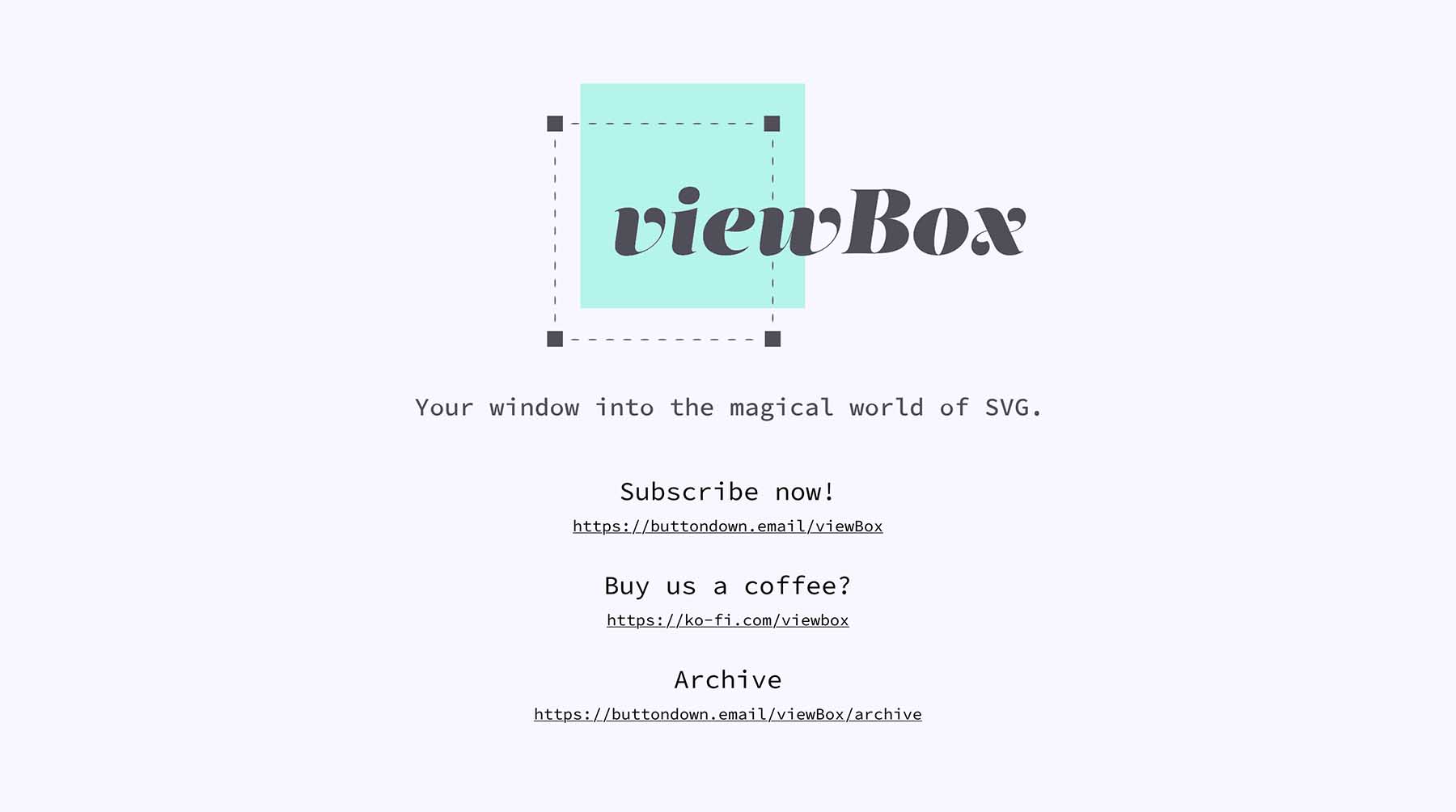
This fabulous newsletter by Cassie Evans and Louis Hoebregts focuses on one SVG-related topic per issue, and features gorgeous demos and an SVG challenge. I also really love the header animation and can’t stop replaying it.
Front End Horse
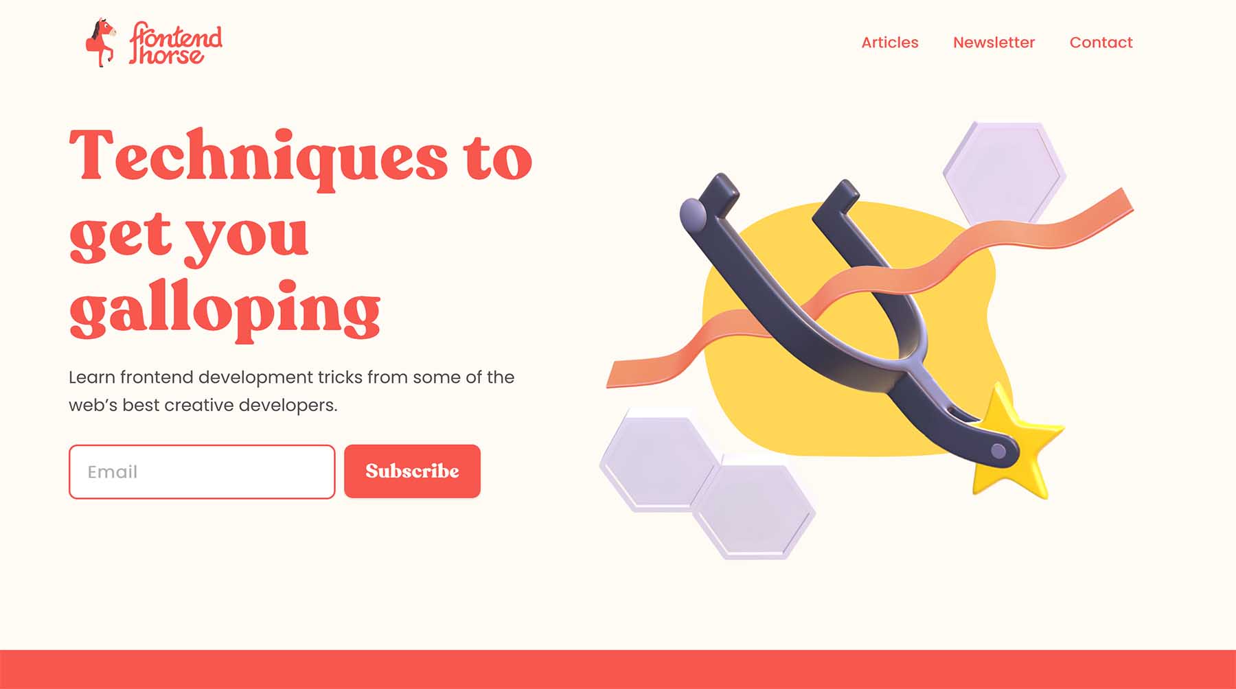
The Frontend Horse website has recently undergone a redesign, with some gorgeous illustrations. Each issue of the newsletter features an in-depth breakdown of a creative demo from the likes of Adam Kuhn, Andy Barefoot, Ilithya and more. I was honoured that Alex chose to feature my Weird Fishes demo in a recent issue!