This article was updated on 13 August 2020 to include additional reference material.
If you’re familiar with CSS, you probably know all about the box-shadow property. But did you know there is a CSS filter, drop-shadow, that does something similar? Like box-shadow, we can pass in values for x-offset, y-offset, blur radius and colour:
.my-element {
  filter: drop-shadow(0 0.2rem 0.25rem rgba(0, 0, 0, 0.2));
}
Unlike box-shadow, it doesn’t take a spread parameter (more on that later).
Why is drop-shadow useful?
If we have box-shadow, why do we need drop-shadow at all?
Non-rectangular shapes
Using drop-shadow allows us to add a shadow to an element that doesn’t correspond to its bounding box, but instead uses the element’s alpha mask. We could add a drop shadow to a transparent PNG or SVG logo, for instance.
img {
  filter: drop-shadow(0.35rem 0.35rem 0.4rem rgba(0, 0, 0, 0.5));
}
We can compare the effect of box-shadow versus drop-shadow:
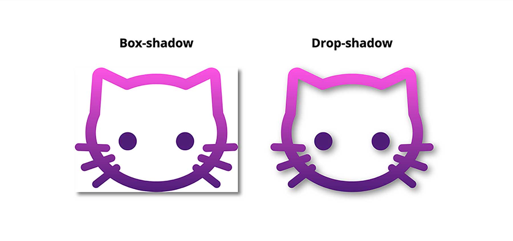
Using box-shadow gives us a rectangular shadow, even though the element has no background, while drop-shadow creates a shadow of the non-transparent parts of the image.
This will work whether the image is inline in the HTML (either as an inline SVG, or in <img> tag), or a CSS background image. That means we could also add a shadow to a gradient background. These shapes are created with background gradients, with the drop-shadow filter applied:
Clipped elements
If we clip or mask an element using clip-path or mask-image, any box-shadow we add will be clipped too - so it will be invisible if it’s outside of the clipped area.
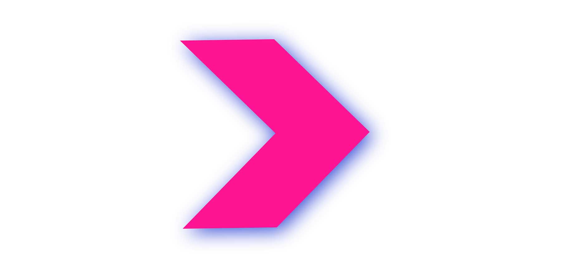
But we can create a drop shadow on the clipped element by applying the drop-shadow filter on the element’s parent. Pretty cool!
.parent-element {
	filter: drop-shadow(0.35rem 0.35rem 0.4rem rgba(0, 0, 0, 0.5));
}

.clipped-element {
	clip-path: polygon(0 0, 50% 0, 100% 50%, 50% 100%, 0 100%, , 50% 50%))
}
Grouped elements
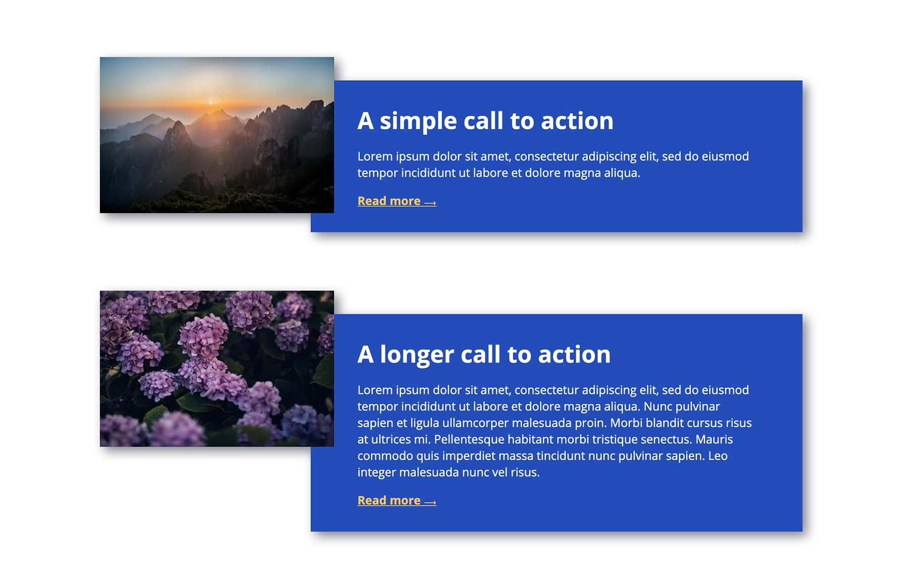
On occasion I’ve needed to build components made up of overlapping elements, which itself needs to cast a shadow.
If we add a box-shadow to the whole component, we’ll be left with strange empty spaces:
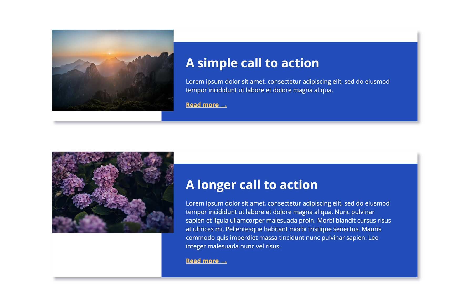
If we add a box-shadow to each element individually, then each one will cast its own shadow, which might not be the desired effect. We’d need to employ some clever CSS to hide those shadows where elements overlap.
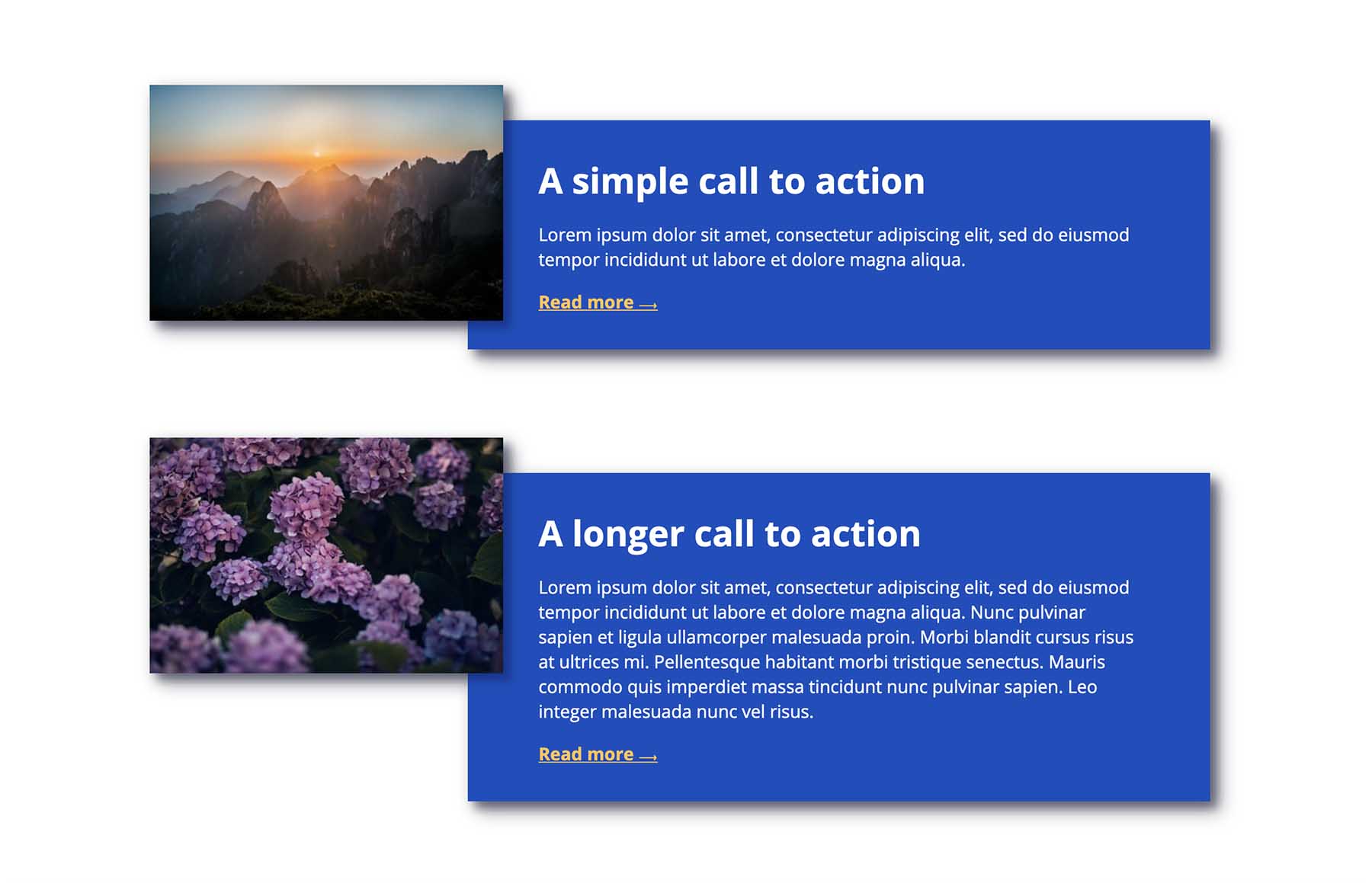
But by using drop-shadow on the whole component, we get the shadow exactly where we want it, without resorting to hacks:
Multiple drop shadows
Here’s a fun thing: You can use multiple drop shadows for some pretty cool effects! Check out the following demo.
(Side note: transitioning and animating CSS filters isn’t particularly performant, and it’s probably best to avoid animating this many filters at once in real projects. This one’s just for fun though!)
Limitations
As mentioned above, drop-shadow doesn’t include the spread parameter. This means we can’t currently use it to create an outline effect, which I think would be really useful. For example, if it was supported, we could use drop-shadow to create an outline on a gradient background, in the way we can with box-shadow on other elements.
Gotchas
drop-shadow doesn’t render the exact same shadow effect as box-shadow, even when given the same parameters. box-shadow tends to give a darker, heavier shadow than drop-shadow when the same values are used. I suspect this is something to do with CSS filters being based on SVG filter primitives. Whatever the case, you’ll likely need to compensate for the difference by adjusting your drop-shadow values somewhat.
Browser support
CSS filters (including drop-shadow) are supported in all modern browsers. I tend to use it as progressive enhancement, without the need for a workaround for older browsers, as it isn’t normally something that would affect the user experience in any significant way. But if you do need to provide alternative styling for older browsers, you could do so using a feature query, with a box-shadow fallback:
.my-element > * {
  box-shadow: 0 0.2rem 0.25rem rgba(0, 0, 0, 0.2);
}

@supports (filter: drop-shadow(0 0.2rem 0.25rem rgba(0, 0, 0, 0.2))) {
  .my-element {
    filter: drop-shadow(0 0.2rem 0.25rem rgba(0, 0, 0, 0.2));
  }

  .my-element > * {
    box-shadow: none;
  }
}
Conclusion
Despite having excellent support, the drop-shadow filter is highly under-utilised. I hope this article highlights some cases where it could save you hacking around with box-shadow – maybe you could use it in your next project!
Webmentions for this page
About webmentionsLikes: 0
Reposts: 0
Mentions: 8