Have you ever needed to build a UI where a caption needs to slide over an image on hover, revealing more content?
This is something I’ve been tasked with implementing in various ways throughout my career. It’s not too difficult to do: Use position: absolute to position the caption over the image, then transform it down, transitioning it back up on hover – not forgetting overflow-y: hidden on the containing element.
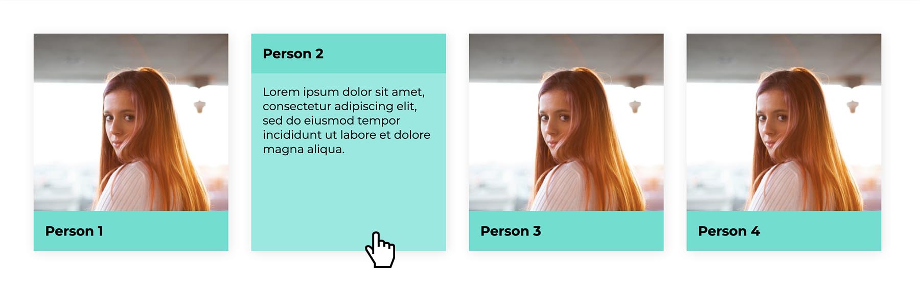
Here’s a simple implementation:
The difficulty comes in when the part of the overlay that needs to “peek” out over the image before hover is of indeterminate height. That could easily be the case if, say, you have a grid of team members, some of whom might have long names or job titles that wrap onto multiple lines.
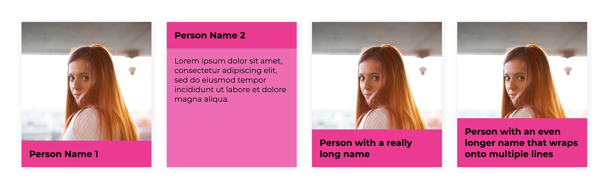
Transforming the overlay a fixed length could result in some of the text being clipped. You might resort to Javascript to detect the height of the caption titles and set the transform property accordingly. But we can solve this quite satisfactorily with CSS alone.
First we transform the entire overlay down by 100%:
.item {
  position: relative;
}

.item__overlay {
  position: absolute;
  width: 100%;
  height: 100%;
  top: 0;
  left: 0;
  transition: transform 300ms;
  transform: translate3d(0, 100%, 0);
}
We also transform the caption title – the part that will “peek” over the image – up by 100%. Now it peeks over as we want it to initially. Note, we’re also setting the transition property on both the overlay and the caption title with an equal duration, which will help the transition feel smooth:
.item__caption-title {
  transition: transform 300ms;
  transform: translate3d(0, -100%, 0);
}
We also need to set our hover and focus transition states. For these cards I’m using an absolute-positioned anchor link, to enable the whole card to be hovered. On hover, both the overlay and the caption title are set back to their original position. I’m also including focus styles, to ensure the caption can be toggled for non-mouse users:
.item__overlay a:hover ~ .item__overlay,
.item__overlay a:focus ~ .item__overlay,
.item__overlay a:hover ~ .item__overlay .item__caption-title,
.item__overlay a:focus ~ .item__overlay .item__caption-title {
  transform: translate3d(0, 0, 0);
}
This works pretty well already. But to add a finishing touch and make it feel just a little bit smoother, I like to transition the opacity of the caption body, adding a slight delay so that it only appears once the caption has transitioned most of the way in:
.item__body {
  opacity: 0;
  transition: opacity 500ms 100ms;
}

.item__overlay a:hover ~ .item__overlay .item__body,
.item__overlay a:focus ~ .item__overlay .item__body {
  transform: translate3d(0, 0, 0);
}
Here’s the demo with the complete example:
Webmentions for this page
About webmentionsLikes: 0
Reposts: 0
Mentions: 1