A little while ago, Ana Tudor created an impressive collection of halftone patterns using only CSS. As I had a little time to spare, I thought I’d dig into the code and see how it was done! Ana’s demos are made using Sass — what better way to learn than to try to produce similar effects using vanilla CSS?
Ana’s demo uses Houdini to animate the halftone background (only supported in Chromium browsers). For the purpose of this article we’re just going to be concentrating on the halftone pattern itself, rather than the animation.
What is halftone?
Halftone is defined as a reproduction of an image in which dark and light variations in tone are produced by variously sized dots. It was originally invented as a technique for printing images in journals and other publications at a time when other printing processes were prohibitively expensive. You might have come across the style in older comic books, where colour reproduction was limited.
Halftone in CSS
It’s simple enough to produce a dotted background in CSS by using radial-gradient(). But for a halftone effect, we need some variation in the size of the dots in order to depict an image or pattern.
To get this effect, we need three essential ingredients:
- A repeating background, using
radial-gradient. - A mask, which will be the image or pattern we want to reproduce.
- The secret weapon: the contrast filter. We’re going to take our radial gradient background and turn the contrast up high. The effect when combined with the mask is where the magic happens.
Simple dotted background
Let’s start with a simple dotted background, made with radial-gradient(). First let’s define the gradient. Instead of a smooth gradient where one colour blends into another, we’re using hard stops, so the colour goes from black to transparent without any blending. That’s how we get a circle with a smooth edge.
.halftone {
  background: radial-gradient(circle at center, black 0.25rem, transparent 0);
}
We’ll have just a single circle at this point. If we change the background size to something smaller, we’ll instead get a repeating dotted pattern. We can use background-repeat: round to ensure the dots won’t be clipped, and we’ll position our background in the centre. I prefer to use separate properties as it’s easier to read, but you can use the background shorthand.
.halftone {
background-image: radial-gradient(
circle at center,
black 0.25rem,
transparent 0
);
background-size: 1rem 1rem;
background-repeat: round;
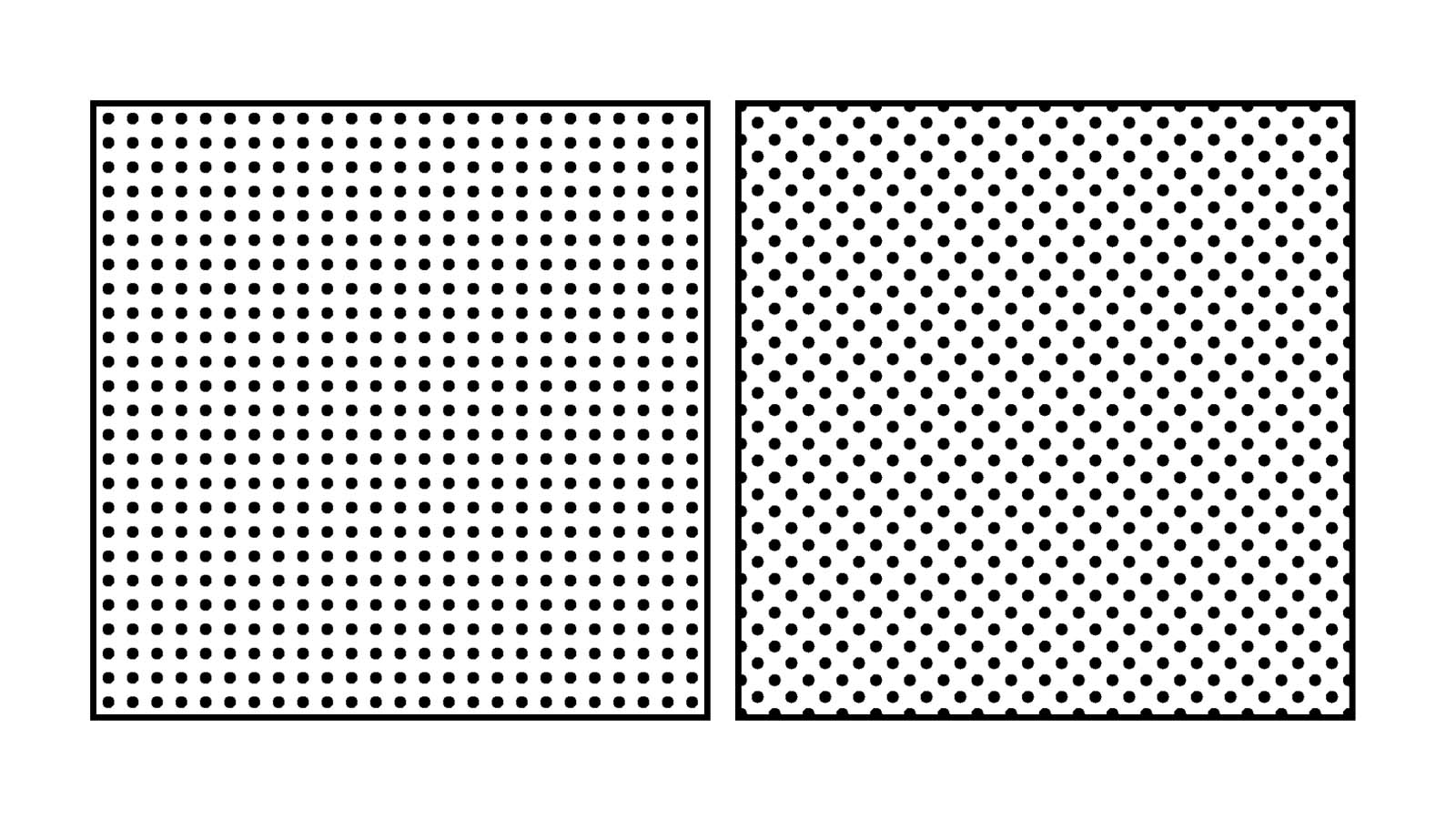
}This gives us a straightforward dotted grid. If we want an angled grid instead we could use two gradients overlaid, as long as the second colour is transparent (otherwise we wouldn’t see the gradient below).
.halftone {
  background-image: radial-gradient(
      circle at center,
      black 0.25rem,
      transparent 0
    ), radial-gradient(circle at center, black 0.25rem, transparent 0);
  background-size: 1.3rem 1.3rem;
  background-position: 0 0, 0.65rem 0.65rem;
}
The result is subtly different.
We’re repeating several values here, so we could make our code a bit more concise (and readable) using custom properties:
.halftone {
  --dotSize: 0.25rem;
  --bgSize: 1.35rem;
  --bgPosition: calc(var(--bgSize) / 2);

  background-image: radial-gradient(
      circle at center,
      black var(--dotSize),
      transparent 0
    ), radial-gradient(circle at center, black var(--dotSize), transparent 0);
  background-size: var(--bgSize) var(--bgSize);
  background-position: 0 0, var(--bgPosition) var(--bgPosition);
}
Using custom properties means it’ll be much easier to adjust individual values later on, as we refine our halftone pattern: we’ll have just one place to update them, instead of a bunch of places.
Masking
To create a halftone pattern we’ll need to move our background properties to a pseudo-element. This is because shortly we’re going to apply a contrast filter to the element itself.
.halftone {
  --dotSize: 0.25rem;
  --stop1: 3%;
  --stop2: 60%;
}

.halftone::after {
  /* Cover our element */
  content: '';
  position: absolute;
  inset: 0;

  /* Dotted background */
  background-image: radial-gradient(
    circle at center,
    black var(--dotSize),
    transparent 0
  );
  background-size: 1.3rem 1.3rem;
  background-position: 0 0, 0.65rem 0.65rem;
}
The next step in creating our halftone pattern is to add a mask. To start with, we’ll use a simple linear gradient, fading black to transparent from top to bottom.
.halftone::after {
  mask-image: linear-gradient(rgb(0 0 0), rgb(0 0 0 / 0));
}
(Older versions of Safari require prefixed mask properties, e.g. -webkit-mask-image. I’m excluding them here for brevity.)
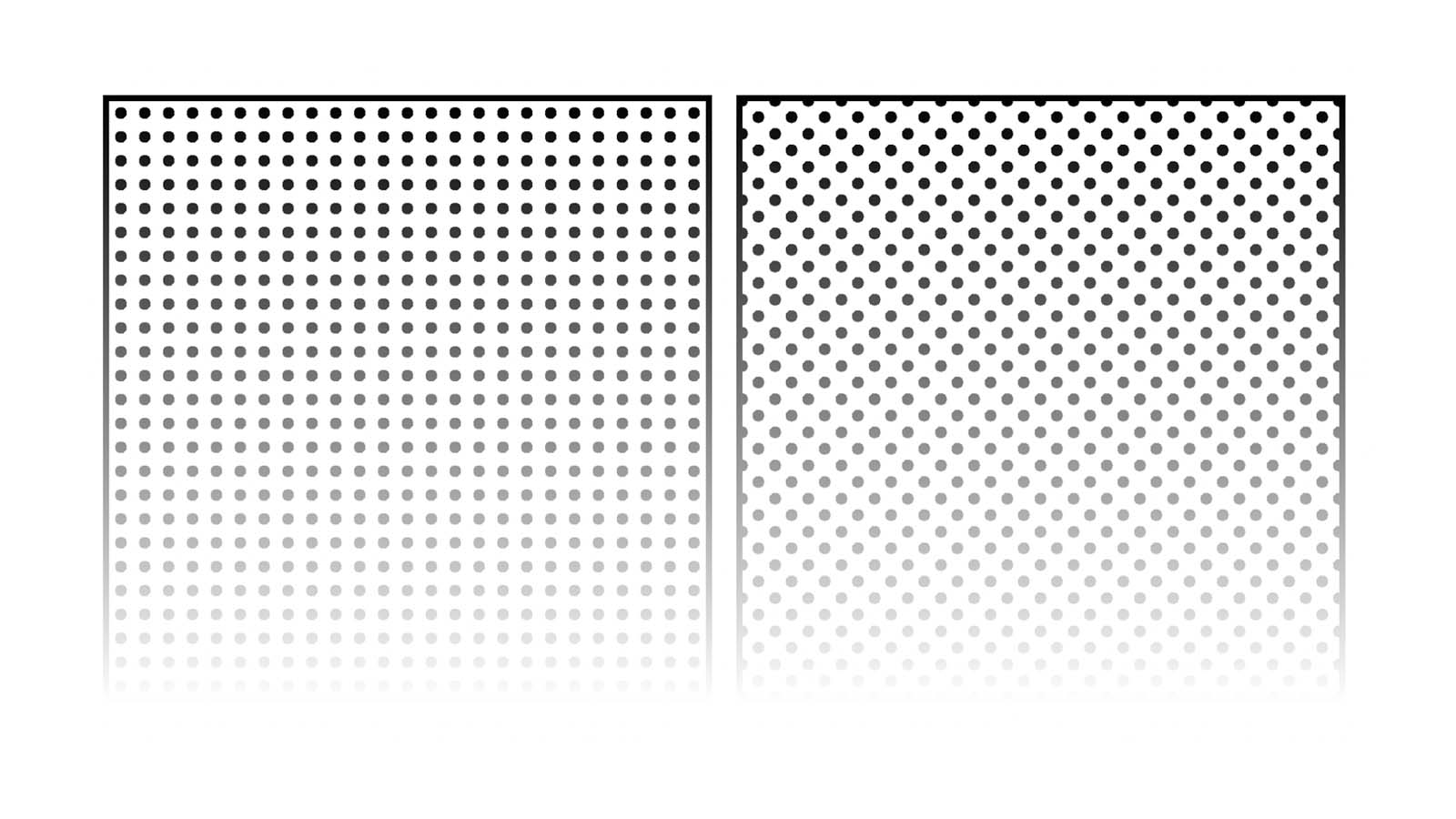
Applying the mask doesn’t result in a halftone pattern, as the dots are all the same size — they simply appear to become more transparent from top to bottom. We’ll need to revisit our background pattern to change that.
Blurring the background
Instead of using hard stops for our radial gradient background, we’re going to give them smooth edges by fading them, more like a typical gradient. We’ll need two stops: the point at which the black begins to fade (--stop1) and the point at which it should be fully transparent (--stop2). The exact values don’t matter too much for now, as we can always adjust them later — again, custom properties make it easy to do this.
.halftone {
  --stop1: 0.06rem;
  --stop2: 0.65rem;
}

.halftone::after {
  background-image: radial-gradient(
    circle at center,
    black var(--stop1),
    transparent var(--stop2)
  );
}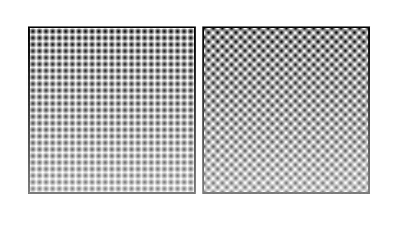
You’ll notice now that our background now looks nothing like a halftone. But it’ll all come together in the final step.
Adding contrast
Lastly, we add a contrast filter to our element (not the pseudo-element). A background colour is also crucial, otherwise we won’t see the contrast.
.halftone {
  background: white;
  filter: contrast(50);
}
The goal here is to add enough contrast so that our radial gradient background no longer appears blurred, but starts to resemble the dotted pattern we had originally — except now you should notice that the dots vary in size, depending on to what degree they are masked by the linear gradient. If you don’t see much contrast at this point, try adjusting the values of the radial gradient stops (in the previous step). The larger the difference between --stop and --stop3, the greater the variation in dot size.
The faded effect is currently a little abrupt, so let’s adjust the mask to fade to a less transparent value: about 0.5 on the alpha channel should do it, ensuring we don’t end up with some areas with no dots at all.
.halftone::after {
  mask-image: linear-gradient(rgb(0 0 0), rgb(0 0 0 / 0.5));
}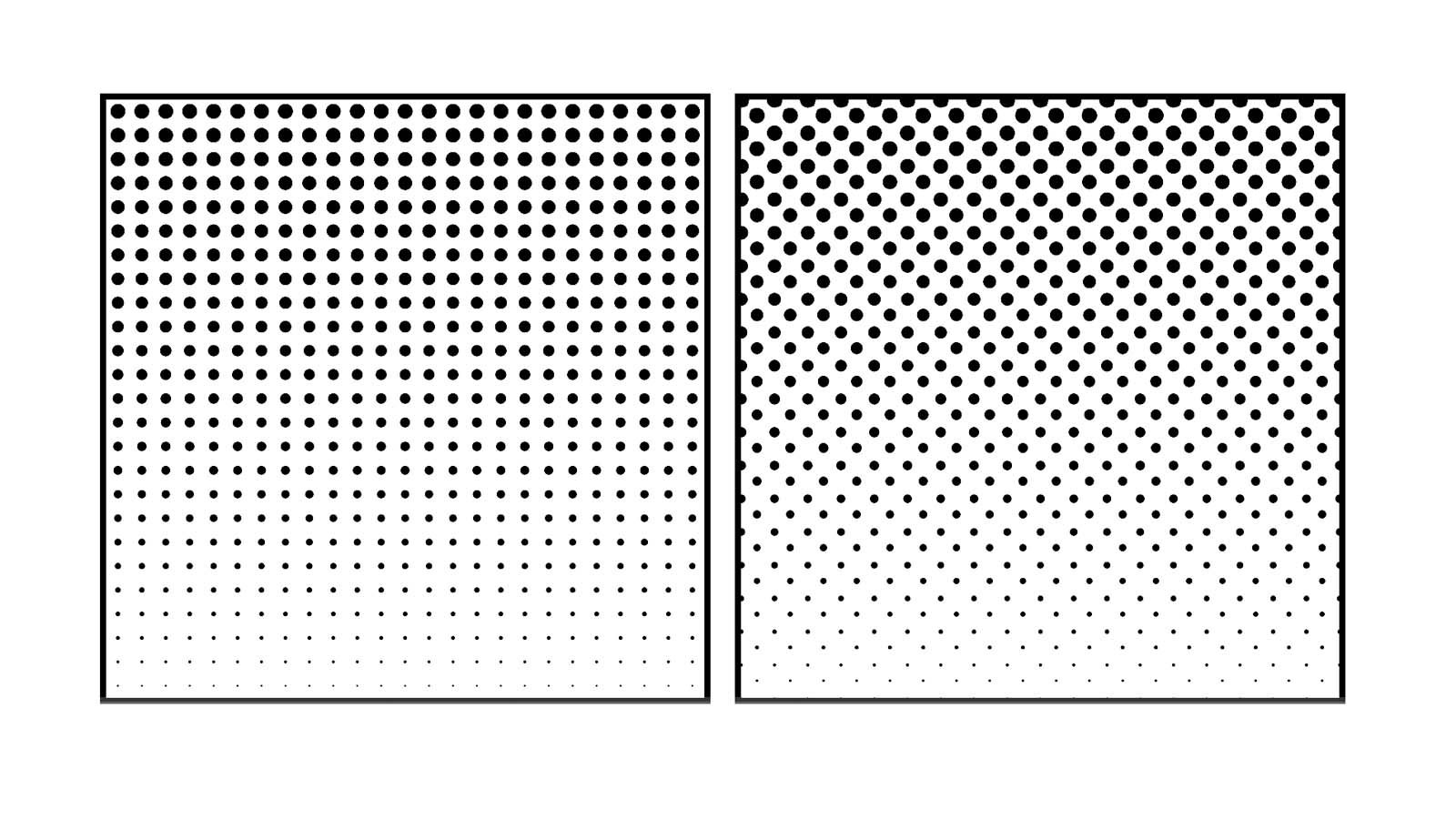
Here’s the full demo.
See the Pen Simple halftone backgrounds by Michelle Barker (@michellebarker) on CodePen.
Colouring the background with blend modes
We now have a black and white halftone pattern, but we might want to add some colour. There’s one problem: changing the background colour of our element will result in a distorted effect, because of the contrast filter. (Try changing the background value of the .halftone class in the above demo to a light colour to see the problem.)
We can get around this by using mix-blend-mode. Let’s add a background to our body. (We could alternatively wrap each element, as Ana does in her demo.)
body {
  background: linear-gradient(45deg, red, blue);
}
Then we’ll apply the multiply blend mode to the halftone element. This will result in the white areas being rendered transparent, while the dots remain black. The screen blend mode has the opposite effect: the white background is preserved, and the black dots will instead show the background beneath.
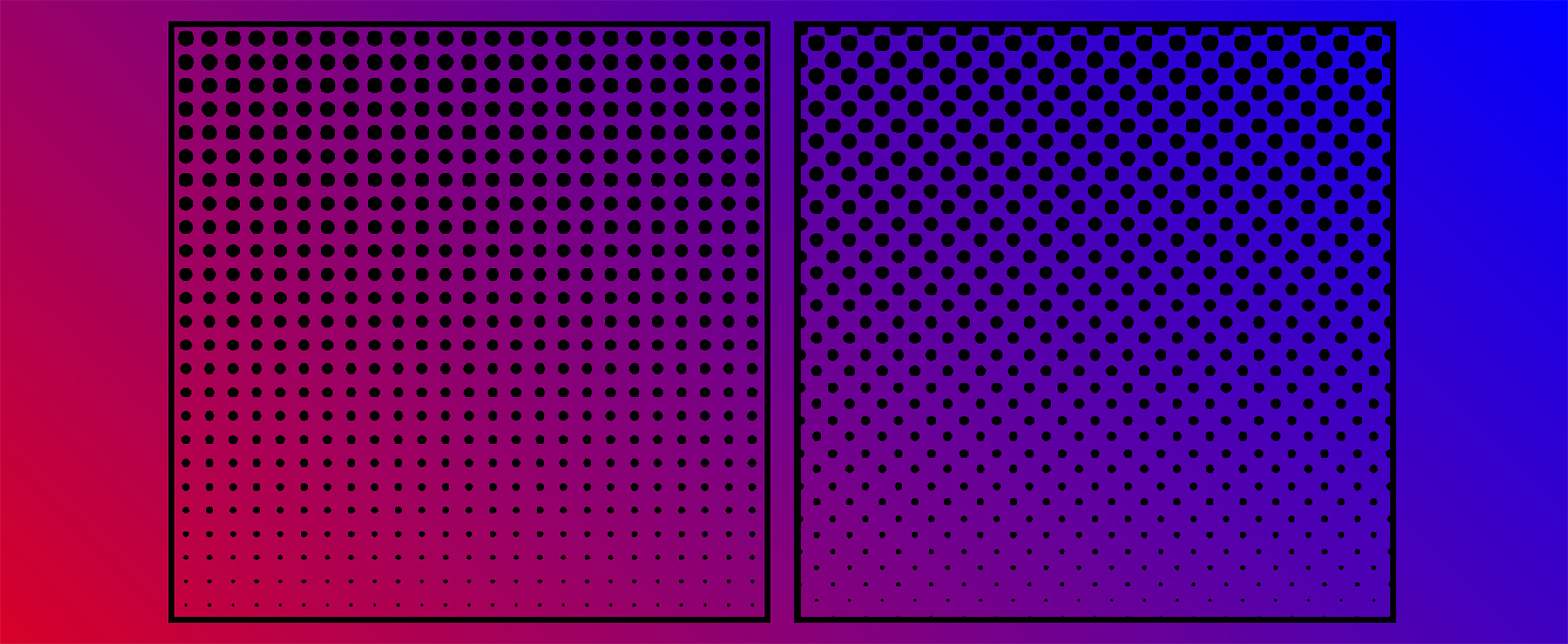
multiply blend mode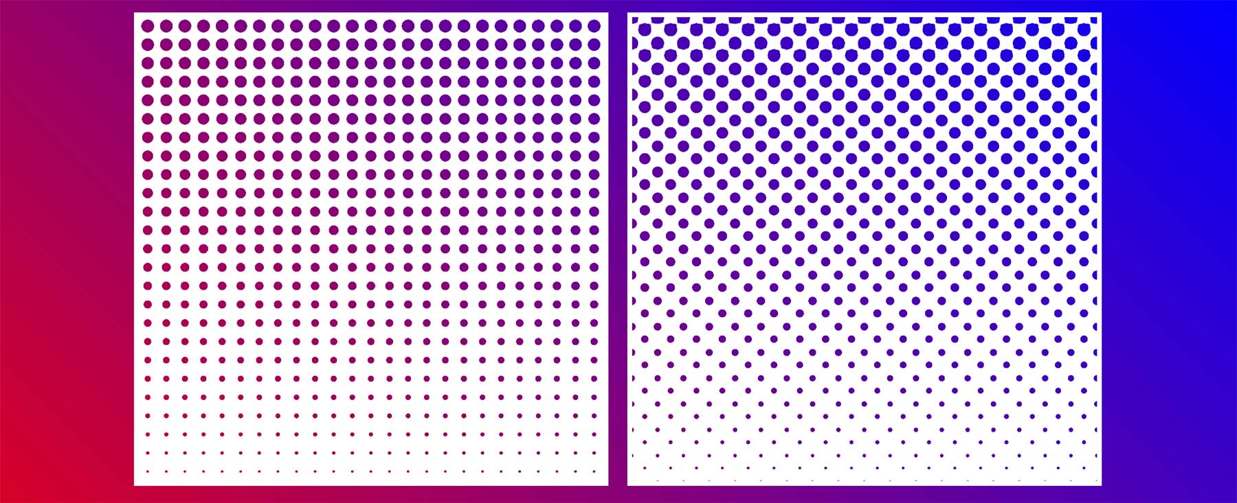
screen blend modeWe could alternatively render a black background with the dots the colour of the background, by inverting the colours of the backgrounds. We can either switch these colours from black to white (and vice versa), or we could use the invert filter, as I’m doing here.
.halftone {
  filter: contrast(50) invert(var(--invert, 0));
}

.halftone--inverted {
  --invert: 1;
}
This demo shows the different effects produced by different combinations of blend modes and the invert filter.
See the Pen Halftone background with blend modes by Michelle Barker (@michellebarker) on CodePen.
Different mask effects
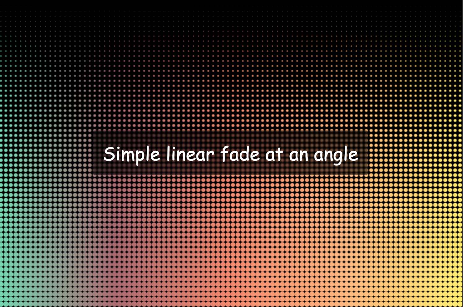
We’re using a simple linear gradient as a mask, but there are endless possibilities for interesting, creative effects. We could use radial gradients, conic gradients, repeating gradients (or a combination!). We can use images too: Either SVGs or transparent PNGs. This demo shows a few different effects. You can also adjust a few custom properties using the controls to explore some different options.
See the Pen Halftone pattern explorer by Michelle Barker (@michellebarker) on CodePen.
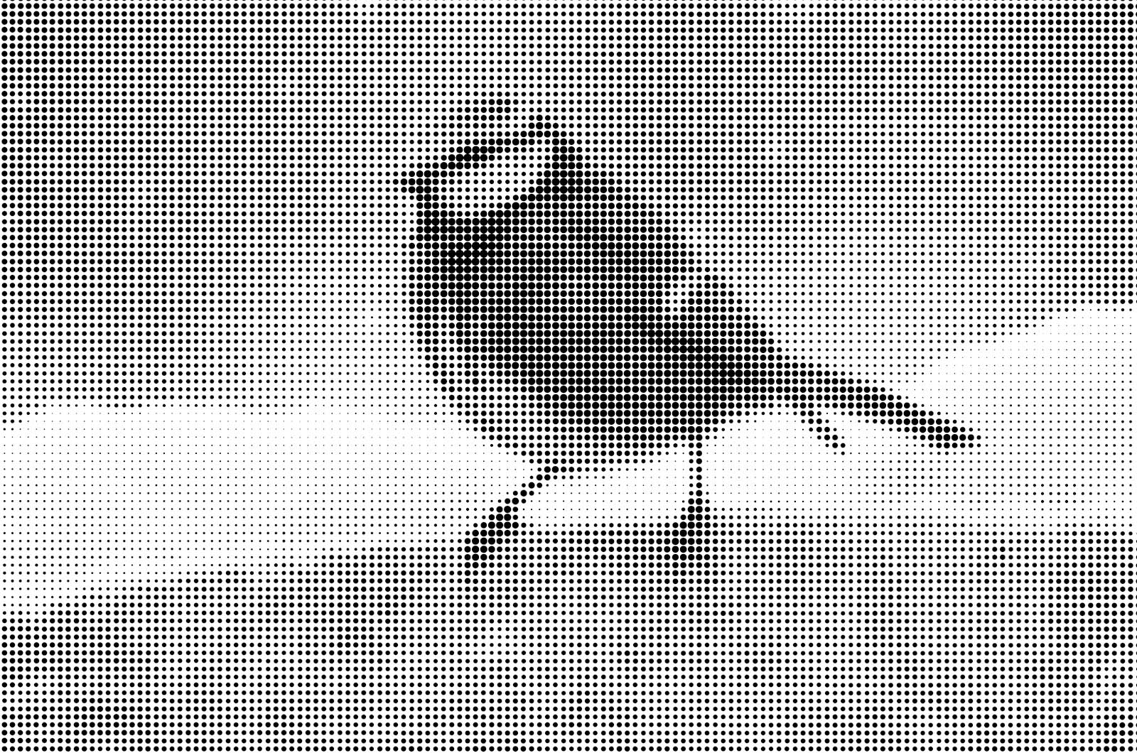
Ana has another demo that applies a halftone treatment to non-transparent images. We’re not going to walk through it here, but it’s another intriguing one to study!
Limitations
Because we’re using a filter and blend mode, either our dots or the background ideally need to be white or black. If we try applying a different colour we’re not always going to get the result we hope for, as the colour will be distorted. Perhaps there’s another way to do it? Still, it’s interesting to know we can create these kind of effects with only CSS!
Webmentions for this page
About webmentionsLikes: 38
Reposts: 7
Mentions: 1