Last month I had the priviledge of giving a talk at Vienna Calling, the online meetup organised by CSS-In-Vienna and Webclerks. Alongside fantastic talks by Cassie, Andy, Ramón and Carie, I spoke about how I built a recent Codepen demo, the Zig-Zag Gradient Lab:
You can watch the full talk here, or read the transcript (including some slides and code examples) below.
https://www.youtube.com/embed/-7t1pg0ENLY
Transcript
Hi, I’m Michelle, I’m a front end developer, and my main hobby is messing about with CSS on Codepen and creating pointless demos. I assume that most of you know what Codepen is, but if you don’t, it’s a front end playground where you can go all out making fun things without worrying about clients, or browser support, all the things we love about our jobs. Today I want to tell you the story of how I created a recent Codepen demo...and it all starts with gradients.
A lot of people have been redesigning their personal websites recently. Cassie is one of them – if you haven’t seen her personal site, it’s incredible, go and check it out. And this inspired me, I started thinking about ways I could redesign my personal site and bring a bit more creativity, a bit more personality. And one of the ways I thought about doing this was using background gradients in CSS to make some geometric patterns.
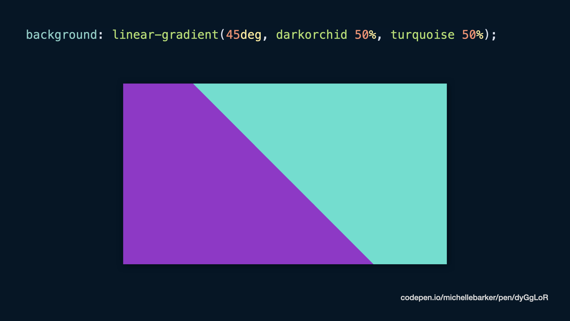
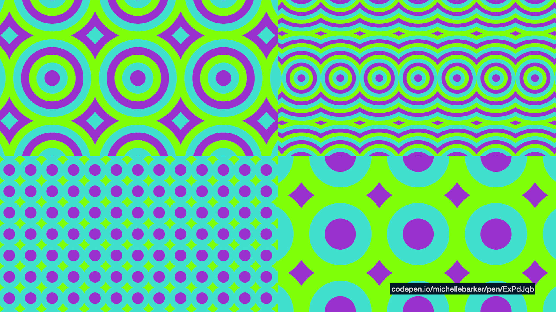
You might already know that you can create clean lines with CSS gradients by using hard colour stops. So if we want to transition between one colour and another without a fade you can use two consecutive colour stops with the same value. (Fig 01)
.element {
  background: linear-gradient(45deg, darkorchid 50%, turquoise 50%);
}
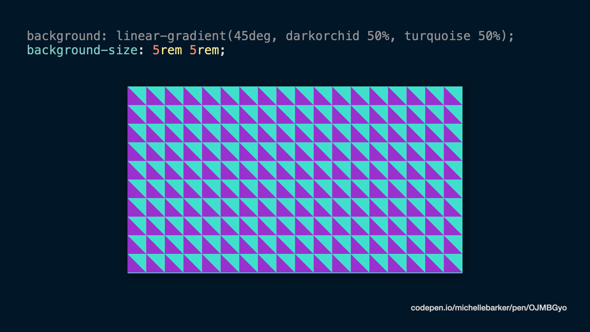
If we set the background-size to a fixed value, then that gradient pattern is going to repeat, and cover our background. (Fig 02)
.element {
  background: linear-gradient(45deg, darkorchid 50%, turquoise 50%);
  background-size: 5rem 5rem;
}
We could do a similar thing with radial gradients to created a spotted pattern. Or we could overlay multiple backgrounds [to make more complex patterns]. This demo uses multiple gradient backgrounds:
So you can get really creative and make some cool patterns just with gradients.
Repeating gradients
Using repeating gradients also allow us to produce some really cool effects. So we could have a striped background, with three colours, which just repeats, we don’t have to set every stripe.
.element {
background: repeating-linear-gradient(
45deg,
darkorchid,
darkorchid 40px,
turquoise 40px,
turquoise 80px,
chartreuse 80px,
chartreuse 120px
);
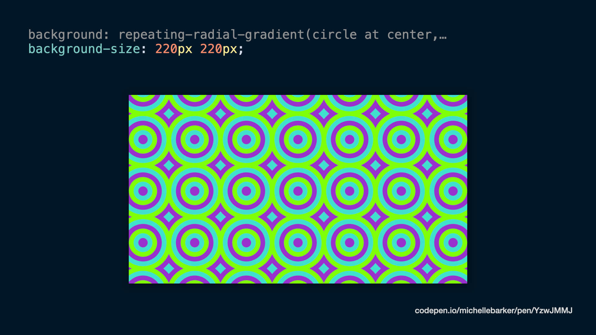
}Or we could use repeating-radial-gradient, which gives us these concentric circles.
.element {
  background: repeating-radial-gradient(
    circle at center,
    darkorchid,
    darkorchid 40px,
    turquoise 40px,
    turquoise 80px,
    chartreuse 80px,
    chartreuse 120px
  );
}
Setting a fixed size again gives us some pretty cool effects – our stripes join together, and we get this interesting pattern. (Fig 03)
And different variations in the background size and the thickness of the stripes produce different patterns. (Fig 04)
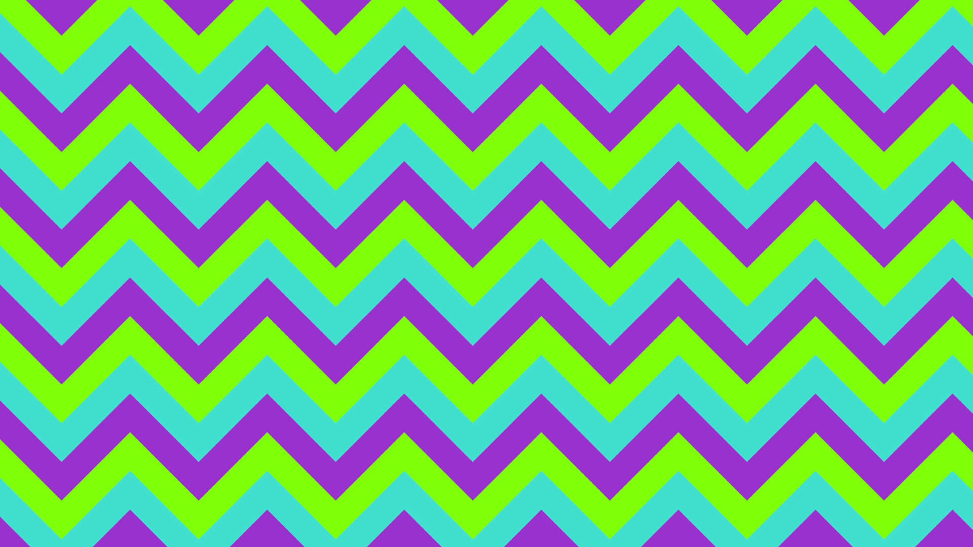
So far so good, there are lots of cool ways I can create geometric patterned backgrounds for my personal site. But there’s one thing I’m really good at, and that’s procrastination! I still haven’t even started my personal site. But I thought to myself, “I’d quite like to create a zig-zag background pattern”. And I figured someone, somewhere has already done this, but this is a learning exercise – I wanted to work out how I would do it, and then see if there was a better way. So how would I do it?
Creating a zig-zag gradient pattern
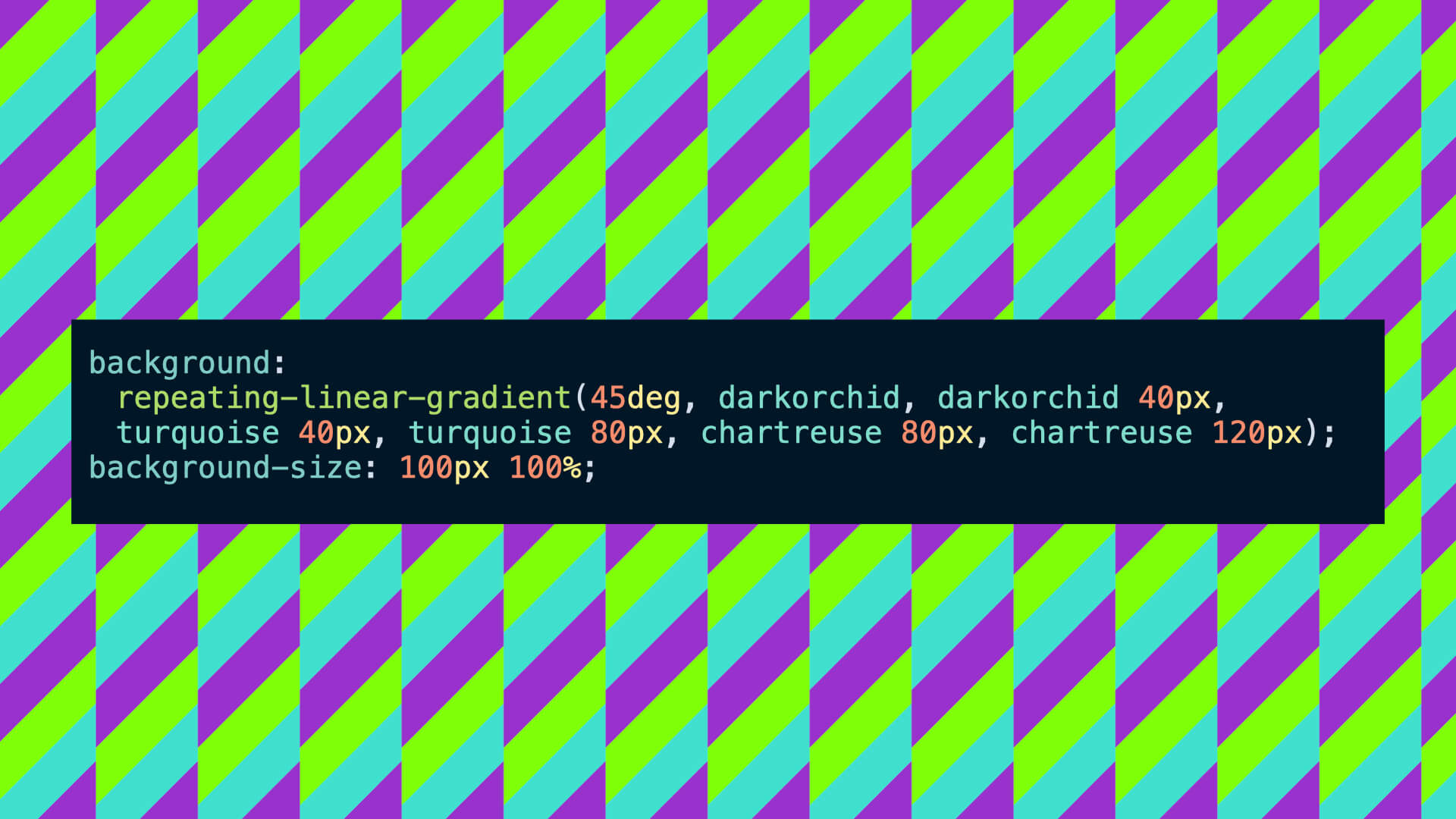
I started off creating a striped background with a 45 degree angle and a fixed background size, so we get this kind of candy stripe pattern. (Fig 05)
.element {
  background: repeating-linear-gradient(
    45deg,
    darkorchid,
    darkorchid 40px,
    turquoise 40px,
    turquoise 80px,
    chartreuse 80px,
    chartreuse 120px
  );
  background-size: 100px 100%;
}
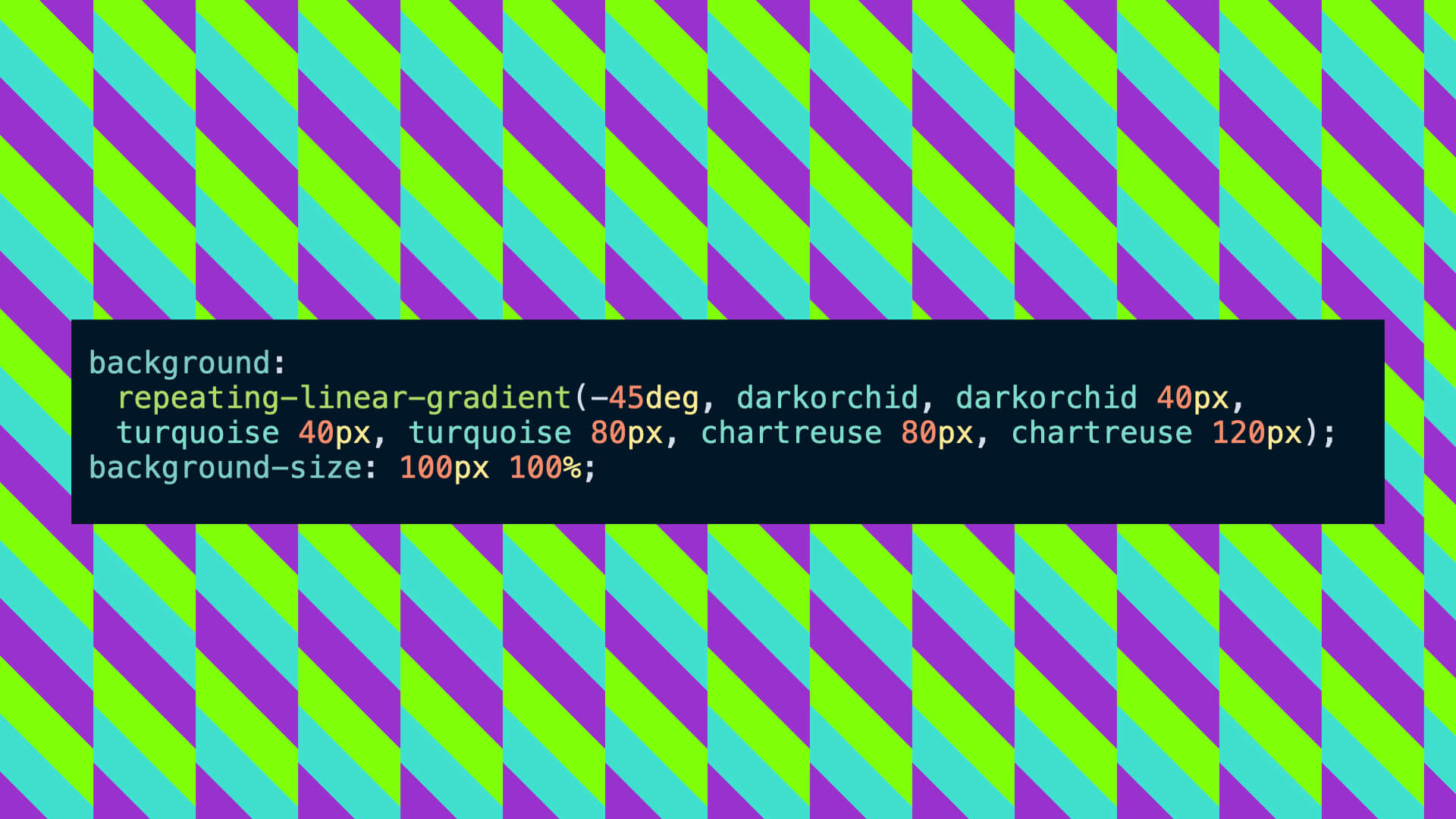
Then I used an absolute-positioned pseudo-element with the same background at the opposite angle. (Fig 06)
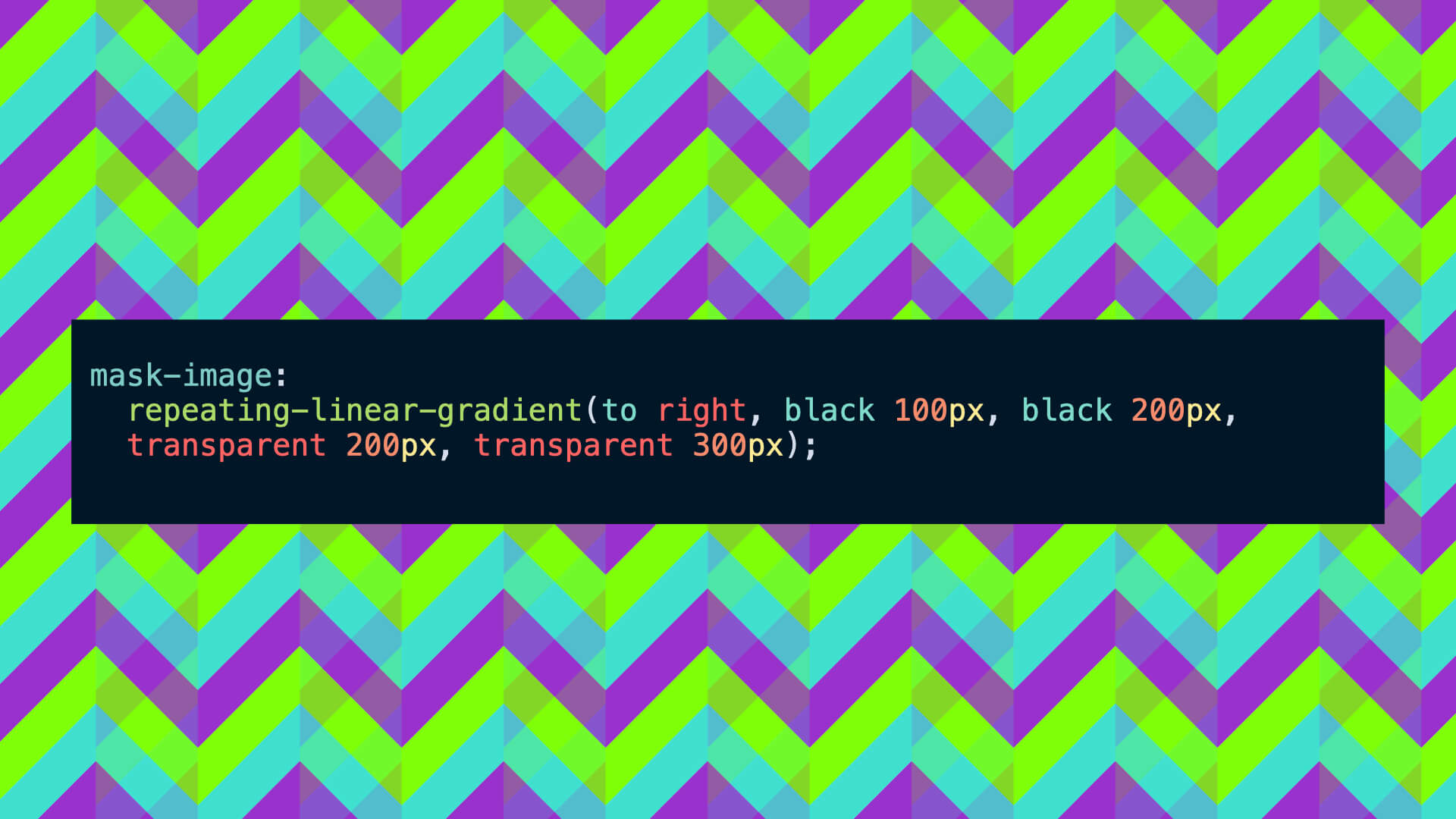
Then I used the mask-image property with a repeating linear gradient to mask the pseudo element with vertical stripes,so the original element is visible through the pseudo element. I’ve left a bit of an overlay [in this image] so you can see where those hidden stripes would be. (Fig 07)
.element {
  mask-image: repeating-linear-gradient(
    to right,
    black 100px,
    black 200px,
    transparent 200px,
    transparent 300px
  );
}
This is the actual result. (Fig 08)
Alternative solutions
Now, I don’t completely love this solution, as is uses a pseudo-element – I kind of wanted this to be possible with a single element background. I did a bit of searching to see if anyone had a solution that was better than mine, and one of the results that came up was Lea Verou’s CSS Patterns Gallery, from a few years back. Of course, if anyone has a solution to this, it’s Lea Verou. And there is a zig-zag pattern on the site, but with one crucial difference: it’s only two colours. I wanted my pattern to be three or more colours. I searched a bit more, but I couldn’t find an example anywhere that was more than two colours. That’s not to say it isn’t possible, but figuring it out was a bit more than my tiny brain can handle. So I decided to stick with my solution for now.
Custom properties
So, once I had my zig-zag gradient, I wanted to experiment a bit with colours, the thickness of the stripes, and the size of the zig-zags. Enter custom properties. CSS custom properties are among my favourite things in CSS – I use them in so many places. They are perfect for when you have a value repeating in a number of places, and you just want to tweak that value and have it update everywhere. So I can replace the gradient stops with a custom property, which represents the thickness of the stripes, and another that represents the background width. I need to do this in the pseudo-element too, but for brevity I’m not showing all the code here.
.element {
  --t: 40px;
  --w: 100px;

  background: repeating-linear-gradient(
    45deg,
    darkorchid,
    darkorchid var(--t),
    turquoise var(--t),
    turquoise calc(var(--t) * 2),
    chartreuse calc(var(--t) * 2),
    chartreuse calc(var(--t) * 3)
  );
  background-size: var(--w) 100%;
}
I can just update that value to get different outcomes without changing anything else in the code. (Fig 9)
.element {
  --t: 20px;
  --w: 120px;
}
And we can replace some other values with custom properties too. We can adjust the angle of the zig-zags [for example], by tweaking a single custom property.
.element {
  --t: 40px;
  --w: 40px;
  --angle: 40deg;

  background: repeating-linear-gradient(
    var(--angle),
    darkorchid,
    darkorchid var(--t),
    turquoise var(--t),
    turquoise calc(var(--t) * 2),
    chartreuse calc(var(--t) * 2),
    chartreuse calc(var(--t) * 3)
  );
  background-size: var(--w) 100%;
}
These values are needed for the initial element’s background and the pseudo element, but by setting a custom property I only need to change it in one place, because the pseudo element will inherit the new value.
So we can update those custom properties and have an infinite number of variations, but what would be even cooler than that? If we could edit those values with a GUI and have our gradient pattern change before our eyes.
Well, if we add some inputs and a bit of Javascript, then we can! With these range sliders, I can update the custom property every time the value changes (see demo). This is ok, because the sliders have a step increment of 1, but the change is not that smooth because unfortunately gradients are not animatable within CSS.
Houdini
But, not so fast! We can animate custom properties using Houdini. I always struggle to explain exactly what Houdini is, so I’m going to quote right off MDN:
Houdini is a set of low-level APIs that exposes parts of the CSS engine, giving developers the power to extend CSS by hooking into the styling and layout process of a browser’s rendering engine
Houdini consists of a bunch of APIs, but the one that’s important for us here is the Properties & Values API. That allows us to register the property in Javascript and then animate or transition that custom property in exactly the same way you would a normal animatable CSS property.
transition: --angle 200ms, --t 200ms, --w 200ms;And that makes that gradient transition much smoother. Support is currently limited to Chromium browsers, so it’s not going to work in Firefox or Safari. This website tells you how well supported the different APIs are. But in Chrome, the gradient transition is just that little bit nicer.
Colour
There’s one part that I haven’t really covered yet, and that’s the colour. I could have three colour inputs and allow users to fully customise the colour of the gradient stripes. But I quite liked the idea of users being able to adjust the colour via a slider, rather than dropdown or colour pickers, that seemed a little clunky.
I like to use HSL when I’m working with custom properties and colour. HSL stands for Hue Saturation Lightness. HSL is really nice to work with using custom properties because it allows you to tweak colour values really easily. In the gradient lab I’m using a custom property for the hue value – the first value in the HSL function:
.element {
  --color1: hsl(var(--h1), 90%, 50%);
}
The user can select the primary hue using the slider, and the two other hues are calculated as adjacent colours from the opposite side of the colour wheel. (Fig 10)
.element {
  --h1: 0deg;
  --h2: calc(var(--h1) + calc(180deg - 30deg));
  --h3: calc(var(--h1) + calc(180deg + 30deg));

  --color1: hsl(var(--h1), 90%, 50%);
  --color2: hsl(var(--h2), 90%, var(--l, 70%));
  --color3: hsl(var(--h3), 60%, var(--d, 40%));
}
That’s known as a split complementary colour scheme. So if the user changes the primary hue using the slider, those other two colours are adjusted accordingly.
Incidentally, the colour wheel illustration is built with CSS gradients and custom properties too!
Storing the values
Lastly, it would be pretty useful if, once we have a gradient we like, it didn’t reset the moment we navigate away from the page, or close our browser window. We can use localStorage to store the values locally in the user’s browser:
localStorage.setItem('angle', '45')Then retrieve them and apply them as soon as the page is loaded:
localStorage.getItem('angle')So that’s the story of how I made this little tool. I don’t know if anyone will use it for anything real, but it was fun to make and has given me lots of inspiration for my personal site.