My son was recently tasked with the responsibility of looking after his pre-school class teddy bear for the week, which comes with the obligation to take said teddy bear out on adventures and add your memories to a scrapbook. I quite enjoyed creating this scrapbook layout, and it got me thinking about how I would build something like this with CSS Grid!

Compound grids
Andy Clarke delivered a fantastic talk, Inspired by CSS Grid at this State of the Browser conference, which was really illuminating for someone like me, a developer with design roots. In it he talked about ways in which ideas from print design can be applied to the web to create striking layouts, and how CSS Grid makes it not only possible, but much more straightforward than ever before. One of those principles was using compound grids.
Most of us are probably familiar with using grids in some way for web design and development. Virtually all website designs I’ve been handed to build have hung on a standard 12-column (or occasionally 24-column!) grid, with all columns an equal width. So far, so predictable.
Compound grids, on the other hand, are created by layering two or more grids. Juxtapositions such as a 5-column grid superimposed onto a 4-column grid produce rhythmic patterns, and open up more dynamic layout possibilities than a regular grid.
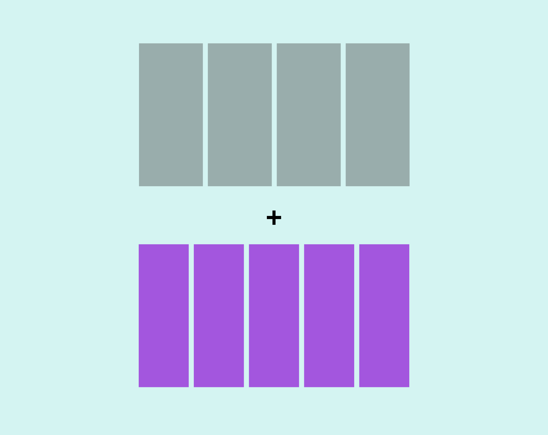
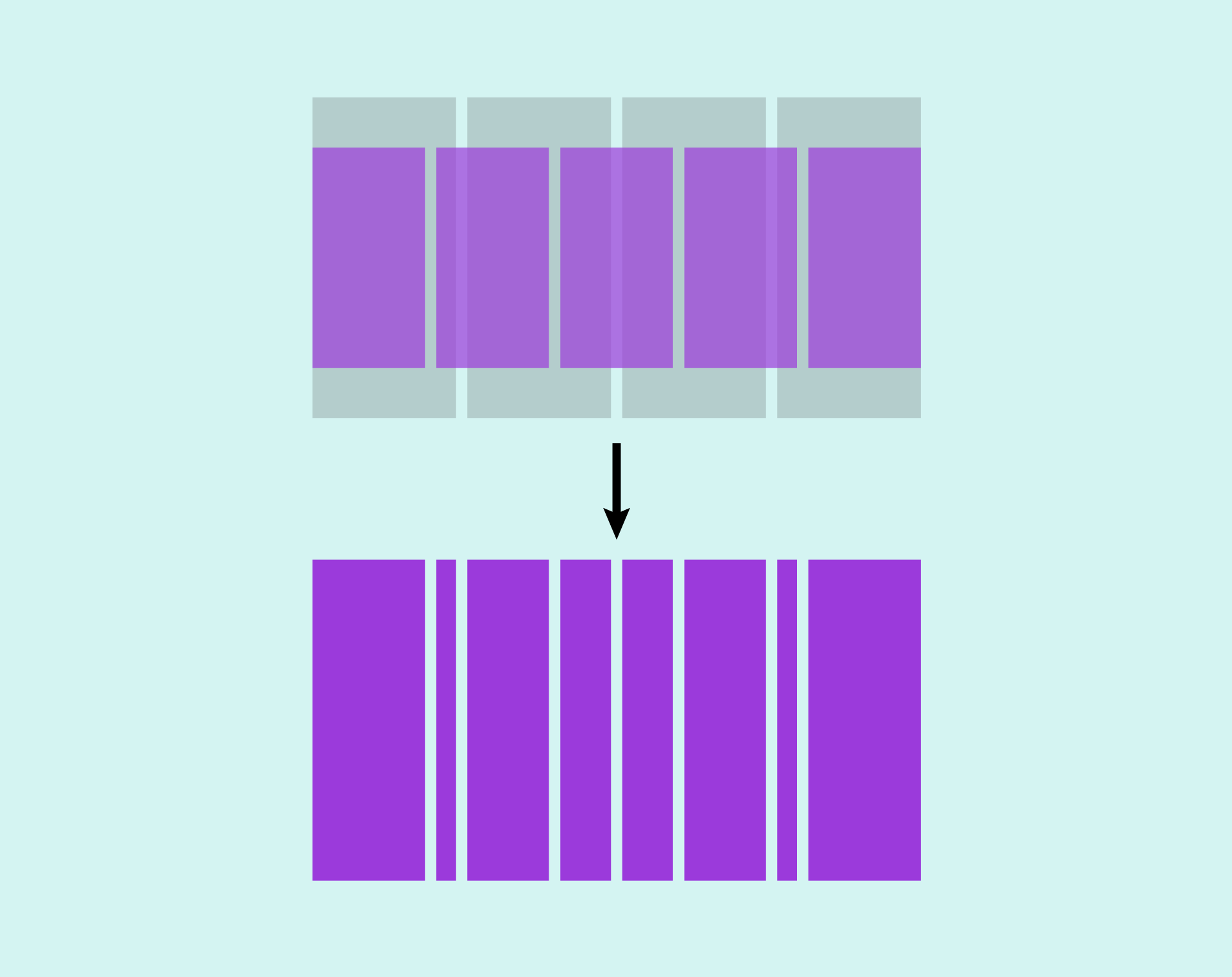
This applies from a psychological as well as a technical point-of-view – it’s perfectly possibly to built a very ordinary layout despite using a compound grid, but something about having a more interesting grid to work with encourages the creative juices to flow! Andy has written a detailed article, Inspired Design Decisions: Pressing Matters, which explains compound grids (and more) in-depth. His talk from State of the Browser is also available to watch.
Building a compound grid generator
Compound grids translate really well to CSS Grid, as using fr units makes them very simple to implement. I love the idea of using compound grids in web design, but I felt the process of calculating them (especially the more complex the grid) could be a hindrance. I wanted a way to generate compound grids on demand so, inspired by Andy’s talk, I rolled up my sleeves and built a little tool to generate and visualise compound grids. Enter the number of columns for two different grids (with 10 columns as a maximum for any one grid) and the generator combines them, spitting out a resulting value which can be used in the grid-template-columns property using CSS Grid. For example, a grid with four columns plus a grid with five columns will generate the value 4fr 1fr 3fr 2fr 2fr 3fr 1fr 4fr.
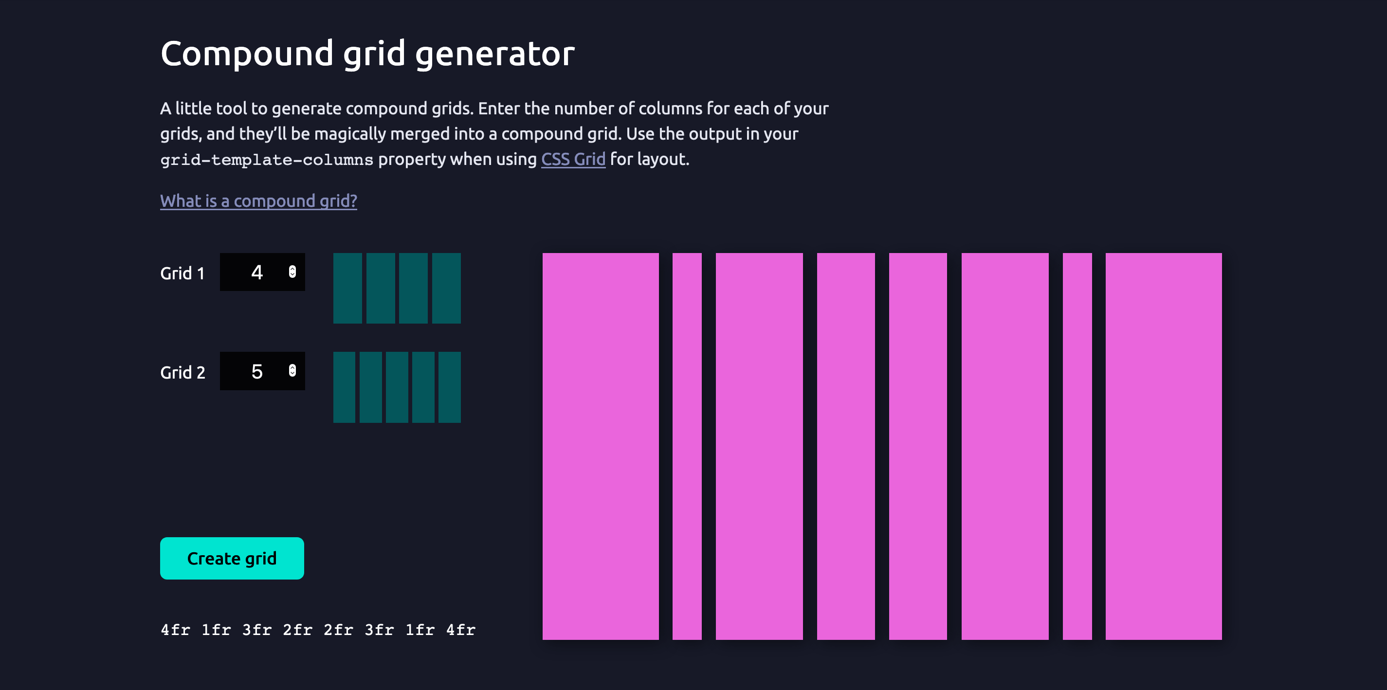
This tool is on Codepen, so feel free to use it or adapt it to suit your needs.
Creating the grid for a scrapbook layout
A compound grid is ideal for a scrapbook layout, where I wanted the layout to feel slightly unpredictable and haphazard but still maintain a sense of rhythm and balance. After a bit of experimentation with the compound grid generator, I settled on a 6/5 compound grid, which I felt gave me a good number of columns to play around with. That gives me an initial grid to work with:
.grid {
  display: grid;
  grid-template-columns: 5fr 1fr 4fr 2fr 3fr 3fr 2fr 4fr 1fr 5fr;
  gap: 1rem;
}
Defining grid rows
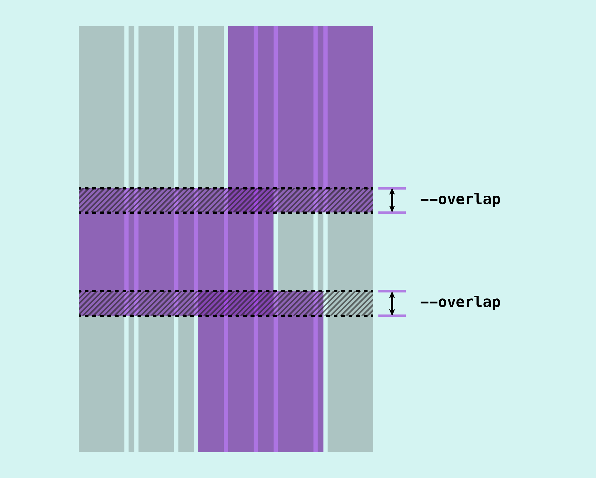
Defining the grid rows was trickier, and required a bit more trial-and-error. Each photo in the grid needs to overlap another. It was helpful to roughly draw the grid out on paper to understand how many rows I would need.
To maintain a sense of vertical rhythm, I decided the photos should each overlap by the same amount. I assigned this amount to a custom property so that it could be used thoughout the page and updated if necessary (Fig 4).
.grid {
  --verticalPadding: 2rem;
  --overlap: 6rem;
}
Each image also has an accompanying paragraph of text. This needs to have sufficient space above and below, so that it doesn’t overlap or crash into the previous photo. This meant adding a grid row above and below the caption, which I think of as a “padding” row. Now each image would need to span at least four grid rows – images that overlap at the top and bottom would need to span five rows.
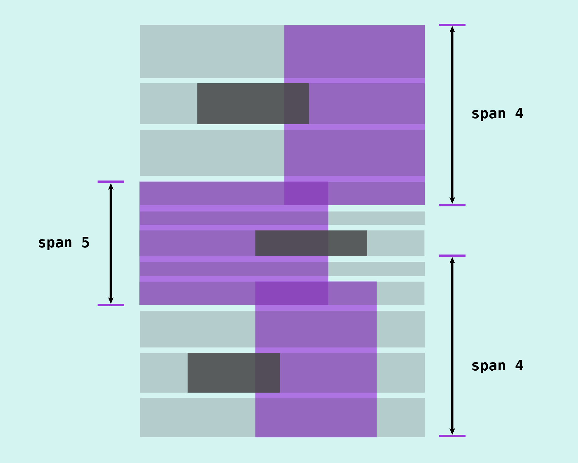
But we’re not quite done with building our grid yet: I decided to force an aspect ratio on the images themselves, just like real photos. Some would be landscape and others portrait. I wanted the grid layout to work regardless of the image aspect ratio or the length of text, so I needed my grid rows to be able to adapt.
Instead of using fixed values for the overlap and “padding” rows, we can make these tracks flexible by using minmax(). This will ensure those row tracks have a minimum size, but they will also expand if the content necessitates it.
minmax(var(--padding, auto));
Placing items
Once we have our grid “scaffolding” in place, it’s time to place some items. One thing that can sometimes be tricky with CSS Grid is understanding the best way to place items on the grid for any given layout. We have a number of different options available to us – line numbers, the span keyword, named lines or named grid areas – and some work better than others in different situations. But there’s no right or wrong methodology, and it often comes down to finding the method that makes to most sense to you.
As long as the layout works, there’s no such thing as “doing it wrong”!
Placement by grid line
I often start by placing items using start and end values – usually start and end line numbers, but if I know the exact number of tracks an item needs to span then I’ll use that instead, treating it as a constant. I sometimes name grid lines for important “landmarks” (e.g. wrapper-start and wrapper-end), but I rarely go so far as to name grid lines or create grid areas for every item in the grid. A strategy that serves me very well is using negative grid lines for when I want to place an item relative to the end of the grid, which I have written about in a previous article. I use negative grid lines most frequently on the column axis, as in most cases (for the grids I’m working with) the number of columns in a known, fixed value.
Placing an item from line 1 to line -1 with the grid-column property, for example, would position that item spanning the entire column axis of our grid, from the first line to the last:
.item {
  grid-column: 1 / -1;
}
Another case where I might be more inclined to name grid lines is for grids with a very large number of tracks. In this case we only have 10 column tracks, so for me placing items by line number on this axis feels manageable.
Using a mixture of positive and negative grid lines, and span values, it’s fairly straightforward to place items on the column axis. Switching on the grid inspector in the Firefox dev tools panel is very helpful, as it allows us to see the line numbers.
Placement by grid area
If we take a look at the grid we can see that we have quite a large number of rows to work with.

Although I started placing items by line number on the row axis, this quickly became difficult to manage. Items need to overlap each other, and I found it difficult to keep track of where one item should end and another should begin. Additionally, I didn’t want to use negative grid lines because there’s a good chance I might want to add to my layout in the future. If I ended up adding more explicit rows to the grid, then the negative line numbers would no longer be correct, potentially causing a lot of layout bugs!
This was when I decided to create named grid areas on the row axis. Grid areas are created in two ways:
- With the
grid-template-areasproperty, which enables you to effectively “draw” your grid layout as ascii art. - Using named grid lines, by using
-startand-endas suffixes to our line names.
The grid-template-areas property doesn’t allow us to define areas for overlapping items, so it doesn’t really help us with this particular layout. Using named grid areas will definitely make life easier, however.
If we name lines on both the row and the column axis, we get a grid area (fig 8):
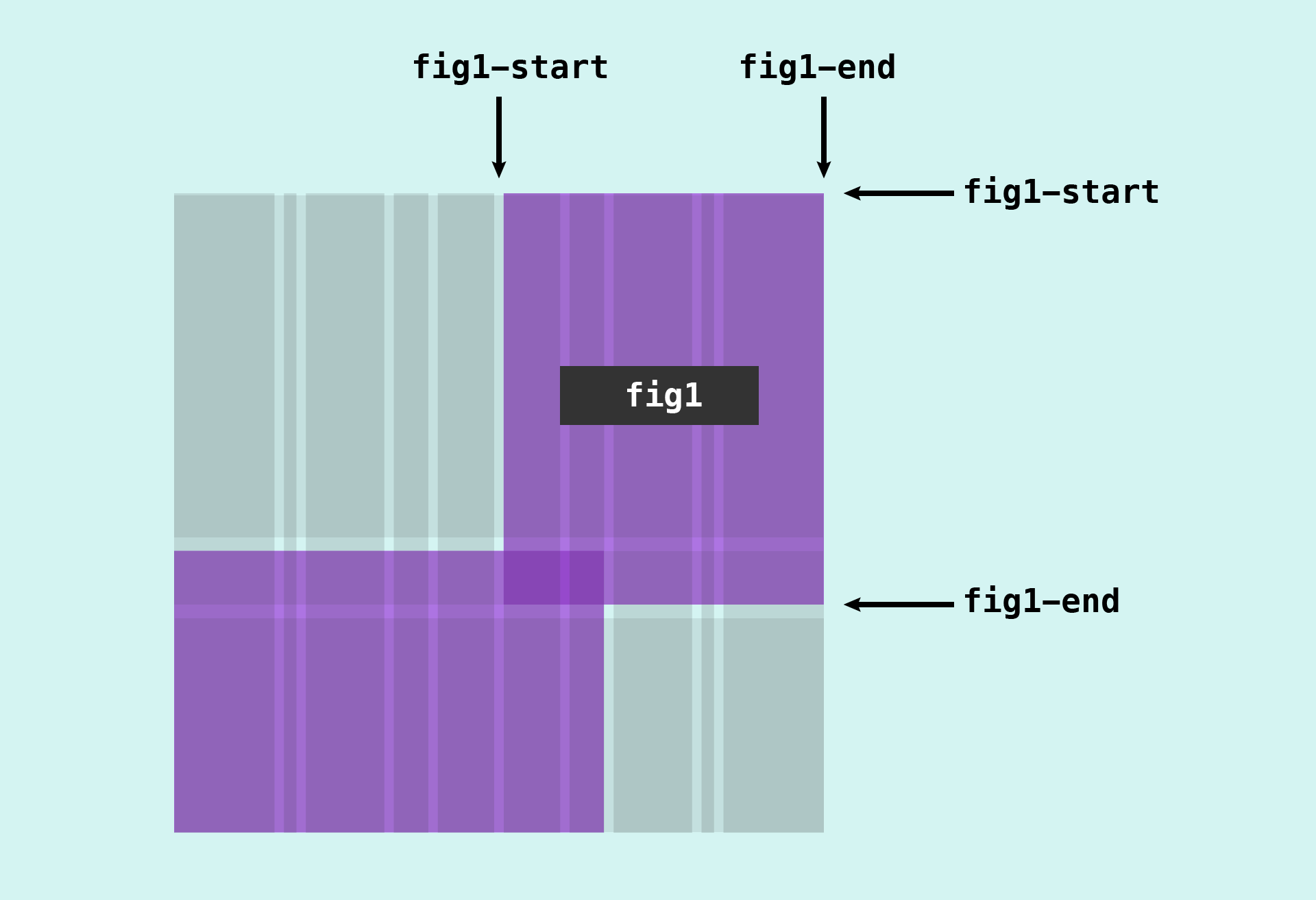
It’s then possible to reference that area when placing an item using the grid-area property:
.item {
  grid-area: image;
}
This makes our code more concise and easier to read than using grid-column and grid-row, and writing out the line names longhand:
.item {
  grid-row: image-start / image-end;
  grid-column: image-start / image-end;
}
But we only need the named grid area on the row axis this time. That’s fine, as we can just reference it with the grid-row property:
.item {
  grid-row: image;
}
As we have a large number of rows, I find it much clearer to write our grid-template-rows property vertically, so that it mirrors the structure of the page:
grid-template-rows:
/* The first two rows deal with the header */
  auto
  3rem
  /* The rest of the grid content starts here */
  minmax(var(--verticalPadding), auto)
  minmax(0, auto)
  minmax(var(--verticalPadding), auto)
  var(--overlap)
  minmax(var(--verticalPadding), auto)
  minmax(0, auto)
  minmax(var(--verticalPadding), auto)
  var(--overlap)
  minmax(var(--verticalPadding), auto)
  minmax(0, auto)
  minmax(var(--verticalPadding), auto);
Now adding the line names in the correct place becomes simpler and less error-prone, as we can visualise the structure of the grid:
grid-template-rows:
  [header-start]
  auto
  [fig1-start]
  3rem
  [header-end]
  minmax(var(--verticalPadding), auto)
  [p1-start]
  minmax(0, auto)
  [p1-end]
  minmax(var(--verticalPadding), auto)
  [fig2-start]
  var(--overlap)
  [fig1-end]
  minmax(var(--verticalPadding), auto)
  [p2-start]
  minmax(0, auto)
  [p2-end]
  minmax(var(--verticalPadding), auto)
  [fig3-start]
  var(--overlap)
  [fig2-end]
  minmax(var(--verticalPadding), auto)
  [p3-start]
  minmax(0, auto)
  [p3-end]
  minmax(var(--verticalPadding), auto)
  [fig3-end];
All that remains is to reference the area names on the row axis when placing our grid items:
.fig--1 {
  grid-column: span 5 / -1;
  grid-row: fig1;
}

.fig--2 {
  grid-column: 1 / span 7;
  grid-row: fig2;
}

.fig--3 {
  grid-column: span 5 / -2;
  grid-row: fig3;
}
The finished result (fig 10) is available to explore on Codepen.

Although I haven’t gone to the extra effort of making this layout responsive, it is useable down to smaller tablet-sized screens. Adjusting the layout for small screen sizes would now be relatively straighforward. At smaller screen sizes I would personally opt for a simpler grid, as we would likely lose a lot of the visual nuance the coumpound grid. But once again, there’s no right or wrong – and even those of us who regularly work with CSS Grid are still figuring out as we go along!
Webmentions for this page
About webmentionsLikes: 0
Reposts: 0
Mentions: 1