This is an old trick, but one I reach for just often enough to warrant a post on this blog — for no reason other than my own reference!
The problem
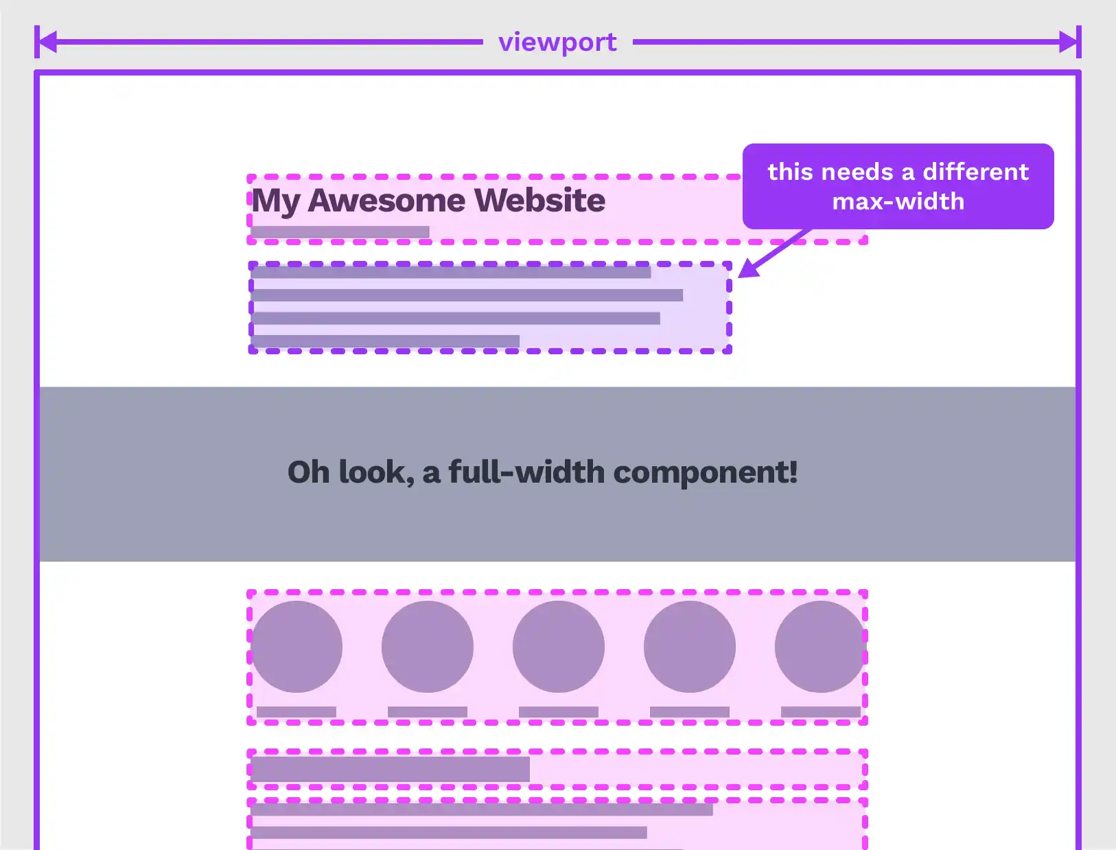
Suppose you have a page of content, all neatly constrained within a central wrapper. Probably using some kind of utility class, like so:
.wrapper {
  width: 70rem;
  max-width: 100%;
  margin-inline: auto;
}
(I’m using the margin-inline logical property as shorthand for margin-left and margin-right.)
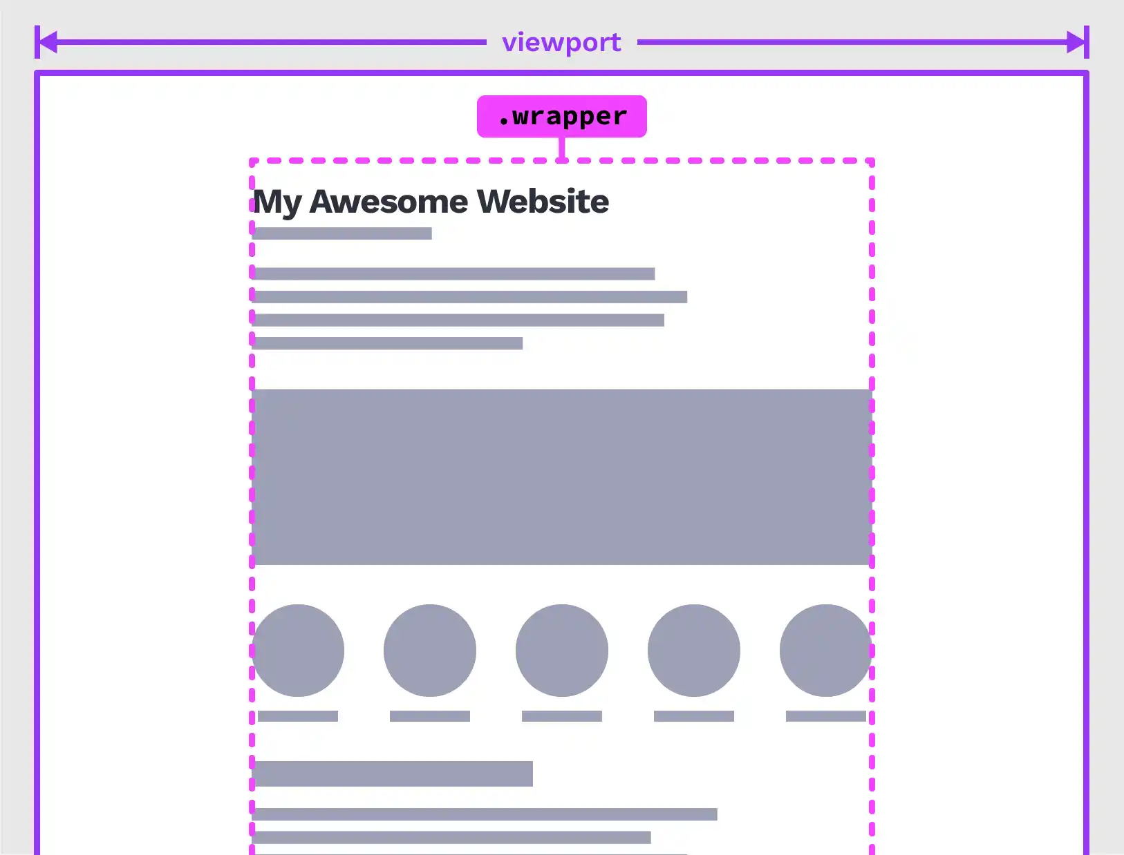
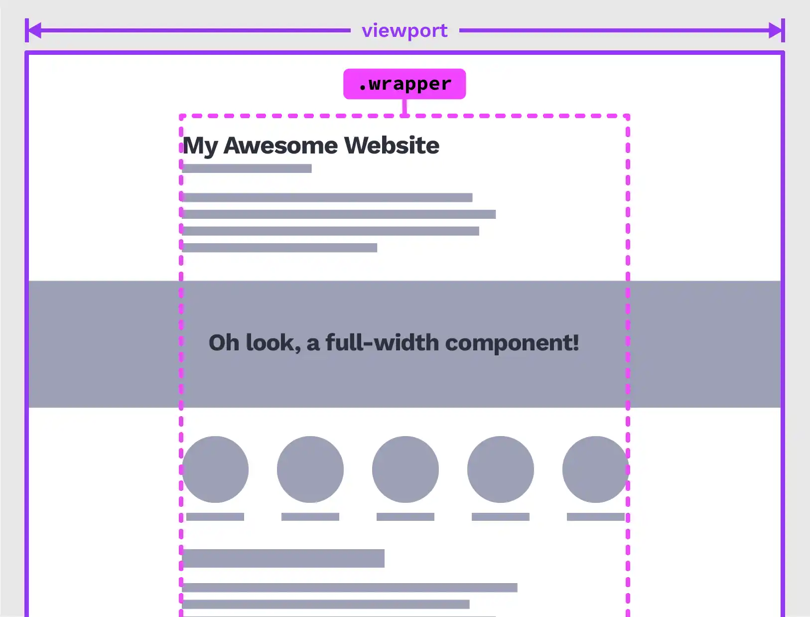
But oh no! Suddenly you find yourself in need of a component that spans the full width of the page in the midst of your neatly constrained content. What to do? Well, there are a bunch of options.
The solution(s)
Solution 1: Wrap the content either side
OK, we could wrap the content above and below our full-width section in our wrapper class.
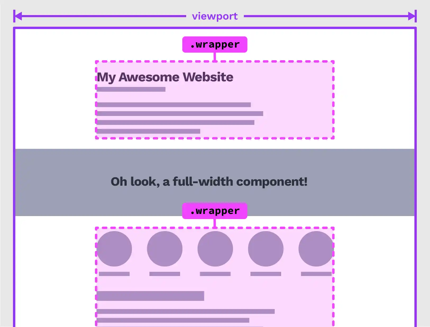
Sure, that’ll work well enough. But that relies on us having sufficient control over the markup, which is not always the case if, for instance, your content is coming from a CMS. And it doesn’t feel like the most flexible solution, if we want to add more full-width sections in the future.
Solution 2: Wrap every component
Instead of wrapping groups of components, what about if we wrap each one individually?
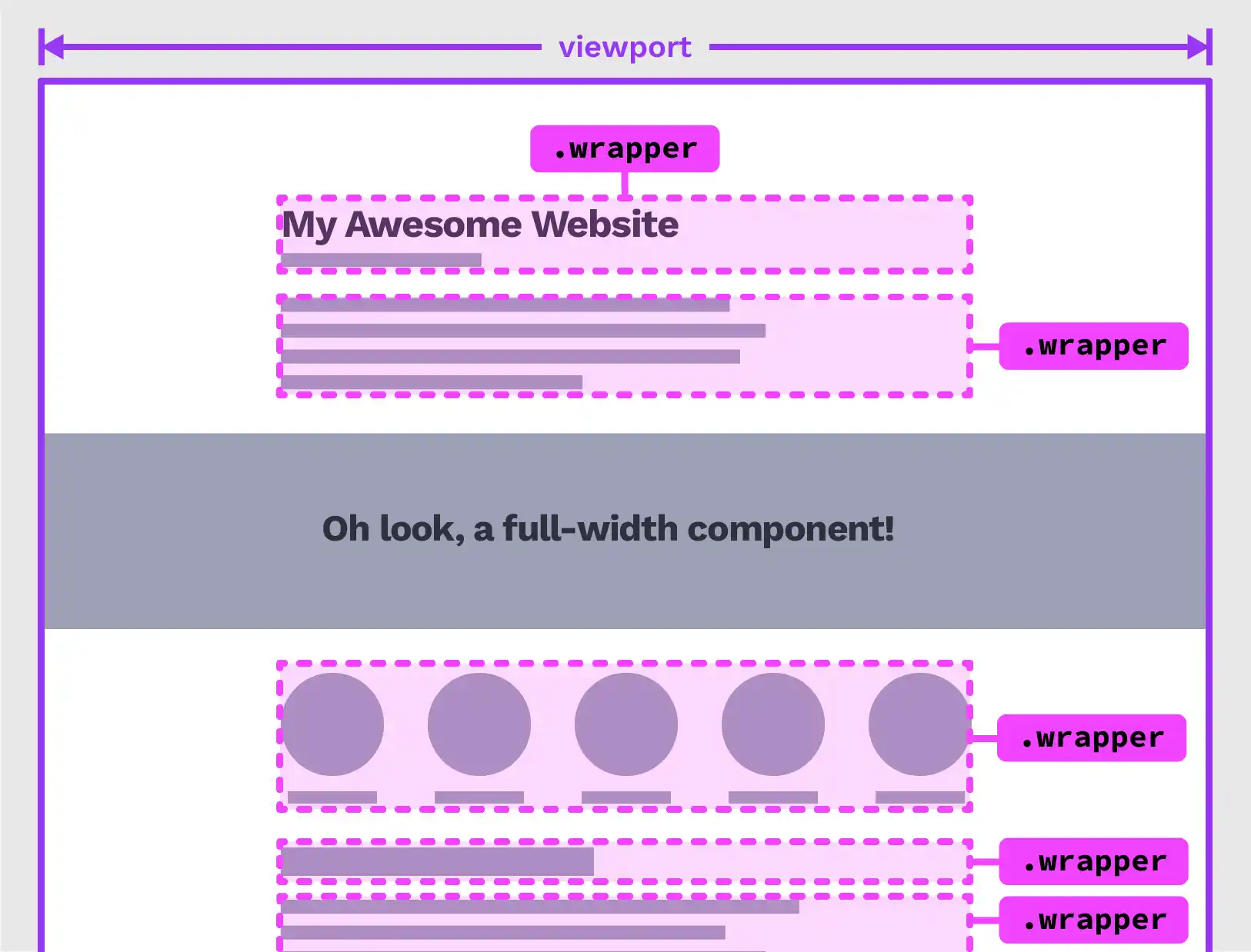
Again, it works where we can control the markup, if we’ve built our own custom components. But in WordPress for instance, paragraphs, heading, list blocks etc. are rendered as simple HTML elements, without any kind of wrapping markup to hook into. There’s probably a way you could wrap every component in a <div> if you’re au fait with PHP, WordPress and the block editor, but it’s certainly beyond my abilities. And, in any case, it might result in in some issues with accessibility and semantics, as well as just feeling kind of gross. Div soup anyone?
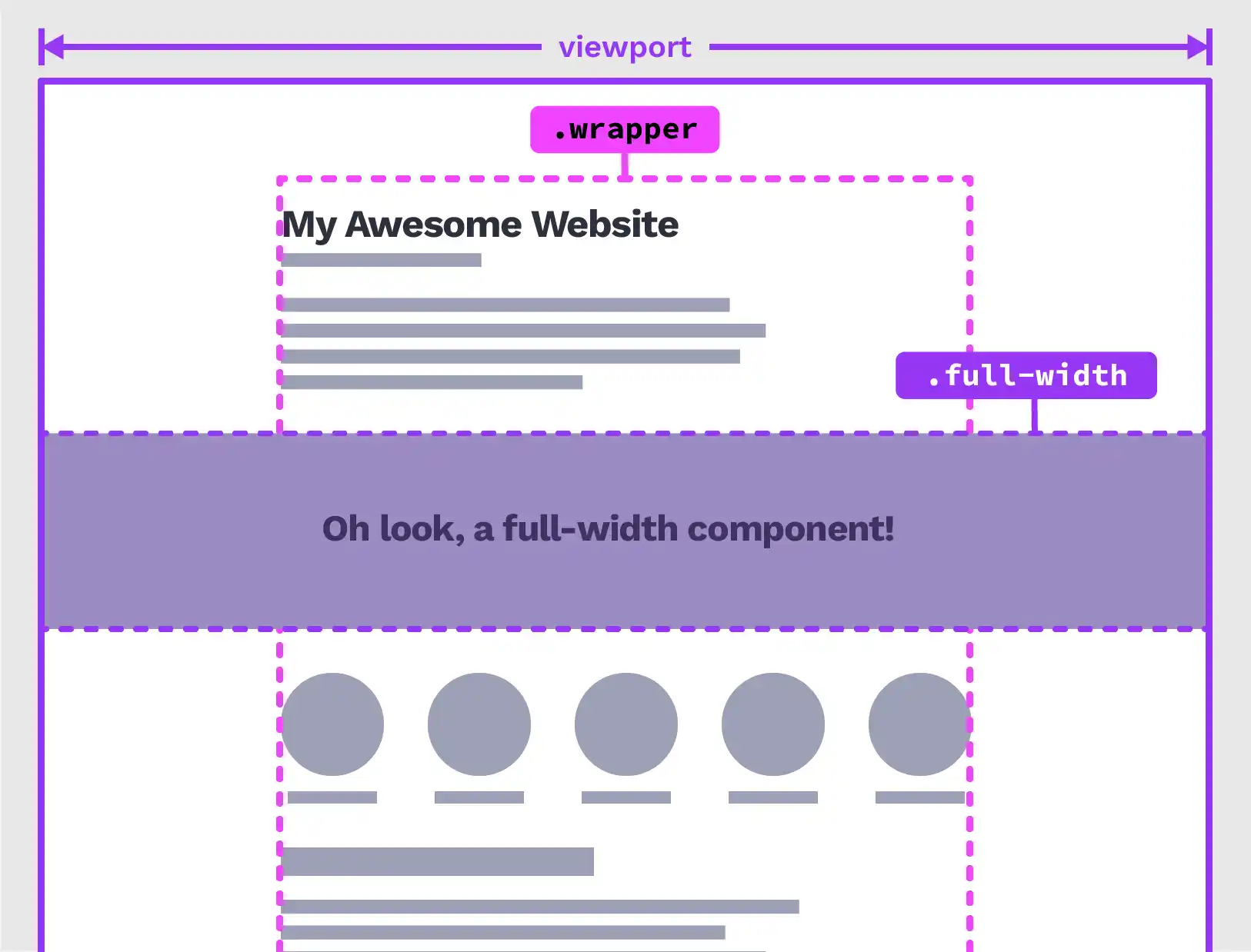
Solution 3: Append a class to every component
Rather than wrapping each component, how about adding a class? We’ll give each of the components that needs to be constrained the wrapper class. So our markup would end up something like this:
<main>
  <h1 class="wrapper">Heading</h1>
  <p class="wrapper">
    Lorem ipsum dolor sit amet, consectetur adipiscing elit, sed do eiusmod
    tempor incididunt ut labore et dolore magna aliqua. Ut enim ad minim veniam,
    quis nostrud exercitation ullamco laboris nisi ut aliquip ex ea commodo
    consequat.
  </p>
  <p class="wrapper">
    Duis aute irure dolor in reprehenderit in voluptate velit esse cillum dolore
    eu fugiat nulla pariatur.
  </p>

  <!--Full width component-->
  <div>...</div>

  <p class="wrapper">
    Excepteur sint occaecat cupidatat non proident, sunt in culpa qui officia
    deserunt mollit anim id est laborum.
  </p>
</main>
Or, we could go the other way: Set our wrapper styles on all direct children of our main element, then set a full-width class on the full-width ones.
main > * {
  width: 70rem;
  max-width: 100%;
  margin-inline: auto;
}

main > .full-width {
  width: 100%;
}
This doesn’t seem like a great solution, as it assumes each direct child needs to be the same width. You might have some components that need to be narrower than that central wrapper, but still align with the rest of the content.
Adjusting the margins or widths of those elements could have unpredictable results. For example, setting a narrower width results in misalignment.
Not to mention, we’ll need to increase the specificity of the elements we want to target for individual styling.
main > * {
  width: 70rem;
  max-width: 100%;
  margin-inline: auto;
}

/* This will have no effect  :( */
p {
  width: 65ch;
}

/* We gotta do this instead */
main > p {
  width: 65ch;
}
Solution 4: Viewport width breakout technique
Using viewport units, we can force an element to break out of the wrapper, without changing our original markup! Originally shared by Una Kravets in 2018, this little CSS snippet will do just that:
.full-width {
  position: relative;
  right: 50%;
  left: 50%;
  margin-left: -50vw;
  margin-right: -50vw;
  max-width: 100vw;
  width: 100vw;
}
Handy! But you know what? We can do it even more concisely with a transform:
.full-width {
  width: 100vw;
  margin-left: 50%;
  transform: translate3d(-50%, 0, 0);
}
This comes with a small caveat: It won’t work if we have overflow: hidden on the wrapper element. Still, if we can avoid that, and if we don’t have control over the markup (or even if we just need a quick fix), this is a great solution.
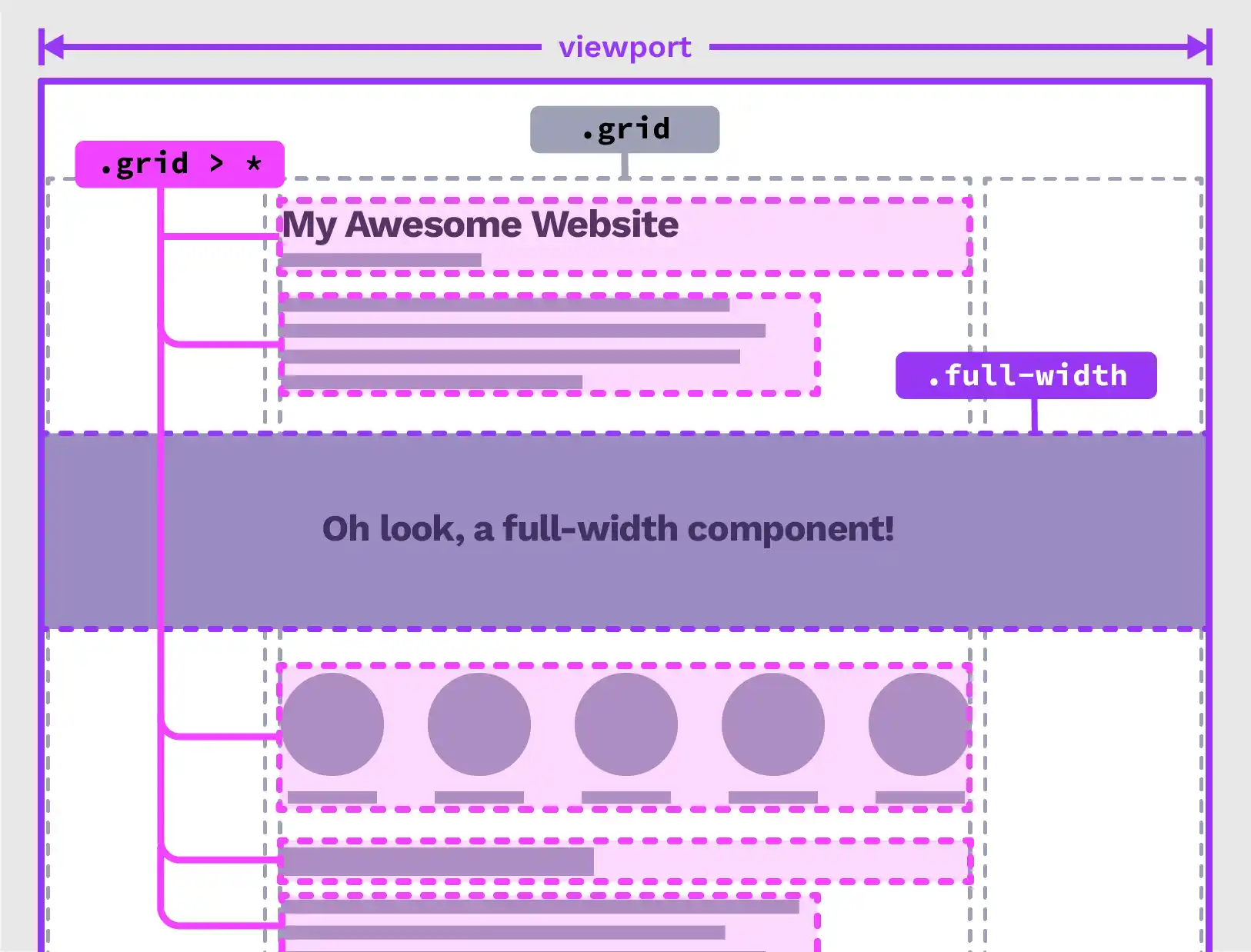
Solution 5: Grid
This is a grid pattern I reach for time and time again, ostensibly for precisely this sort of problem. We create a grid with two flexible-width outer columns (using the fr unit) and one or more max-width contrained columns. In this case, a single central column will serve our needs. I like to name my grid lines, to make placement easier:
.wrapper {
  display: grid;
  grid-template-columns:
    [full-start] 1fr [wrapper-start]
    minmax(0, 70rem) [wrapper-end] 1fr [full-end];

  /* Optional gap */
  column-gap: var(--pad, 1rem);
}
Then we can place all direct children of our wrapper into the central column, except the ones that need to break out:
.wrapper > * {
  grid-column: wrapper;
}

.wrapper > .full-width {
  grid-column: full;
}
I like to add a column gap when I’m using this technique, because it means our grid will be responsive straight off — when the viewport is narrow there will be a space between the edge of the viewport and the content in the central column, we don’t need to use padding. I prefer not to set a row gap, as I often need to have more control over the space between items, giving headings more space above them than paragraphs, for instance. Grid doesn’t permit us to set different gap values, so the spaces between every item would be the same. Opting for margins instead allows for more control.
This demo shows the technique used for a page layout.
See the Pen Untitled by Michelle Barker (@michellebarker) on CodePen.
This is my favourite solution to the breakout, and one I’ve used on plenty of sites. My only word of caution is that if you’re retro-fitting an old site with this technique, make sure you do plenty of testing to make sure any leftover workarounds in your code don’t cause layout bugs.