Maybe it’s just me, but I feel like a lot of the time learning new CSS features doesn’t involve just learning a what a single property does, more like getting to grips with a collection of properties and how they work together — even learning a whole specification. That’s certainly not a complaint from me: it makes sense to consider properties as part of an ecosystem. But I have to confess, I love it when a new CSS property lands in browsers that doesn’t have a steep learning curve and just works, with no fuss. The aspect-ratio property hits all the right spots there, neatly solving with a single line of CSS something that was, quite frankly, a bit of faff before. It’s been supported in browsers for going on a year now, but with Safari finally catching up in September 2021, we can finally feel confident using it with aplomb.
Goodbye, padding hack
In times gone by we needed to write some pretty ugly CSS to get elements to conform to an aspect ratio:
.aspect-box {
  position: relative;
}

.aspect-box::before {
  display: block;
  content: '';
  width: 100%;
  padding-bottom: calc(100% / (var(--aspect-ratio, 3 / 2)));
}

.aspect-box > :first-child {
  position: absolute;
  top: 0;
  right: 0;
  bottom: 0;
  left: 0;
}
We tend to call this the “padding hack” because, well, that’s what it is. The custom property helps us cut down on repetition if we need more than one ratio. Here’s a rundown from CSS Tricks, and a demo here.
No one in their right mind wants to be writing all that. Ratio Buddy is a handy tool that generates the Sass snippet for you.
Practical usage of aspect-ratio
Using the CSS aspect-ratio property is far simpler: Specify width and height values for the aspect ratio, separated with a slash, or specify a single decimal value. These two aspect ratio values will have the same result:
.aspect-box {
  aspect-ratio: 3 / 2;
}

.aspect-box {
  aspect-ratio: 1.5;
}
You can explicitly set a width or height on the element and aspect-ratio will work pretty much as you might expect: Whichever dimension is unspecified will be automatically determined by the aspect ratio. If you set both the width and height to something other than auto, then the aspect ratio no longer applies. That’s not a bug, that’s deliberate and useful behaviour.
See the Pen Aspect-ratio by Michelle Barker (@michellebarker) on CodePen.
Expand to fit
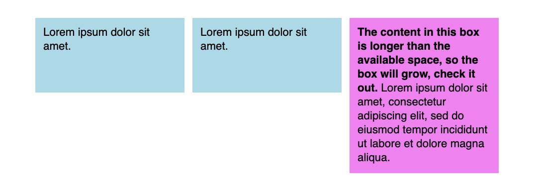
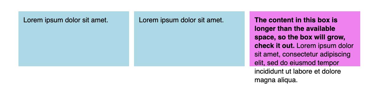
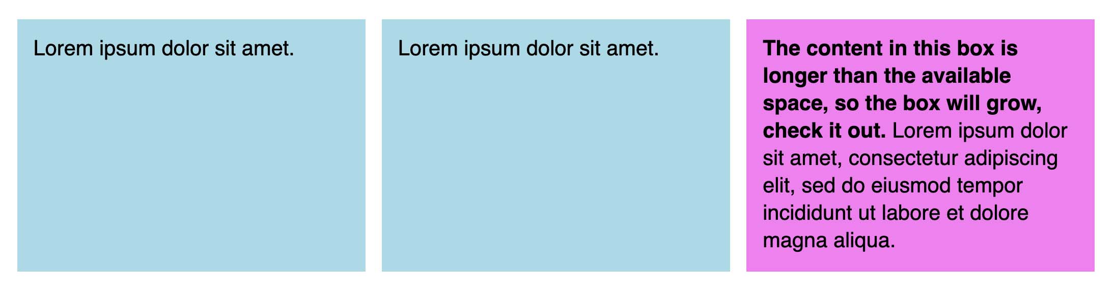
aspect-ratio is both intrinsically and extrinsically sized. That means it’s smart enough to respond to both content and context. Each of these three boxes has as aspect ratio of 2 / 1 and an explicit width set. The text content in the third box is longer than the available space, so rather than maintaining the aspect ratio, the element expands vertically to fit the content.
If we set an explicit height instead, the element doesn’t expand, but instead we get overflow (which we could handle with the CSS overflow property if we choose to).
Aspect ratio images with object-fit
aspect-ratio really shines when combined with object-fit for sizing images. Use object-fit: cover for gallery-style thumbnails:
See the Pen Aspect ratio image gallery by Michelle Barker (@michellebarker) on CodePen.
Or object-fit: contain for a logo grid:
See the Pen Aspect ratio logo grid by Michelle Barker (@michellebarker) on CodePen.
It’s worth noting that object-fit requires an explicit width and height to be set on the element we want to “fit”. So for the following markup (an image element inside an aspect ratio box):
<div class="aspect-box">
  <img src="https://images.unsplash.com/photo..." alt="Robin on a log" />
</div>
If we want the image to fill and cover the aspect ratio box, we’ll need the following CSS:
img {
  display: block;
  width: 100%;
  height: 100%;
  object-fit: cover;
}
Quite often we want to put stuff in the aspect ratio box, as above. But we could omit the wrapper and put the aspect ratio slap bang on the image element if we wish, using it instead of either width or height:
img {
  display: block;
  width: 100%;
  aspect-ratio: 3 / 2;
  object-fit: cover;
}
Aspect ratio boxes in context
The above demos use Grid or flexbox for the layout, and for a gallery of images that works perfectly as expected. But what if we have a grid where our aspect ratio boxes only contain text (or perhaps are even empty)? One thing to watch out for is that flex and Grid set align-items: stretch by default. That mean that if we have one grid child with content that’s longer than would fit within the aspect ratio box (and assuming we’ve set an explicit width for those boxes rather than height, the more common scenario), then the other items in the grid will grow to match the height of the longest item, ignoring the aspect ratio:
This might be desirable behaviour for our design, and is often quite suitable as a default. If, on the other hand we want items to maintain their aspect ratio, even if one item in the row is taller, then we need to set align-items to something other than the default on the grid or flex container:
See the Pen Aspect ratio by Michelle Barker (@michellebarker) on CodePen.
Minimum aspect ratio
One place where the default behaviour comes in pretty handy is in a UI component where you have text on one side and an image on the other — a call to action, for instance. If we set an aspect ratio on the image, the text column will be at least tall enough to match the height of the image. But if the text is longer, the image will grow to match the height of the text.
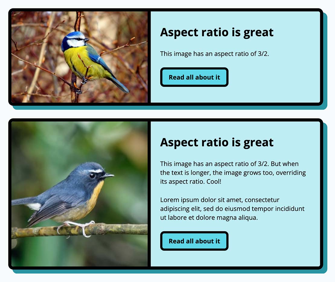
We can think of aspect-ratio in this case as behaving like a minimum, rather than being fixed.
Browser support
Browser support is now widespread, but the good thing is that, in most cases, you probably don’t need to provide much in the way of fallbacks. Users will still be able to see your content, it just won’t be sized to perfectly fit your desired aspect ratio. However, in the case of an image gallery that uses object-fit, any particularly tall images would cause the other thumbnails in the row to grow, potentially resulting in some odd cropping.

By setting align-items: start on the grid container, we can prevent this growing behaviour on the larger item’s siblings.

If you do need to provide a fallback for older browsers, then a good old feature query should suffice:
.aspect-box {
  /* Styles for browsers that don't support aspect-ratio */
}

@supports (aspect-ratio: 1 / 1) {
  .aspect-box {
    /* Styles for browsers that support aspect-ratio */
  }
}
Wrapping up
aspect-ratio is a great example of a humble property that fills a long-awaited need in the CSS community. It’s simple to use and behaves in a way that respects content, without the need for any extra CSS.
Webmentions for this page
About webmentionsLikes: 0
Reposts: 0
Mentions: 4