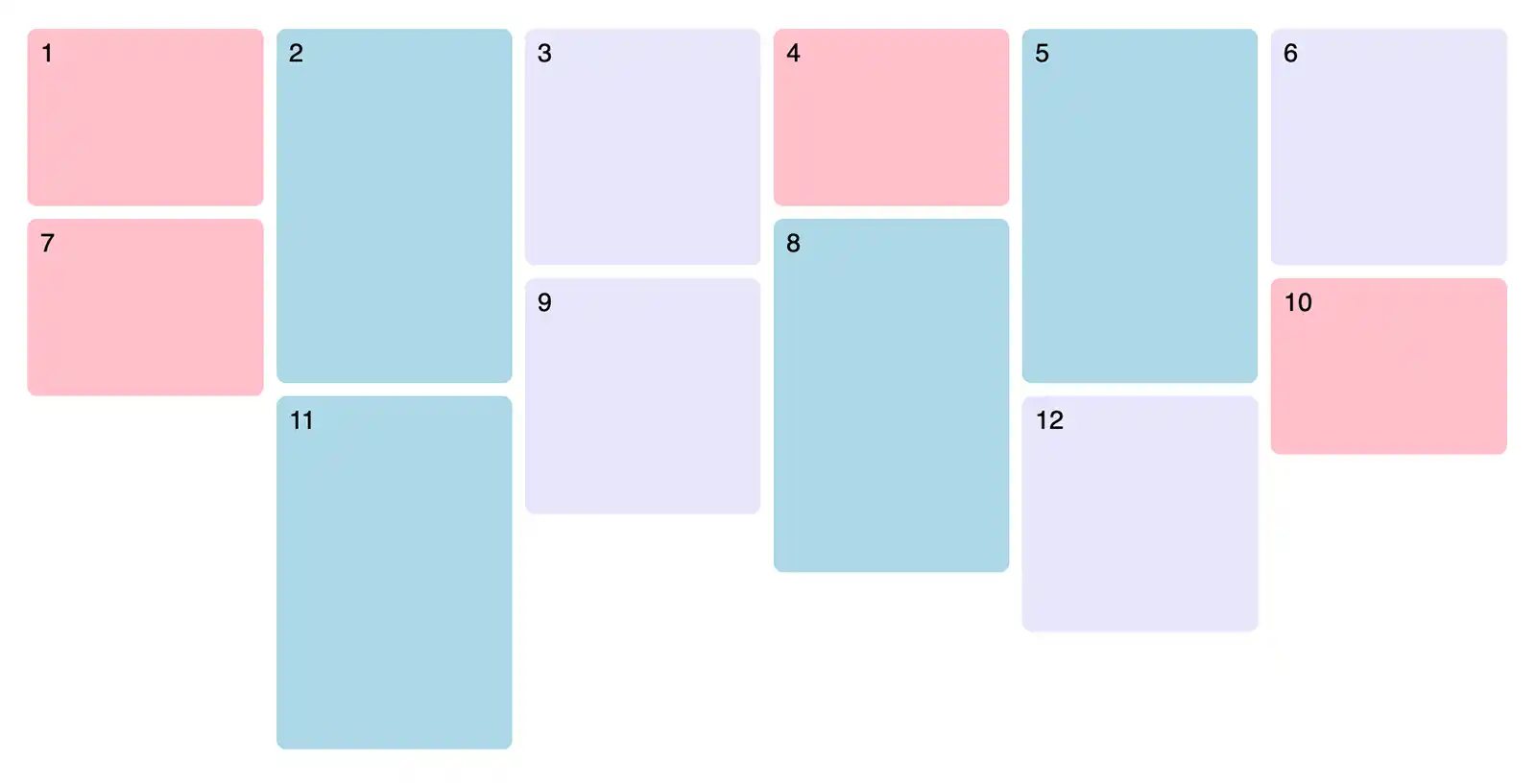
I spoke about CSS layout at CSS Day conference recently, and in the Q&A session afterwards I was asked about masonry layout in CSS. Masonry layout, in case you’re not aware, is where different height items are laid out in columns but, rather than being aligned on the row axis, the items below effectively move up to plug any gaps, kind of like a bricklayer — hence the name. Pinterest’s grid design is a commonly-cited example whenever the masonry conversation comes up.

The current state of masonry in CSS
Currently we can build a kind of faux-masonry (or “fakesonry”, if you will) layout in CSS by using columns.
.list {
  columns: 20rem;
  column-gap: 1rem;
}
See the Pen Masonry grid (Firefox with flag enabled) by Michelle Barker (@michellebarker) on CodePen.
This will create a layout that looks like masonry, but the items are ordered by column, not by row. If you were using this layout for an entire page, for the user to browse the items in order they would need to work their way down each column, right to the end before scrolling back up to the top of the page again. Perhaps this might be an OK visual experience if the order doesn’t matter, but users navigating via a keyboard or screenreader would still have to browse by column. When we think of a masonry layout, we normally expect that items are ordered horizontally (or along the inline axis).
We can also build a grid that kind of looks like masonry, but it would require manual placement of grid items, and the height of each item wouldn’t truly be determined by the content. In fact, there are a number of ways we can kind of, almost do masonry in CSS, and some of them might serve us well in some situations — check out this CSS Tricks article from 2019 that collates a few of them. (Beware of re-ordering with CSS though. It’s not recommended for accessibility reasons.)
But building a true masonry layout currently requires Javascript, such as the Masonry library created for precisely this purpose.
What’s next for masonry?
I’d remember masonry in CSS being discussed by Rachel Andrew some time ago, but I admit it’s kind of fallen off my radar recently. I think that’s partly due to the fact that I’m just not required to build that many masonry layouts these days. Some of that might be down to changing jobs, but I also suspect that masonry just isn’t as popular among designers as it once was. To me, it feels like a very late-2010s design trend, from when Pinterest was all the rage.
Perhaps it’s also down to greater performance and accessibility awareness. Using a JS library for layout isn’t going to do your performance metrics any favours, and is something I’d advise against where possible. And sure, masonry looks cool* (*or it did in 2017), but I’d argue it’s not the most user-friendly layout: the order of the content isn’t as clear when items are not aligned. (I don’t have any evidence to back that up, it’s just a personal feeling.)
But what about masonry in CSS?
Ah yes, the whole point of this article. Despite masonry arguably being less popular, it would still be great to have a way to do it without JS. Well, the CSS Grid Level 3 Specification includes a proposal for masonry layout. In fact, it can already be enabled with a flag in Firefox, so you can try it for yourself.
It works be using the keyword masonry for the grid-template-columns or grid-template-rows property. This example will give us a 6-column grid with masonry applied to the row axis, to replicate the Pinterest-style grid:
.grid {
  display: grid;
  grid-template-rows: masonry;
  grid-template-columns: repeat(6, 1fr);
}
See the Pen Masonry grid (Firefox with flag enabled) by Michelle Barker (@michellebarker) on CodePen.
For a full overview, Rachel has a great write up from 2020 in Smashing Magazine.
Does masonry belong in Grid?
A while back, there was some debate about whether masonry belongs in the Grid specification, as it’s not really Grid or flexbox, but has elements of both. Or perhaps it’s own thing altogether? While I did have some reservations about it being part of the Grid spec, I think the current implementation makes sense. It feels a little like Subgrid in some respects, where we’re effectively telling an element to use a different grid on either the row or column axis — albeit one determined not by its parent, but by a predetermined algorithm.
Another, more soul-searchy, question is whether the effort is warranted. If masonry is a declining design trend, the sometimes glacial pace of web standards might ensure that by the time browser support is widespread, no one really wants to use it anyway.
While I personally would love to see masonry implemented, there are plenty of features that should arguably be a higher priority. Watch Rachel’s talk from CSS Day for details on the CSS features browsers are prioritising and working together to implement.
Webmentions for this page
About webmentionsLikes: 0
Reposts: 0
Mentions: 1