Last week I had the privilege of attending an online workshop on Data Visualisation Fundamentals hosted by data visualisation expert Andy Kirk. The six-hour workshop was split across two days, and consisted of a mixture of teaching materials, examples and interactive exercises (both individually and in small groups). It can be tricky to find the right balance to hold people’s attention for an online workshop — speaking from my own experience, I find I sometimes struggle to stay engaged compared to attending in person. But the blend of content here, combined with Andy’s presentation style and his expertise and enthusiasm for the subject meant that in this case I felt fully immersed. It appeared the rest of the audience was similarly engaged too.
What did we learn?
One of the most useful aspects of the workshop for me was learning about how to analyse and interrogate the data before designing the chart itself. What questions do we need to ask? What is the message we’re trying to convey? Who is the audience? Where will they encounter the visualisation? What limitations are there? What types of charts might be suitable or unsuitable? It made me think about approaching data visualisation in a new way, and consider slowing down and taking a more methodical approach.
There were some fun group exercises analysing different charts. It was helpful to examine the choices the designers had made within the constraints, what worked well and what didn’t, and think about how they could be improved.
Andy presented examples of lots of different types of charts, and talked about what sort of data they could be used for. I found this really helpful, and although it was a lot of information I know I’ll refer back to it later.
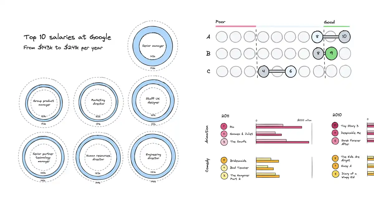
Andy also introduced a sketching tool I hadn’t encountered before, Excalidraw. This seems super useful for brainstorming visualisation ideas, and I’ll definitely use it in the future. I enjoyed coming up with different chart ideas, and it was useful to apply the information from the workshop in a practical way.
Summary
I got a lot out of this workshop, and would recommend it for anyone interested in designing charts and levelling up their data visualisation skills. It’s very much a design-and-thinking workshop — you don’t have to be an expert at any particular tool, or be amazing at drawing. There’s plenty of relevance, regardless of whether you’re a total beginner or a seasoned pro.
Andy also runs a longer (in-person) version of this workshop, which seem like it would be worthwhile.
Webmentions for this page
About webmentionsLikes: 9
Reposts: 2
Mentions: 1
-
@michelle @andykirk great to hear this was (unsurprisingly) good! Looking forward to attending Andy's next workshop myself!! ????
- Mike Brondbjerg -
@mikebrondbjerg @andykirk I think I heard about it from you in the first place, so thank you! ????
- Michelle Barker -
- Mike Brondbjerg